The Dimming of Lights in India during the COVID-19 Pandemic
by
 , ,
, ,
Tilottama Ghosh
1,* ,
,
Christopher D. Elvidge
1 ,
,
Feng-Chi Hsu
1, 
Mikhail Zhizhin
1,2 and
Morgan Bazilian
3 1
Earth Observation Group, Payne Institute for Public Policy, Colorado School of Mines, Golden, CO 80401, USA
2
Russian Space Research Institute, 117997 Moscow, Russia
3
Payne Institute for Public Policy, Colorado School of Mines, Golden, CO 80401, USA
*
Author to whom correspondence should be addressed.
Remote Sens. 2020, 12(20), 3289; https://doi.org/10.3390/rs12203289
Submission received: 4 September 2020
/
Revised: 29 September 2020
/
Accepted: 8 October 2020
/
Published: 10 October 2020
(This article belongs to the Special Issue Remote Sensing of Nighttime Observations)
Abstract
:The monthly Suomi National Polar-orbiting (NPP) Visible Infrared Imaging Radiometer Suite (VIIRS) Day–Night Band (DNB) composite reveals the dimming of lights as an effect of the lockdown enforced by the government of India in response to the COVID-19 pandemic. The changes in lighting are examined by creating difference maps of a pre-pandemic pair and comparing it with two pandemic pairs. The visual raster difference maps are substantiated with quantitative analysis showing the proportion of population affected by the changes in the lighting brightness levels. In the pre-pandemic images of February and March 2019, 60% of the population lived in administrative units that became brighter in March 2019. However, in the first pandemic pair, 87% of the population lived in administrative units that became dimmer in March 2020 after the lockdown in comparison to February 2020. The nightly DNB profile at the airport in Delhi illustrate how the dimming of lights coincide with the date of the onset of the lockdown (in March 2020). The study shows the usefulness of the DNB nightly and monthly composites in examining economic impacts of the pandemic as countries throughout the world go through economic declines and move towards recovery.
1. Introduction
The year 2020 will be etched in our lifetimes as the most economically and emotionally stressful year in a generation because of the COVID-19 global pandemic. It is estimated that the pandemic could slow down the global economic growth from 3% to 6 % in 2020 [1]. The pandemic has caused an economic slump beyond anything the world has experienced in nearly a century, with massive levels of unemployment and the economic and social costs associated with the many lives lost. In this paper, we present results from low-light imaging satellite data collected by the National Aeronautics and Space Administration/National Oceanic and Atmospheric Administration (NASA/NOAA) Visible Infrared Imaging Radiometer Suite (VIIRS) Day–Night Band (DNB) to study the economic impacts of the COVID-19 pandemic in India. This paper uses concepts developed by Elvidge et al. for studying the impacts of COVID-19 in China [2].
Since the first COVID-19 case was diagnosed, it has spread to over 200 countries. India reported its first case of COVID on January 30 in Kerala’s Thrissur district [3], from a student who had returned home for a vacation from Wuhan University in China. As the number of confirmed cases slowly spread and the number of cases in India reached 500, Prime Minister Narendra Modi asked all citizens to follow a “Janata” curfew for 14 h (7 a.m. to 9 p.m.) on 22 March. Following the “Janata” curfew Prime Minister Modi ordered the First Phase of lockdown on 24 March, the largest lockdown ever, asking 1.3 billion people to stay at home for the next 21 days [4]. This was followed by three more phases of lockdown—Phase 2 (15 April–3 May), Phase 3 (4 May–17 May), and Phase 4 (18–31 May) [3]. These measures were taken in view of the ominous predictions for India, the second most populous country in the world, with a large majority of the population living in poverty and unsanitary, crowded conditions, and with a hospital bed capacity of just 0.7 persons per 1000 people [4].
The economic impacts of the lockdown were disastrous for the 100 million migrant workers in India who make up 20% of the workforce [5]. These daily wage earners lost their income overnight and rushed to their homes in packed buses and trains, potentially carrying the virus to rural areas. When they were left with no transportation options to travel, they started walking to their distant villages [4]. The economic fallout in the service sector, accounting for 60% of India’s Gross Domestic Product (GDP), and in the industrial sector because of the closure of the industries and factories, have been phenomenal [6]. The Indian economy had already slowed down in 2019 partly because of the slowdown of the global economy [7]. According to an estimate by the economists at Goldman Sachs, the economic slowdown because of the pandemic is expected to shrink the Gross Domestic Product to 5% for the next fiscal year, which began in April and will be ending in March 2021 [8].
The usage of VIIRS DNB data to study economic landscapes of countries at the granular level is well established, and there have been studies specific to India [9,10,11]. Low-light imaging satellite sensors have also been used to detect dimming and recovery of lights after natural disasters [12,13,14], wars [15,16], other humanitarian crisis [17], and economic collapse [18]. With this background information, this paper explores the effect of the COVID-19 pandemic in India through the percentage change in the brightness difference images of monthly VIIRS DNB data. The difference images were created between the February 2020 image and the image of March covering the period of the lockdown, which was 24–31 March; the second set is the difference image between February 2020 and the image of April. As a reference, the same analysis was also conducted on a pair of months from the previous year—February 2019 and March 2019. Further, a nightly temporal profile is examined, which clearly depicts the dimming of lights from the exact starting date of the lockdown on 24 March.
2. Materials and Methods
The NASA/NOAA VIIRS DNB was originally designed to detect moonlit clouds in the visible band. However, with million times intensification of the signal, the DNB detects electrification on the Earth’s surface [19]. The VIIRS DNB data are available in daily, monthly, and annual formats. The annual data go through several steps of processing to remove cloud cover, solar and lunar contamination, background noise, and features such as fires and flares, which are not related to electric lighting [20]. When the user is interested in studying any monthly event or daily event, the monthly and daily DNB data can be used. However, the monthly data need some pre-processing before use. This is because the monthly data are not filtered to remove clouds, ephemeral events like biomass burning, or background noise. Thus, it is left to the discretion of the analyst to apply the filters and make the data appropriate for analysis.
In this paper, we have used three pairs of filtered DNB monthly images, which were comprised of five individual images—February 2019, March 2019, February 2020, 24–31 March 2020, and April 2020. The monthly composites comprised a pair of images, the average radiance, and the tally of the cloud-free coverages. In order to create a standard set of images having a consistent set of lit grid cells, the images were filtered on the basis of low cloud-free coverages, low radiance levels, and snow cover.
2.1. Filtering Based on Low Cloud-Free Coverages
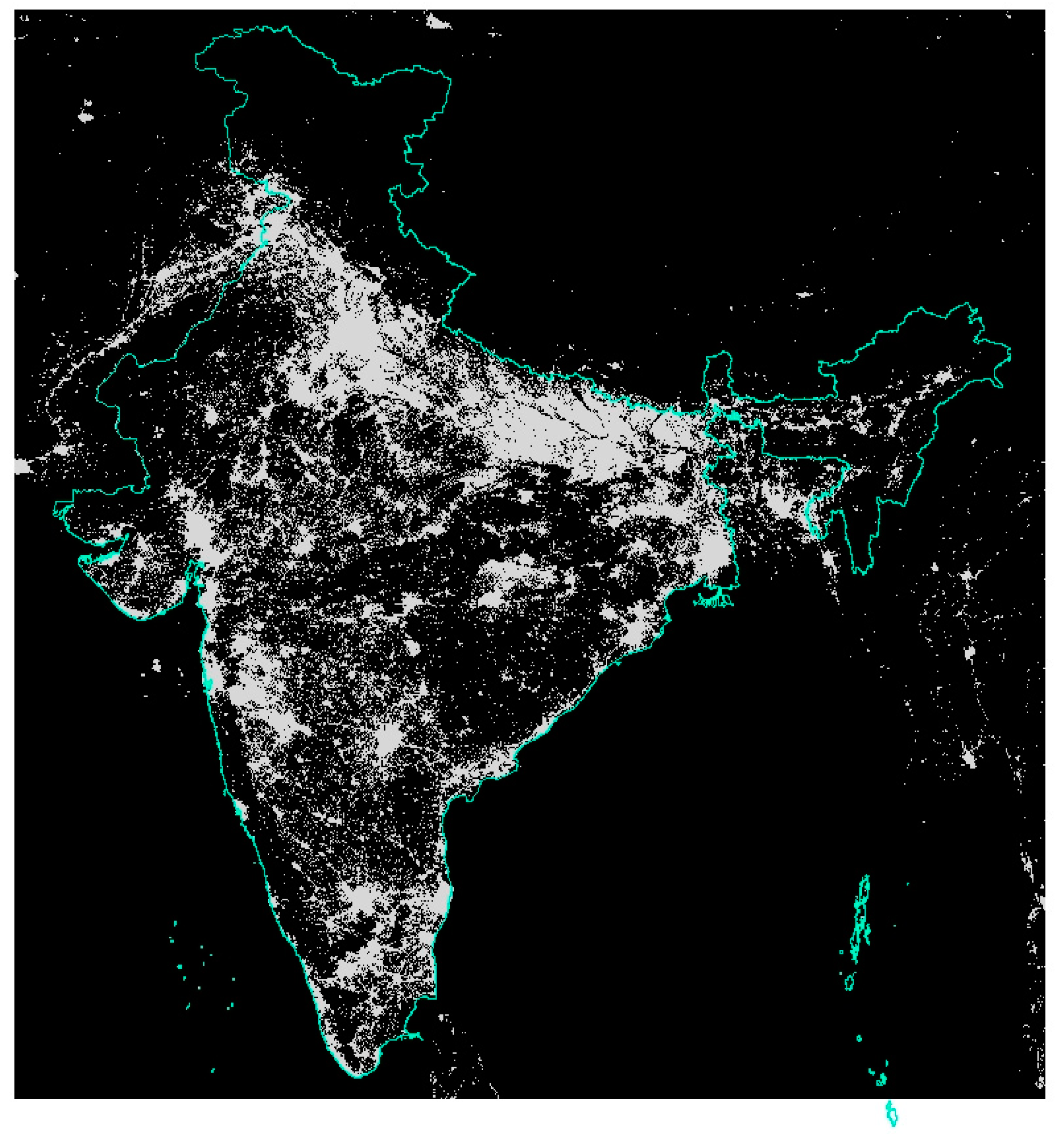
Visual examination of the cloud-free coverage grids showed that there were significant data gaps in areas of zero, one, or two cloud-free coverages. Thus, for each of the five months, a binary on–off mask was created for grid cells having less than or equal to two cloud-free coverages. The masks of all the five months were added up, and in the final step an “off” mask was produced to exclude all grid cells with less than or equal to two cloud free coverages in any of the five months (Figure 1).
2.2. Filtering Based on Low Average Radiance
The background areas with very low average radiances are usually contributed by biomass burning and fires. Although the values are very low, when they are summed up over a considerable spatial extent and over a period, it provides a “false” higher value of the sum of the average radiances. Again, through visual examination it was determined that excluding grid cells with radiance values less than or equal to 0.6 nanowatt/cm2/sr would help to exclude all the background noise from fires and biomass burning. Thus, binary on–off masks were created for each of the five months, and then the masks of all five months were added up. In the final step, an “off” mask was created to exclude all grid cells with average radiances less than or equal to 0.6 nanowatt/cm2/sr in any of the five months (Figure 2).
2.3. Filtering of Snow Cover
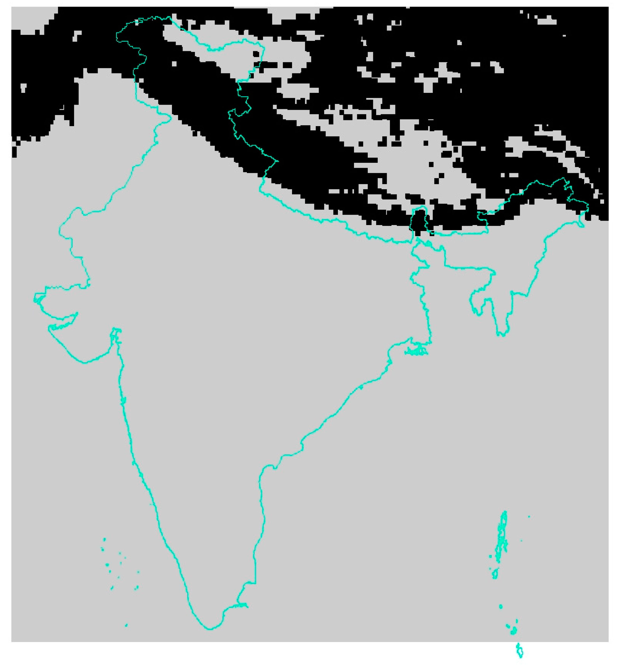
Snow cover increases the brightness of the lighting because of the high visible wavelength reflectivity. Snow cover masks for each of the five months were derived from the NOAA AMSU-A (Advanced Microwave Sounding Unit-A) daily snow cover product by tallying the number of times snow cover was detected for each of the five months [21]. Monthly snow cover tallies of one and two were removed to exclude false detections. The snow cover grids for each of the five months having tallies of greater than or equal to three were added up, and then an “off” mask was created to “zero” out the lighting affected by snow cover in any of the five months (Figure 3).
2.4. Calculating the Sum-of-Lights
After applying all the three masks on each of the monthly composites, the 15 arcsecond grids were adjusted for area. Because of the spherical shape of the earth, the cell areas are largest at the equator and smallest at the poles. Therefore, the monthly composite grids were multiplied with the area grid derived from LandScan [22]. The district-level shapefile of India, having 667 administrative units [23], was overlaid on each of the five monthly composites, and the sum of the radiance values or sum-of-lights (SOL) were extracted. The sum differences were calculated between 2019/02 and 2019/03; 2020/02 and 2020/03/24–31; and 2020/02 and 2020/04. The percentage differences were also calculated. The population of the administrative units were also extracted using the LandScan population grid of 2018, which was also adjusted for area.
3. Results
3.1. Colorized Difference Images
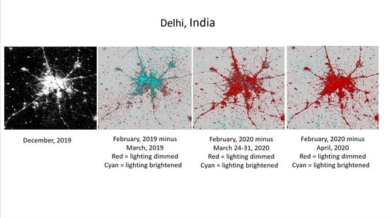
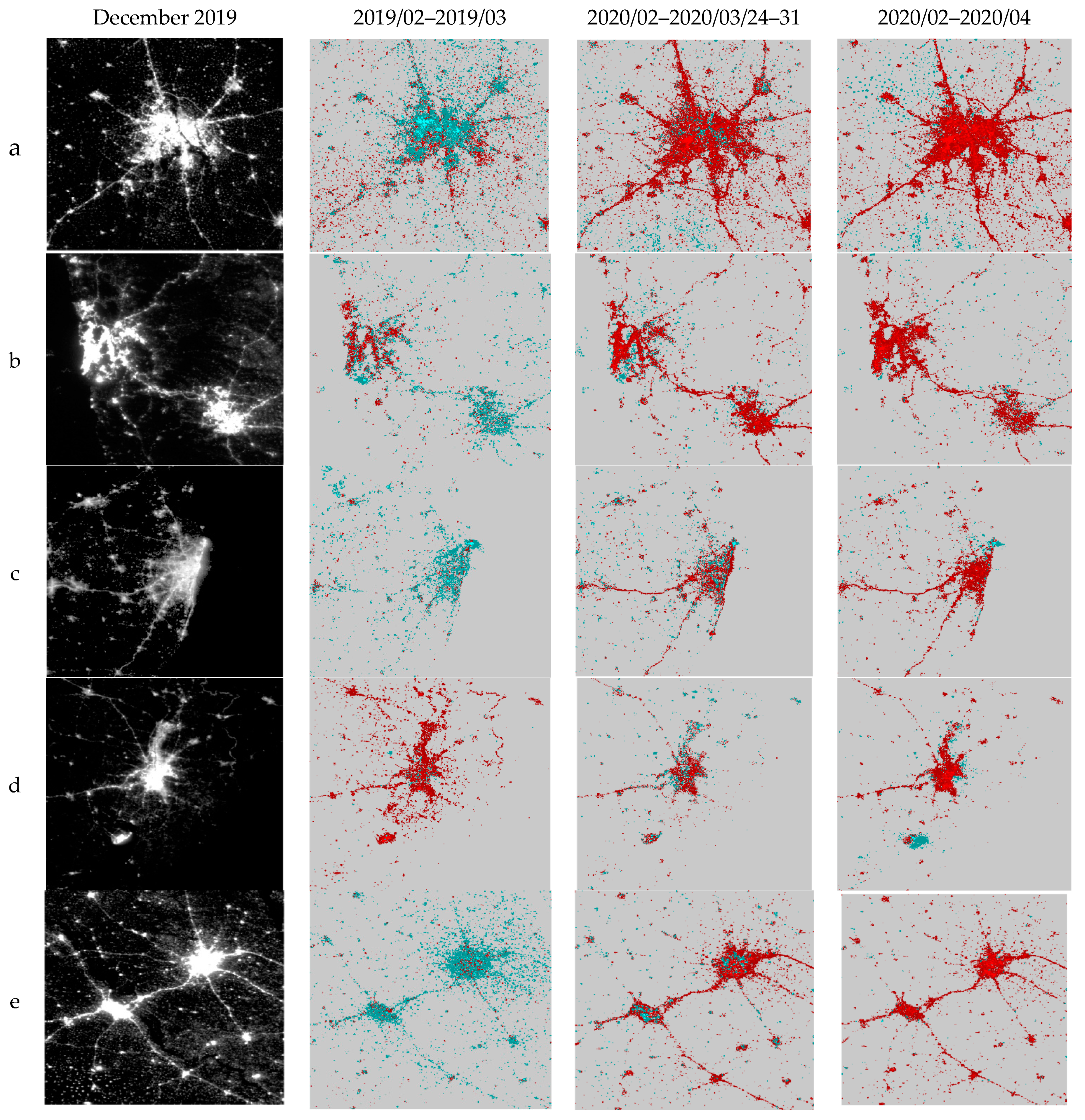
The lockdown effects due to Covid-19 is clearly visible in the difference images of February 2020 and (24–31) March 2020, and in February 2020 and April 2020 for several urban areas in India. In the difference images, the gains in brightness have been colored cyan and the declines in brightness as red. The pre-pandemic difference pair of February 2019 and March 2019 is added to further understand the effects of the pandemic. In addition, the VIIRS DNB composite image of December 2019 is shown to provide a gray-scale visual display of the original DNB composites. The eight cities included are Delhi, Mumbai, Pune, Chennai, Kolkata, Lucknow, Kanpur, and Hyderabad (Figure 4). Except for Kolkata and Mumbai, it is seen that the lights had brightened in the pre-pandemic pair for all the other cities. The effects of the lockdown that began on 24 March is shown in the dimming of the lights in the first pandemic difference pair set, and the “red” gets more widespread in the second pandemic difference pair set, which extends to the end of April. The slowdown in the movement of traffic becomes evident from the dimming of the lights along the highways extending out from the cities and connecting the satellite cities and towns. Moreover, interestingly in the case of Delhi it is seen that, as the lights dimmed in the city core, many of the towns between Gurgaon and Faridabad in the south, and in the north-west towards Haryana, became brighter in both the pandemic difference pair images. This may be due to the migrant population leaving the city and going back to their towns/villages in the outskirts. Similarly, for Kolkata it is observed that in the pandemic difference pairs, as the lights dimmed in the city, the lights became brighter in the towns towards the east and the north (Figure 4). For Pune, specks of cyan are seen to be scattered within the city core as well as on the outskirts in the second pandemic difference pair, probably indicating movement of people for work or returning to their towns or villages.
The qualitative analysis is corroborated through the quantitative analysis shown in Table 1. As seen in the images of Mumbai (city and suburban), the lights had become dimmer in the pre-pandemic times by 4% and 6%; it declined to about 18% after the lockdown in March, and to 19% in April. For Kolkata, lights had declined by 7% between February and March of 2019, and this was more than the decline after the shutdown on 24 March, when it declined by 1.5% from what it was in February 2020. However, there was almost a 15% decline in lighting in April in comparison to February 2020. For the rest of the six cities, there was a gain in lighting in the pre-pandemic period between February and March of 2019, ranging from 3% in Hyderabad to 13% in Lucknow. Nevertheless, the lockdown effect is seen in all the cities, with diminished lighting ranging from 4% in Kanpur to 19% in Hyderabad in the first difference pair, and lights diminishing further in the second difference pair ranging between 7% in Pune and 32% in Hyderabad. However, for Pune, the percentage difference in lighting became less in the second pandemic pair in comparison to the first pandemic pair. This is confirmed by what is seen in the difference image.
3.2. Percent Change Maps with Population
Three maps of the entire country were created to spatially visualize the effects of the pandemic in reducing the brightness of lights in reference to population numbers. All three maps show the outline of the second-level administrative units (that is, districts) in black. The circles are proportionate to the population numbers, and the diameter size of the circles are around the centroid of the administrative units. Five classes of population numbers are shown. The circles are color-coded and divided into five classes on the basis of changes in brightness levels. The three classes of increased brightness are shown in yellow (0–10% increase), light green (10–20% increase), and dark green (greater than 20% increase). The circles with decreased brightness are shown in orange (0 to −10% decrease) and red (greater than 10% decline). Administrative units for which lighting has been completely masked out are shown in gray.
The pre-pandemic reference map (Figure 5) shows that in the heavily populated areas in northern, west-central and southern India green and yellow circles dominate, indicating that the brightness levels had increased between February and March 2019. However, the eastern and north-eastern states, and the extreme western states showed a decline in brightness levels, even in the pre-pandemic period. In the first pandemic percentage difference map (Figure 6), red and orange circles are widespread all over India in almost all the heavily populated administrative units and also in the areas with low population. Very few specks of yellow and green are seen in this map. Interestingly, the densely populated administrative units in the eastern state of West Bengal, which were red in the pre-pandemic map, either show a 0 to –10% decline of brightness or even an increase in brightness up to 10% in the first pandemic difference map. The north-eastern administrative units, which were mostly red in the pre-pandemic map, were also yellow and green in Figure 6, showing an increase in brightness levels. The second pandemic percentage difference map (Figure 7) has predominantly red and orange circles with a few administrative units showing improvements in brightness levels.
3.3. Histograms of Percent Differences Versus Population
Figure 8 shows the population numbers in million on the Y axis and the percent difference in brightness for the reference period (2019/03 minus 2019/02) in blue and the first pandemic period (2019/03/24–31 minus 2020/02) in orange. A very distinct shift in the population numbers between the pre-pandemic period and the first phase of the pandemic period is seen. In the reference period, the majority of the population lived in the administrative units where the brightness levels increased in March 2019 in comparison to February 2019. However, in the first phase of the lockdown, which started on 24 March, a clear “shift” in the population numbers are seen in the administrative units, which became dimmer after the lockdown in comparison to the previous month of February 2020. In the pre-pandemic period about 60% of the population lived in administrative units, which became brighter in March 2019 in comparison to the previous month. However, after the lockdown on 24 March 2020, it was observed that about 87% of the population lived in administrative units where lighting dimmed after the lockdown in comparison to the previous month of February 2020. In April 2020 there was a very slight shift with about 84% of the population living in the areas where lighting dimmed in comparison to February 2020.
3.4. Correlation with Total Number of Cases
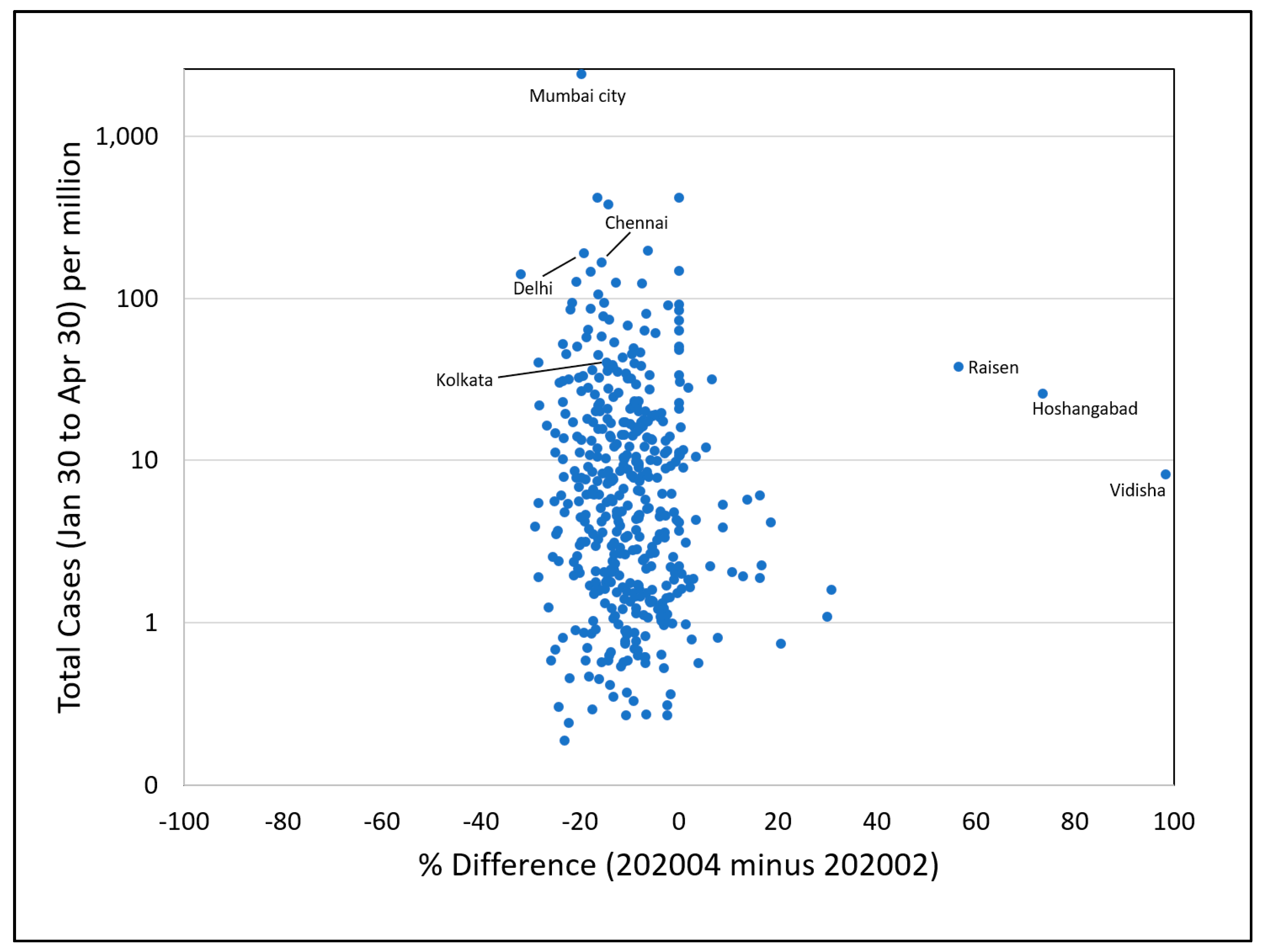
The percent change in the sum-of-lights (SOL) were correlated with the total number of COVID-19 cases per million people at the district level. The total number of cases were derived from covidindia.org [24]. The total cases were defined as the “cumulative number of all reported cases for the district or state from 30 January to that date”. The cumulative cases from 30 January to the end of March per million people were correlated with the percent difference in the SOL of the first pandemic pair, 2020/03/24 minus 2020/02 (Figure 9), and the cumulative cases per million people from 30 January to the end of April were correlated with the percent difference in the SOL of the second pandemic pair, 2020/04 minus 2020/02 (Figure 10). In both Figure 9 and Figure 10, it is seen that there is no specific correlation between dimming of lighting and the number of cases per million population. In other words, lights were dimmed in areas where there were a lower number of total cases and in areas with a high number of cases per million people.
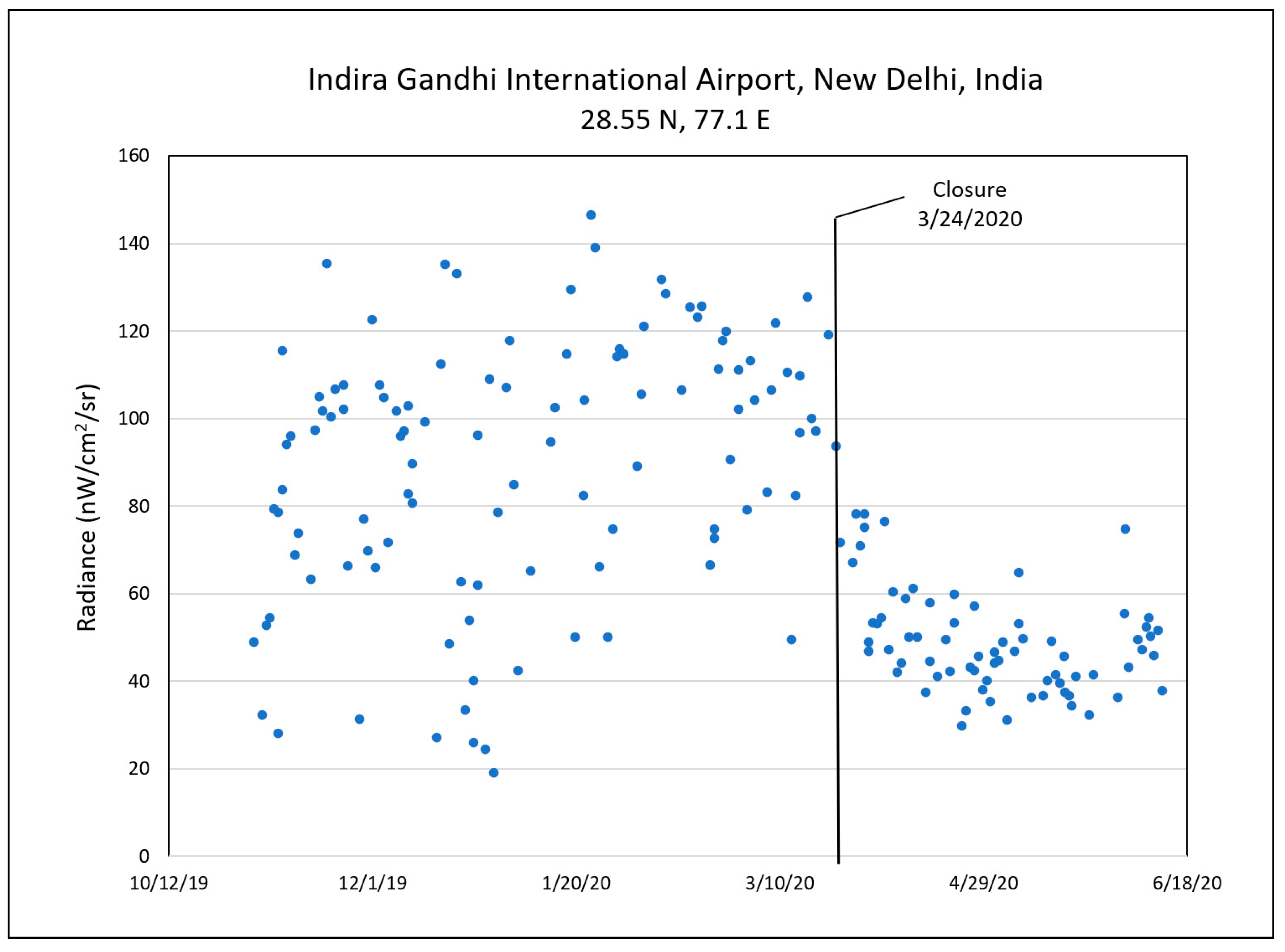
3.5. Examination of Dimming with a Nightly Temporal Profile
The nightly temporal profiles (Figure 11) captured the effects of the lockdown precisely. Some of the pixels with the sharpest decline in brightness were in and around the Indira Gandhi International airport in Delhi. It is seen in Figure 11 that the sharp decline in the radiance values coincide exactly with the first day of the lockdown on 24 March, and has been under 80 nW/cm2/sr since then.
4. Discussion
The decline in the brightness of the lights in India during the month of March after lockdown varied from 0.07 and 30.9. In the month of April, the decline went down further to 42.8. The dimming of the lights was examined in three different ways.
The first way of examining the decline in the brightness levels was by differencing the monthly radiance composite images. The monthly composite images were pre-processed to have the same number of lit pixels for all the months. Pre-processing here implies excluding the grids impacted by snow cover, low numbers of cloud-free coverages, and background areas with no real lighting.
For a pre-pandemic reference pair, the February 2019 and March 2019 images were subtracted. This difference pair shows a greater spread of cyan for most of the cities, indicating areas becoming brighter in March 2019 in comparison to February 2019, except for Mumbai and Kolkata. The difference images of Mumbai and Kolkata shows a greater spread of red, demonstrating that more areas became dimmer in March 2019, even in the pre-pandemic times.
Two pairs of pandemic pairs were compared. The 24–31 March composite and the April 2020 composites were subtracted from the February 2020 composite. The raster difference images were density sliced to augment the visual understanding of the dimming and brightness. Of all the eight cities examined, the first pandemic difference pair shows a massive visual decline in the brightness levels with an extensive spread of red in the difference composite, and the red becoming more widespread in the second difference pair, indicating that more areas became dimmer as the lockdown was extended. In the case of Delhi, it is seen that as the red became more widespread after the lockdown, there was a simultaneous increase in brightness in the surrounding town and villages, indicative of migrant workers moving out of the city core. As for Mumbai, the pandemic difference pairs depict an expanding spread of “redness” in the third difference pair in comparison to the second. For Kolkata, in the first difference pandemic pair the dimming of lights seems to have got more centralized, with areas becoming brighter in the northern extent. However, in the second difference pandemic pair, red is seen to be more widespread with specks of cyan in the satellite towns, probably suggestive of migrant workers going back to their homes in town and villages in the outskirts of the cities. For Pune, the dense cluster of “redness” in the city core has become loosened in the second pandemic pair with specks of cyan in the city core and in the outskirts.
Besides the visual evidence of dimming, a quantitative analysis was conducted by summing up the radiance values of the 667 district-level administrative units in India. Differences and percentage differences were calculated for a pre-pandemic pair (February 2019 and March 2019) and two sets of pandemic pairs (February 2020 and 24–31 March, and February 2020 and April 2020). The difference and percentage difference values between these pairs provide a quantitative corroboration of what is seen in the images. Two t-tests of unequal variances were carried out to determine whether the differences of the means between the pre-pandemic and the pandemic pairs is significant or not. The unequal variances t-test between the pre-pandemic and the first pandemic pair at the 0.05 significance level (Table 2) is associated with a significant effect t (1288) = −13.24, p = 1.35 × 10−37; the unequal variances t-test between the pre-pandemic and the second pandemic pair at the 0.05 significance level (Table 3) is associated with a significant effect t (1148) = −13.19, p = 4.18 × 10−37. Thus, both the pandemic difference pairs have a statistically significant larger mean than the pre-pandemic pair.
A third manner in which the decline of lighting can be viewed is through the nightly temporal profiles. A nightly temporal profile of a location in Indira Gandhi International airport clearly illustrates a drop in the radiance values from the exact start date of the lockdown; that is, 24 March. It did not go above 80 nW/cm2/sr through the different phases of the lockdown.
Correlation analyses were conducted between the percentage change in SOL of the two pandemic difference pairs and the total number of COVID-19 cases per million people. No relation was found between these variables as the lights were dimmed in most areas irrespective of the total number of cases per million people.
The proportion of population affected by the dimming of lights between the pre-pandemic and pandemic times were examined visually by drawing circles proportionate to the population numbers and were color-coded based on the changes in brightness levels. The pandemic difference maps show how the decrease in lighting is extensive in many of the heavily populated administrative units. This visual analysis was further validated with a histogram analysis of population numbers against the percent difference in brightness. A clear “shift” in the population numbers are seen from when the lockdown started. In other words, more people are seen in administrative units where lights became dimmer after the lockdown. This condition is reverse from the pre-pandemic times when more people are seen to be in administrative units that became brighter.
5. Conclusions
Responses to the coronavirus pandemic forced people to stay at home, either by governmental enforcement or by choice because of their own health and safety concerns. The shuttering of industries, factories, small businesses, and schools has had a significant impact on economies globally. This study considers the effects of government-enforced lockdown since 24 March in India. The visual satellite-derived images were substantiated with quantitative analyses. The proportion of the population affected by the shutdown and the subsequent changes in lighting were also shown through mapping and histograms. Additionally, the temporal nightly profile shows a distinct decline in brightness from the exact date of the initial shutdown in India.
The global nightly and monthly Day–Night Band data are valuable in studying the impact of the pandemic on the global economy. Based on the concepts developed for Chinese cities, it is shown that similar analyses can be extended to other countries and cities. However, when dealing with monthly DNB composites, the filtering of pixels with a low cloud-free coverage, those affected by snow cover, and background noise is necessary. As for the nightly profiles, the VIIRS cloud mask was used for clear observations, and to avoid the effect of reflected moonlight, and only those nights with a lunar illuminance < 0.0005 was selected.
The Indian economy was already descending the “historic stepwells” from 2016 [25]. Economists argue that the sudden declaration of a lockdown without any policies in place for the migrant population defeated the purpose. These migrant populations were forced to leave cities after losing their jobs overnight, and “scattered” in the town and villages, thus also spreading the virus. In fact, 23% of the population affected by coronavirus were in rural areas in April, but now it has risen to 54% [25]. The “scatter” of the migrant population after the shutdown is also seen in the monthly difference images of Delhi, Kolkata, and Pune, where the town and villages in the outskirts are brighter in the difference images.
Since no correlation was found between the total number of COVID-19 cases per million people and the dimming of lights, it can be said that the dimming was connected entirely to the lockdown and people staying at home. Thus, hypothetically, the lights can serve as an economic indicator of the slowing down of the economy due to the lockdown, and of economic recovery as the lockdown is slowly lifted. Again, if dimming persists in any area, it can be indicative of a prolonged economic crisis in the said area.
The economic predictions for 2020–21 for India are grim. The Economist Intelligent Unit has lowered the forecast for India’s growth from −5.8% to–8.5% [25]. The VIIRS DNB images can provide easy, timely, objective, and continuous analysis of the effect of the pandemic on the economic landscape at a granular level. Further research could be extended to the months beyond April for India, and to other cities and countries.
Supplementary Materials
The following are available online at https://www.mdpi.com/2072-4292/12/20/3289/s1, File 1: India data supplementary file.
Author Contributions
Conceptualization, C.D.E. and M.B.; Methodology, C.D.E., T.G.; Software, M.Z., F.-C.H., T.G.; Validation, T.G.; Formal Analysis, T.G., F.-C.H.; Investigation, T.G.; Data Curation, T.G.; Writing-Original Draft Preparation, T.G.; Writing-Review & Editing, T.G., C.D.E., M.B.; Visualization, T.G. All authors have read and agreed to the published version of the manuscript.
Funding
Algorithm development for production of the cloud-free DNB composites was funded under a NASA research grant. Algorithm development for the production of nightly DNB profiles is funded by the Rockefeller Foundation.
Acknowledgments
The authors sincerely appreciate the NASA/NOAA Joint Polar Satellite System (JPSS) for providing the VIIRS data used in this study.
Conflicts of Interest
The authors declare no conflict of interest.
References
- Jackson, J.K.; Weiss, M.A.; Schwarzenberg, A.B.; Nelson, R.M. Global Economic Effects of Covid-19. Available online: https://fas.org/sgp/crs/row/R46270.pdf (accessed on 28 August 2020).
- Elvidge, C.D.; Ghosh, T.; Hsu, F.C.; Zhizhin, M.; Bazilian, M. The Dimming of Lights in China during the Covid-19 Pandemic. Remote Sens. 2020, 12, 2851. [Google Scholar] [CrossRef]
- Press Information Bureau, Government of India. Available online: https://pib.gov.in/allRel.aspx (accessed on 30 August 2020).
- Chandrashekhar, V. 1.3 Billion People. A 21-Day Lockdown. Can India Curb the Coronavirus? Available online: https://www.sciencemag.org/news/2020/03/13-billion-people-21-day-lockdown-can-india-curb-coronavirus (accessed on 28 August 2020).
- Khanna, R. Punjab Researchers Assess Economic Impact of Covid-19 and Lockdown. Available online: https://www.thecitizen.in/index.php/en/NewsDetail/index/15/18991/Punjab-Researchers-Assess-Economic-Impact-of-Covid-19-and-Lockdown (accessed on 28 August 2020).
- Yiwei, H. Graphics: How COVID-19 Lockdown Hit India’s Economy. Available online: https://news.cgtn.com/news/2020-06-30/Graphics-How-COVID-19-lockdown-hit-India-s-economy-RJSmm5Laes/index.html (accessed on 30 August 2020).
- Economic Survey: “Indian Economy Slowed down Partly Because of Weak Global Growth”: CEA. Available online: https://www.hindustantimes.com/india-news/economic-survey-indian-economy-slowed-down-partly-because-of-the-weak-global-growth-cea/story-r11cXrFvohjO1DVNBj3WlK.html (accessed on 30 August 2020).
- Choudhury, S.R. Goldman Sachs Gives India’s Growth Forecast a “Gigantic Downgrade”. Available online: https://www.cnbc.com/2020/05/22/coronavirus-goldman-sachs-on-india-growth-gdp-forecast.html (accessed on 30 August 2020).
- Prakash, A.; Shukla, A.K.; Bhowmick, C. Night-Time Luminosity: Does It Brighten Understanding of Economic Activity in India? Reserve Bank of India Occasional Papers. 2019, 40. Available online: https://rbidocs.rbi.org.in/rdocs/Content/PDFs/01AR30072019EF4B60BF96E548F284D2C95EB59DD9A9.PDF (accessed on 9 October 2020).
- Ghosh, T.; Baugh, K.; Hsu, F.C.; Zhizhin, M.; Elvidge, C.D. Using VIIRS nighttime image in estimating gross state domestic product for India and its comparison with estimations from the DMSP-OLS radiance-calibrated image. In Proceedings of the 38th Asian Conference on Remote Sensing-Space Applications: Touching Human Lives, ACRS 2017, New Delhi, India, 23–27 October 2017. [Google Scholar]
- Beyer, R.C.M.; Chhabra, E.; Galdo, V.; Rama, M. Measuring Districts’ Monthly Economic Activity from Outer Space. Policy Research Working Paper No. 8523. 12 July 2018. Available online: https://papers.ssrn.com/sol3/papers.cfm?abstract_id=3238366 (accessed on 9 October 2020).
- Zhao, X.; Yu, B.; Liu, Y.; Yao, S.; Wu, J. NPP-VIIRS DNB daily data in natural disaster assessment: Evidence from selected case studies. Remote Sens. 2018, 10, 1526. [Google Scholar] [CrossRef] [Green Version]
- Zheng, Y.; Shao, G.; Tang, L.; He, Y.; Wang, X.; Wang, Y.; Wang, H. Rapid Assessment of a Typhoon Disaster Based on NPP-VIIRS DNB Daily Data: The Case of an Urban Agglomeration along Western Taiwan Straits, China. Remote Sens. 2019, 11, 1709. [Google Scholar] [CrossRef] [Green Version]
- Román, M.O.; Stokes, E.C.; Shrestha, R.; Wang, Z.; Schultz, L.; Carlo, E.A.S.; Sun, Q.; Bell, J.; Molthan, A.; Kalb, V.; et al. Satellite-based assessment of electricity restoration efforts in Puerto Rico after Hurricane Maria. PLoS ONE 2019, 14, e0218883. [Google Scholar] [CrossRef]
- Li, X.; Liu, S.; Jendryke, M.; Li, D.; Wu, C. Night-Time Light Dynamics during the Iraqi Civil War. Remote Sens. 2018, 10, 858. [Google Scholar] [CrossRef] [Green Version]
- Coscieme, L.; Sutton, P.C.; Anderson, S.; Liu, Q.; Elvidge, C.D. Dark Times: nighttime satellite imagery as a detector of regional disparity and the geography of conflict. GISci. Remote Sens. 2017, 54, 118–139. [Google Scholar] [CrossRef]
- Zhang, L.; Li, X.; Chen, F. Spatiotemporal Analysis of Venezuela’s Nighttime Light during the Socioeconomic Crisis. IEEE J. Sel. Top. Appl. Earth Obs. Remote Sens. 2020, 13, 2396–2408. [Google Scholar] [CrossRef]
- Elvidge, C.D.; Hsu, F.-C.; Baugh, K.E.; Ghosh, T. Lighting Tracks Transition in Eastern Europe. In Land-Cover and Land-Use Changes in Eastern Europe after the Collapse of the Soviet Union in 1991; Gutman, G., Radeloff, V., Eds.; Springer International Publishing: Cham, Switzerland, 2017; pp. 35–56. ISBN 9783319426389. [Google Scholar]
- Miller, S.; Straka, W.; Mills, S.; Elvidge, C.; Lee, T.; Solbrig, J.; Walther, A.; Heidinger, A.; Weiss, S. Illuminating the Capabilities of the Suomi National Polar-Orbiting Partnership (NPP) Visible Infrared Imaging Radiometer Suite (VIIRS) Day-night Band. Remote Sens. 2013, 5, 6717–6766. [Google Scholar] [CrossRef] [Green Version]
- Elvidge, C.D.; Baugh, K.; Zhizhin, M.; Hsu, F.C.; Ghosh, T. VIIRS night-time lights. Int. J. Remote Sens. 2017, 38, 5860–5879. [Google Scholar] [CrossRef]
- Grody, N.; Weng, F.; Ferraro, R. Application of AMSU for obtaining Water Vapor, Cloud Liquid Water, Precipitation, Snow Cover and Sea Ice Concentration. In Proceedings of the Tenth International TOVS Study Conference, Boulder, CO, USA, 27 January–2 February 1999; pp. 230–240. [Google Scholar]
- Oak Ridge National Laboratory; Bright, E.A.; Coleman, P.R.; Rose, A.N. Virgo GIS. Available online: https://gis.lib.virginia.edu/catalog/stanford-yj228qm2568 (accessed on 31 August 2020).
- Database of Global Administrative Areas. Available online: https://gadm.org/ (accessed on 31 August 2020).
- COVID-19 updated Cases, Statewise & Districtwise India Data & Other Latest updates on Treatments, Vaccines & Cure. Available online: https://covidindia.org/ (accessed on 28 September 2020).
- Basu, K. India’s Descent into Stepwells of Growth. Available online: https://www.livemint.com/news/india/india-s-descent-into-stepwells-of-growth/amp-11598537915733.html?__twitter_impression=true&fbclid=IwAR0op8BAYT7vmkn2cculLaanqXikkeRRcN4B00E1B2_1qP1SGiY9jc8AA2k (accessed on 31 August 2020).
Figure 1.
Cloud-free coverage mask. The “black areas” are the “off mask” areas with less than or equal to two cloud-free coverages in all five months.
Figure 1.
Cloud-free coverage mask. The “black areas” are the “off mask” areas with less than or equal to two cloud-free coverages in all five months.

Figure 2.
Low average radiance mask. The “black areas” are the “off mask” areas with average radiance values less than or equal to 0.6 in all five months.
Figure 2.
Low average radiance mask. The “black areas” are the “off mask” areas with average radiance values less than or equal to 0.6 in all five months.

Figure 3.
Snow cover mask. The “black areas” are the “off mask” areas with snow cover of greater than or equal to 3 days in all five months.
Figure 3.
Snow cover mask. The “black areas” are the “off mask” areas with snow cover of greater than or equal to 3 days in all five months.

Figure 4.
Examples of three pairs of difference images for eight Indian cities: (a) Delhi; (b) Mumbai and Pune; (c) Chennai; (d) Kolkata; (e) Lucknow and Kanpur; (f) Hyderabad.
Figure 4.
Examples of three pairs of difference images for eight Indian cities: (a) Delhi; (b) Mumbai and Pune; (c) Chennai; (d) Kolkata; (e) Lucknow and Kanpur; (f) Hyderabad.


Figure 5.
Map of percentage change in brightness for the pre-pandemic reference period (March 2019 minus February 2019). Please refer to the Supplementary Materials for the tabular data used to make these maps.
Figure 5.
Map of percentage change in brightness for the pre-pandemic reference period (March 2019 minus February 2019). Please refer to the Supplementary Materials for the tabular data used to make these maps.

Figure 6.
Map of percentage change in brightness for the first pandemic pair (24–31 March 2020 minus February 2020). Please refer to the Supplementary Materials for the tabular data used to make these maps.
Figure 6.
Map of percentage change in brightness for the first pandemic pair (24–31 March 2020 minus February 2020). Please refer to the Supplementary Materials for the tabular data used to make these maps.

Figure 7.
Map of percentage change in brightness for the second pandemic pair (April 2020 minus February 2020). Please refer to the Supplementary Materials for the tabular data used to make these maps.
Figure 7.
Map of percentage change in brightness for the second pandemic pair (April 2020 minus February 2020). Please refer to the Supplementary Materials for the tabular data used to make these maps.

Figure 8.
Population histograms for a gradation of brightening and dimming levels for the reference (blue) and the first pandemic pair (orange). Please refer to the Supplementary Materials for the tabular data used to make these maps.
Figure 8.
Population histograms for a gradation of brightening and dimming levels for the reference (blue) and the first pandemic pair (orange). Please refer to the Supplementary Materials for the tabular data used to make these maps.

Figure 9.
Percentage change in sum-of-lights (SOL) from the first pandemic pair versus total number of COVID-19 cases per million people.
Figure 9.
Percentage change in sum-of-lights (SOL) from the first pandemic pair versus total number of COVID-19 cases per million people.

Figure 10.
Percentage change in SOL from the second pandemic pair versus total number of COVID-19 cases per million people.
Figure 10.
Percentage change in SOL from the second pandemic pair versus total number of COVID-19 cases per million people.

Figure 11.
Nightly temporal profile of DNB radiances for a grid cell at Indira Gandhi International airport, New Delhi, India.
Figure 11.
Nightly temporal profile of DNB radiances for a grid cell at Indira Gandhi International airport, New Delhi, India.


Table 1.
Percent difference in brightness for pre-pandemic and pandemic monthly pairs for eight of India’s cities. Please note Mumbai City and Mumbai Suburban have been taken together to represent Mumbai in the map (Figure 4b).
Table 1.
Percent difference in brightness for pre-pandemic and pandemic monthly pairs for eight of India’s cities. Please note Mumbai City and Mumbai Suburban have been taken together to represent Mumbai in the map (Figure 4b).
| Name | Percentage Difference between March 2019 and February 2019 | Percentage Difference between 24 and 31 March 2020 and February 2020 | Percentage Difference between April 2020 and February 2020 | Population |
|---|---|---|---|---|
| Delhi | 8.33 | −13.53 | −19.16 | 18,063,518 |
| Mumbai City | −3.98 | −18.23 | −19.71 | 2,914,088 |
| Mumbai Suburban | −5.88 | −17.81 | −19.28 | 9,803,906 |
| Pune | 8.04 | −12.84 | −7.38 | 10,049,999 |
| Chennai | 4.87 | −2.67 | −15.63 | 5,439,132 |
| Kolkata | −7.15 | −1.54 | −14.56 | 4,568,384 |
| Lucknow | 12.71 | −12.34 | −19.38 | 5,002,592 |
| Kanpur | 10.91 | −4.45 | −15.42 | 4,992,403 |
| Hyderabad | 2.82 | −18.70 | −31.89 | 3,947,029 |
Table 2.
T-tests between the first set of difference pairs—pre-pandemic and the first difference pair.
Table 2.
T-tests between the first set of difference pairs—pre-pandemic and the first difference pair.
| Difference (2019/03–2019/02) | Difference (2020/03/24–2020/02) | |
|---|---|---|
| Mean | −77.54 | 342.07 |
| Variance | 273,310.22 | 396,854.60 |
| Observations | 667.00 | 667.00 |
| Hypothesized Mean Difference | 0.00 | |
| df | 1288.00 | |
| t Stat | −13.24 | |
| P (T<=t) one-tail | 0.00 | |
| t Critical one-tail | 1.65 | |
| P (T<=t) two-tail | 0.00 | |
| t Critical two-tail | 1.96 |
Table 3.
T-test between the second set of difference pairs—pre-pandemic and the second difference pair.
Table 3.
T-test between the second set of difference pairs—pre-pandemic and the second difference pair.
| Difference (2019/03–2019/02) | Difference (2020/04–2020/02) | |
|---|---|---|
| Mean | −77.54 | 410.39 |
| Variance | 273,310.22 | 639,083.50 |
| Observations | 667 | 667 |
| Hypothesized Mean Difference | 0 | |
| df | 1148 | |
| t Stat | −13.19 | |
| P (T<=t) one-tail | 2.09 × 10−37 | |
| t Critical one-tail | 1.65 | |
| P (T<=t) two-tail | 4.18 × 10−37 | |
| t Critical two-tail | 1.96 |
© 2020 by the authors. Licensee MDPI, Basel, Switzerland. This article is an open access article distributed under the terms and conditions of the Creative Commons Attribution (CC BY) license (http://creativecommons.org/licenses/by/4.0/).
Share and Cite
MDPI and ACS Style
Ghosh, T.; Elvidge, C.D.; Hsu, F.-C.; Zhizhin, M.; Bazilian, M. The Dimming of Lights in India during the COVID-19 Pandemic. Remote Sens. 2020, 12, 3289. https://doi.org/10.3390/rs12203289
AMA Style
Ghosh T, Elvidge CD, Hsu F-C, Zhizhin M, Bazilian M. The Dimming of Lights in India during the COVID-19 Pandemic. Remote Sensing. 2020; 12(20):3289. https://doi.org/10.3390/rs12203289
Chicago/Turabian StyleGhosh, Tilottama, Christopher D. Elvidge, Feng-Chi Hsu, Mikhail Zhizhin, and Morgan Bazilian. 2020. "The Dimming of Lights in India during the COVID-19 Pandemic" Remote Sensing 12, no. 20: 3289. https://doi.org/10.3390/rs12203289
Note that from the first issue of 2016, this journal uses article numbers instead of page numbers. See further details here.