Indicators of Electric Power Instability from Satellite Observed Nighttime Lights
by
 ,
,
Christopher D. Elvidge
1,* ,
,
Feng-Chi Hsu
1, 
Mikhail Zhizhin
1,2,
Tilottama Ghosh
1, 
Jay Taneja
3 and
Morgan Bazilian
4 1
Earth Observation Group, Payne Institute for Public Policy, Colorado School of Mines, Golden, CO 80401, USA
2
Department of High Performance Computing, Space Research Institute Russian Academy of Sciences, 117997 Moscow, Russia
3
Electrical and Computer Engineering, University of Massachusetts, Amherst, MA 01003, USA
4
Payne Institute for Public Policy, Colorado School of Mines, Golden, CO 80401, USA
*
Author to whom correspondence should be addressed.
Remote Sens. 2020, 12(19), 3194; https://doi.org/10.3390/rs12193194
Submission received: 30 August 2020
/
Revised: 28 September 2020
/
Accepted: 29 September 2020
/
Published: 30 September 2020
(This article belongs to the Special Issue Advances in VIIRS Data)
Abstract
:Electric power services are fundamental to prosperity and economic development. Disruptions in the electricity power service can range from minutes to days. Such events are common in many developing economies, where the power generation and delivery infrastructure is often insufficient to meet demand and operational challenges. Yet, despite the large impacts, poor data availability has meant that relatively little is known about the spatial and temporal patterns of electric power reliability. Here, we explore the expressions of electric power instability recorded in temporal profiles of satellite observed surface lighting collected by the Visible Infrared Imaging Radiometer Suite (VIIRS) low light imaging day/night band (DNB). The nightly temporal profiles span from 2012 through to mid-2020 and contain more than 3000 observations, each from a total of 16 test sites from Africa, Asia, and North America. We present our findings in terms of various novel indicators. The preprocessing steps included radiometric adjustments designed to reduce variance due to the view angle and lunar illumination differences. The residual variance after the radiometric adjustments suggests the presence of a previously unidentified source of variability in the DNB observations of surface lighting. We believe that the short dwell time of the DNB pixel collections results in the vast under-sampling of the alternating current lighting flicker cycles. We tested 12 separate indices and looked for evidence of power instability. The key characteristic of lights in cities with developing electric power services is that they are quite dim, typically 5 to 10 times dimmer for the same population level as in Organization for Economic Co-operation and Development (OECD) countries. In fact, the radiances for developing cities are just slightly above the detection limit, in the range of 1 to 10 nanowatts. The clearest indicator for power loss is the percent outage. Indicators for supply adequacy include the radiance per person and the percent of population with detectable lights. The best indicator for load-shedding is annual cycling, which was found in more than half of the grid cells in two Northern India cities. Cities with frequent upward or downward radiance spikes can have anomalously high levels of variance, skew, and kurtosis. A final observation is that, barring war or catastrophic events, the year-on-year changes in lighting are quite small. Most cities are either largely stable over time, or are gradually increasing in indices such as the mean, variance, and lift, indicating a trajectory that proceeds across multiple years.
1. Introduction
“Cities, like cats, will reveal themselves at night,” Rupert Brooke, 1915.
Ample and reliable electric power is a cornerstone for building prosperity. However, the supply of electric power remains challenging in developing countries where the total quantity of power is limited and subject to significant disruptions. The United Nations “Sustainable Energy for All” initiative estimates that 87% of the world’s population had access to electricity in 2016 [1]. However, no estimates are provided for the percent of people living with adequate and reliable electric power supplies. It is a certainty that this number will be lower than 87%, but at present there is no systemic global monitoring of electric power services [2]. Supply shortfalls and disruptions constrain economic development [3] and negatively impact education and human health [4]. The use of diesel generators during outages has its own set of economic and health impacts [5].
Many countries have placed a priority on expanding their electric power generation and distribution capacity (Figure 1) [6]. Countries such as China have been successful in dramatically expanding their electric power services (so have Vietnam and Thailand). Other countries rely on loans from the World Bank, the International Monetary Fund, the Asian Development Bank, the Chinese Development Bank, and others to fund projects to expand their electric power generation, transmission, and distribution. Still, there is no systematic and independent global monitoring of electric power services that can span spatial scales from local to national. This work helps to address that gap.
It has been known since the 1970s that meteorological low-light imaging sensors designed to image clouds at night using moonlight also detect electric lighting present on the Earth’s surface [7]. The International Energy Agency [8] estimates that 19% of global electric power consumption is used for lighting. Thus, satellite observations of surface lighting sample a portion of electric power consumption down to the local level. Since these satellites collect nightly data across many years, it is possible to consider a global monitoring system for tracking electric power services and their evolution over time.
2. Previous Studies
Currently, the best available source of global nighttime lights observations from space come the NASA/NOAA Visible Infrared Imaging Radiometer Suite (VIIRS) day/night band (DNB) [9]. The vast majority of studies conducted with VIIRS nighttime lights are based on monthly or annual cloud-free composites produced by the Earth Observation Group (EOG). These are favored by researchers for a number of reasons: the files are available in a generic geotiff format; the input data have been screened to exclude clouds, sunlight, moonlight, and stray light; the averages include a wide range of satellite zenith angles; and the annual nighttime lights are filtered to remove detections from biomass burning, aurora, and background noise [10]. The monthly composites are typically spatially truncated in either the north or south due to solar contamination during the summer months and have discernable gaps with zero cloud-free coverage in seasonally cloud-impacted regions. The solar and cloud issues are largely resolved in the annual composites, which extend from 65 south to 75 north. Using the temporal composites, researchers are relieved from the task of downloading the orbital data files, geolocation, calculating the lunar illuminance, and all the filtering steps.
Elvidge et al. [11] explored the use of monthly VIIRS cloud-free composites to identify spatial patterns of electric power disruptions in the Gangetic plains of India. By enhancing the contrast in a color image made with three months of VIIRS DNB data from a single year, a patchwork of color hues was revealed (Figure 2). The hues arise from differences in the average monthly DNB radiances, with some months being dimmer and other brighter. The patchwork nature of the hues suggests the outlines of electric power service areas.
Despite the advantages of working with temporal composites, there are several good reasons to consider using nightly data for the analysis of electric power outages and reliability. Lighting events in the nightly data can be pinpointed to a precise date and time, making it possible to combine the satellite results with disaster timelines and ground-based records. The standard monthly and annual composites exclude moonlit and cloudy data, excluding more than half of the available observations. This results in missed opportunities to observe outages. In addition, the presence of infrequent outages and brownouts can be lost in the temporal averaging process.
Standard methods for the detection of power disruptions and recovery following disaster events take a hybrid approach, using nightly data as the subject and a recent monthly or annual composite as the reference [12]. In this case, the date and time of the disaster are used to select the nightly images, and the analysis involves identifying locations where lights either disappeared or were significantly diminished in brightness. Using a cloud-free temporal composite as the reference image ensures that all areas where lighting is routinely detected are represented. This hybrid approach has been used by a number of investigators [13,14,15,16,17].
However, what about the case where the outage or brownout dates are unknown? In this case, the temporal profiles of nightly data represent an approach for identifying power disruptions without a priori knowledge of the dates. Mann et al. [18] developed a method for the detection of power outages in Maharashtra State, India, using DNB temporal profiles based on 252 nights of data from 2015. Min et al. [19] developed a “power supply irregularity index” based on the standard deviation of brightness levels observed in nightly Defense Meteorological Satellite Program (DMSP) data spanning from 1993 to 2013 for 600,000 villages in India. The nightly data were filtered to remove cloudy data and a background subtraction was applied to account for radiometric differences over time. The underlying concept of the analysis is that the standard deviation is higher for villages with an irregular supply of electricity.
3. Methods
3.1. Study Sites and Data Extraction
To investigate the remote sensing of electric power system development with DNB data, nightly temporal profiles were extracted for 16 sites in nine countries (Table 1). The sites were selected to cover a range of conditions, from supply-challenged electric power settings to well-supplied and reliable electric power systems. A total of 130,828 temporal profiles were extracted as part of our survey (Table 1). The profiles span from April 2012 through to June 2020—more than 3000 nights. The parameters extracted include the latitude and longitude of the pixel center, DNB radiance, satellite zenith angle, solar elevation, lunar illuminance [20], cloud state, and 2018 population count [21]. The data were processed to remove questionable data and adjust the radiances for variables unrelated to surface lighting. Figure 3 shows a sample of one of the grids, with points arranged on a 15 arc second grid. The key data used in this study are available at (https://eogdata.mines.edu/wwwdata/hidden/power_stability_study/).
Below is a brief description of each test site:
Rohingya Refugee Camps, Bangladesh: This was listed as the most populated refugee camp in the world in 2019 and 2020, with more than a million occupants. There were a limited number of refugees and local residents in the area at the start of the VIIRS record. According to the United Nations Refugee Agency (UNHCR), the population numbers swelled since 2017 with the arrival of more than 700,000 Rohingya [22]. We used a vector set of the camps from the UNHCR to constrain the sampling to the known refugee camps.
Pyongyang, North Korea: This is the capital and largest city of North Korea, with a population of more than 3 million. It has been reported for many years that electric power supplies are limited in Pyongyang and that there are frequent outages [23]. The grid covers the entire city center and much of the surrounding rural areas with limited development.
Harare, Zimbabwe: This is the capital and largest city of Zimbabwe, with a population of more than 1.6 million. Due to economic collapse, the electric power generation and delivery capacity is limited and subject to frequent outages [24]. The grid covers the entire city and portions of the surrounding rural and partially developed areas.
Dhaka, Bangladesh: The capital and largest city in Bangladesh, with a population of more than 16 million residents. Both the World Bank and the Asian Development Bank have invested in expanding the electric power generation, transmission, and distribution in Bangladesh. Despite these investments, there are still reports of power disruptions in Dhaka [25]. The grid covers the city center and portions of the surrounding rural areas.
Sana’a, Yemen: This is the capital of Yemen, with a population of nearly 4 million. Yemen has been a conflict zone for many years, and Sana’a was subjected to aerial bombing in mid-2015 [26], extinguishing the lights for more than two years. The grid covers the city center and portions of the surrounding rural areas.
Mari’b, Yemen: This is an ancient city with a population of about 100,000. It was also subjected to aerial bombing in March 2015, which extinguished the lights. Unlike Sana’a, the lighting recovered and new commercial developments appeared when it became clear that Mari’b was outside the primary conflict zone. The grid covers the entire urban area and portions of the surrounding rural areas.
Chapakri, Bihar, India: This is a small town with surrounding rural areas. The total population is near 16,000. The town shows evidence of electrification, with no detectable lighting early in the VIIRS record.
Gaya, Bihar, India: Gaya is a holy city beside the Falgu River, in the northeast Indian state of Bihar. The population is nearly half a million. The DNB temporal profiles of Gaya exhibit annual cycling linked to load-shedding [27] during the hottest months of the year. The grid covers the main part of the city and portions of the surrounding rural areas.
Dehli, India: This is the capital city of India, with a population of over 11 million. Our grid runs north–south over the west side of Delhi, including the airport. Many of the DNB profiles exhibit annual cycling, associated with load-shedding.
Beijing, China: While China is rated as a developing country, its first-tier cities have ample electric power supplies and no substantial record of disruptions. The DNB profile grid covers the city and extends into the rural and less densely developed areas.
Shanghai, China: This is one of China’s four first-tier cities, with ample electric power supplies and minimal service disruptions. Shanghai is widely rated as the financial and commercial center of Asia, with a population of nearly 24 million. The grid covers the central area of Shanghai, without the sparser suburban and rural areas.
Wuhan, China: This city was in the news in 2020 as the possible origin of the COVID-19 pandemic. Wuhan is a tier two city which has received major infrastructure investment during the past few decades. The DNB profile grid covers the entire city and extends into the rural and low-density development areas at the edges of the city center.
Seoul, South Korea: This is the capital city of Korea and has ample supplies of electric power and no substantial record of power disruptions. The DNB profile grid covers the city center and does not extend to the rural and more sparsely developed areas surrounding Seoul.
Houston, Texas, USA: This is the 4th largest city in the USA, with a population of 2.3 million. The grid covers all of Houston, many suburbs, and sparsely developed rural areas.
Santa Rosa, California, USA: This is a small city north of the San Francisco Bay Area with a population of 176,000 people. The area has ample electricity and no substantial record of power disruptions.
3.2. Data Preprocessing
In order to focus the analysis on the radiances from surface lighting, the first preprocessing steps is to filter out cloudy pixels (Figure 4) using the VIIRS cloud mask [28]. Moonlit clouds are not particularly bright in the VIIRS nighttime data. For areas with dim lighting, clouds can be brighter than the clear sky surface lighting. However, in many urban areas the surface lighting is brighter than the moonlit clouds, resulting a dimming of radiances when clouds cover the surface lighting, moonlit or not. That is the case for the Shanghai location shown in Figure 4.
Following the filtering to remove cloudy pixels, three styles of radiance adjustments are applied. The first of these is a 0.125 nW upward adjustment in the radiances collected prior to 12 January 2017. That is the date that the dark offset term used in converting the raw counts to radiance was switched from a dark ocean view to a space view, resulting in a slight upward radiance shift [29,30,31]. The shift is particularly noticeable for profiles with radiances in the single digits and is most prominent in areas that lack detectable surface lighting. Figure 5 shows an example of the earth view to space view adjustment.
The next preprocessing step is to divide the profile into segments based on the major break points in the average radiance. This is not necessary in most cases unless there has been a major event impacting surface lighting, such as a prolonged outage or a substantial expansion in the brightness of lighting. For example, the DNB profile in Figure 4 was not divided into segments. An example of segmentation is shown in Figure 6. Once the segments are defined, the collection of data points within individual segments are further processed.
The second radiometric adjustment is to normalize the profile radiances for angular differences in brightness levels. The DNB has a 3000 km swath width, with satellite zenith angles extending out 70 degrees from each side of nadir. There can be substantial differences in the brightness of surface lighting as a function of the satellite zenith angle (satz). We developed a satz radiance normalization, which is designed to compensate for several phenomena, including the effects of variable building heights, the manner in which outdoor lights are shielded or pointed, and atmospheric path length differences. The adjustment is made to match the radiance pattern at the nadir. Four primary types of satellite zenith angle effects were identified: flat, concave, convex, and peak at nadir (Figure 7). Note that, for any location on the ground, there are a limited number of allowable satellite zenith angles, thus forming columns on the satz versus the radiance profiles. This is due to the nightly precession of the orbital tracks, with a 16-day repeat cycle, combined with the partial swath overlap along the outer edges. Low-lying buildings typically have a flat satz profile. Where the building heights are higher, all four satz profile types are possible. The peak at nadir type is typically associated with skyscrapers or sites where the sides of buildings are illuminated with high-powered directional lighting from their bases. The adjustment for the satz effects is designed to eliminate the false detection of dimming or brightening in DNB temporal profiles that are in fact satz effects rather than actual changes in lighting. The adjust involves the multiplication of the observed radiance by a coefficient that is specific to each satz column. The coefficient is calculated with the median of the satz column closest to nadir divided by the column median. The adjustment is negligible for locations have flat satz profiles. For the others (concave, convex, peak at nadir), the adjustment reduces the variance (Figure 8).
The third type of radiometric adjustment included in preprocessing is the subtraction of the lunar reflectance component of the observed radiance. The VIIRS DNB detection limits are specifically designed to observe the brightness of moonlight reflected from clouds for use in weather prediction and meteorological analyses. Thus, there are large numbers of pixels where the DNB radiance is cloud impacted, either by the obscuration of the surface lighting or the introduction of radiance from reflected moonlight. Our approach is model the lunar contribution to a pixel’s radiance based on the historical record of cloud-free observations. When examining scattergrams of the observed radiance versus lunar illuminance (LI) for pixels containing dim lighting, there is typically a widening wedge evident in the lowest radiance levels as the LI increases (Figure 9). This angular wedge is evidence of an additive model for radiance emitted from electric lighting plus a reflected moonlight component:
DNB_observed = DNB_emitted + Scaling_factor * LI.
The problem in the LI correction is finding an optimal scaling factor. Then, the correction formula will be simply:
DNB_corrected = DNB_observed − Scaling_factor * LI.
The scaling factor is calculated as a partial regression slope, with the assumption that there is no correlation between the DNB_corrected and LI when the LI > 0.001 lux.
Scaling_factor = std(DNB_observed)/std(LI) * corrcoef(DNB_observed, LI).
The indications that a suitable scaling factor has been selected include: (1) The loss of the angular wedge at the resulting scatterplot LI vs. the corrected DNB radiances (Figure 9). (2) The loss of correlation between the LI and the corrected DNB radiances. (3) Reduced variance in the DNB radiances, especially for the background grid cells.
3.3. Overview of the Difference between Limited and Abundant Electric Power Supplies
To obtain an overview of the differences between the temporal profiles from sites with limited power supply and frequent disruptions and sites with abundant supply and a high reliability, we randomly selected two grid cells—one from Harare and one from Houston. The only criterion added to the selection was that they should both have populations of near 2000. The two temporal profiles are different enough from each other that they can be displayed on top of each other (Figure 10) with no apparent obscuration. The Houston profile is about eight times brighter than the one from Harare, has a wide dispersion, and has more outliers (Figure 11). Both were largely steady over the eight-year period.
3.4. Index Calculations
The following indices were developed and then applied to each grid cell in the 16 test sites. The long-term trends and annual cycling indices were calculated for the entire profile (2012–2020). Other indices were calculated based on the annual increments.
Statistical moments of the profiles: The profile segments were analyzed with the “fitdistrplus” package [32] to derive four moments: mean, variance, skew, and kurtosis. Example results are shown in Figure 11.
Slope of the cumulative distribution function: The slope of the central portion (from 0.4 to 0.5) of the cumulative distribution function was calculated as an index of the “spikiness” of the histogram. Example results are shown in Figure 11.
Annual cycling: In some areas, there are annual cycles in the brightness of the lights, with some months consistently brighter and others dimmer. Each profile segment is tested for annual cycling by running an autocorrelation test [33,34], which reports the autocorrelation coefficients as a function of lag in terms of days. Annual cycling is indicated when the primary autocorrelation peaks fall near 365 days. An example of annual cycling is shown in Figure 12.
Annual Lighting Deficit (%): This index is designed to quantify the intra-annual variability in the profile. The Annual Lighting Deficit (ALD) calculation is made with the monthly mean radiances. The brightest month in the year is taken as the reference. The ALD is calculated with the following formula:
where M is the monthly mean series and i is the month sequence. n is the number of monthly means included in the series; only months with more than three clear observations are included in M, and only ALDs with n > 6 are considered valid and reported. ALD describes the intra-annual variability in the brightness of the observed lighting. When calculating monthly means, nights with a brightness higher than usual are excluded using the K Nearest Neighbor algorithm. Such nights are often caused by festivals and can cause an unrealistic estimation of the maximum monthly mean. An example is shown in Figure 13.
Percent outages: Outages are indicated by clear sky observations in profiles where lighting was detected previously but that fall below the detection limit. If the outage is for 1–3 nights in a row, it can be labeled as sporadic. In some cases, outages can continue for an extended period of time—for example, in Figure 6 from Sana’a, Yemen. Observations falling below the detection limit are labeled and sorted into sporadic versus prolonged types. The duration of prolonged outages is calculated from the start and end dates of the outage. The duration tally should skip over brief upticks in radiance associated with festivals such at Diwali and Ramadan. The monthly and annual outage rates are calculated as the number of detected outages divided by the total number of dark night clear sky observations. Figure 14 shows the monthly power outage rates for a location in Sana’a, Yemen.
Long-term trends: Trends refer to long-term changes in the brightness of lighting. Trends can be stable, gradually moving up, or may have some type of step function midway through the temporal profile. The trends are derived by analyzing the monthly means with a 1st order polynomial. An example of an upward trend is shown in Figure 15.
Lift index: One of the features of urban lighting that the authors were unaware of prior to this study is “lift”. This is defined as the radiance gap between the detection limit (1 nW/cm2/sr) and the lower edge of the data cloud. Our concept in developing the lift index is that the DNB profiles from the developing test sites have little or no lift, while lift is pronounced and widespread in the developed test sites. Figure 16 shows the advent of lift in a grid cell from Mari’b, Yemen. The early record shows no lift in the first five years. Lift begins to develop during the second half of 2017, tracking the expansion of lighting. The lift index is calculated based on annual increments using a K-Nearest Neighbor (KNN) algorithm [35].
3.5. Data Analysis:
To understand the radiant emission differences between developing and developed electric power systems, we calculated the classification accuracies [38] for two grid cell subsets, each with 5000 randomly selected samples. The developed (upper) test set is drawn from the Houston, Seoul, Beijing, and Shanghai study sites. The developing (lower) set is drawn from Harare, Nairobi, Dhaka, and Pyongyang. The testing uses half the samples for training and the other half for calculating classification accuracies. This analysis allows us to quantify the difference in variables between different stages of development, and can be used to determine whether a location is closer to the developing or developed side, given its DNB radiance profile.
Two types of classification methodology were adopted—i.e., single variable classification and variable plus population classification. The single variable classification uses a KNN classifier. Each variable is tested with K from 0 to 30, and the K with the highest accuracy is selected as the final result [39]. For the dual variable classification with population, the Support Vector Machine (SVM) classifier with radial-based function (RBF) is adopted [40]. Accuracies are calculated for the standalone indices and the indices paired with the Landscan population count. For the indices calculated based on the annual increments, we examined the pattern of changes from 2013 to 2019 using column-based charts.
4. Results
The classification accuracies for the solo indices and indices paired with population are shown in Table 2.
Mean: Lighting in the developed cities tends to be substantially brighter than in the developing cities (Figure 17 and Figure 18). There is some overlap at the low radiance end (Figure 17), less than 20 nW, which is the source of classification error. The classification accuracy for the mean is 74%. Adding in population (lighting per person), the classification accuracy increases 11%, climbing to 85% (Table 2). Looking at the mean radiance per person from 2012 through to 2020 (Figure 19) it can be seen that the USA cities have the highest lighting per person and the Rohingya Camps and Pyongyang have the lowest. Dhaka, Delhi, Shanghai, and Seoul have been stable. Harare shows a slight decline. Sana’a shows major decline starting in 2014 and a slow recovery in recent years. Nairobi, Marib, Charpraki, Gaya, Beijing, and Wuhan show increases in lighting per person over time, an indication of growth.
Variance: Variance largely tracks the mean radiance. That is to say, in general, the brighter the lights the higher the variance (Figure 20 and Figure 21). The classification accuracy for variance is 68%. Adding in population (lighting per person), the classification accuracy increases 16%, climbing to an 84% accuracy (Table 2). Looking at the mean variance from 2012 through to 2020 (Figure 21), it can be seen that the brightest cities have the highest variance and the Rohingya Camps, Harare, Pyongyang, and Charpakri have lower ones. Sana’a’s variance dropped following the aerial bombing. Delhi’s variance has been declining.
Skew: The two classes, developing and developed, are highly overlapped in skew (Figure 22). The developed set has more grid cells with negative skew and the developing class has more gird cells with a skew above two. The classification accuracy of the skew is 62%. Combined with population, the classification accuracy increases to 77% (Table 2). Looking at the mean skew from 2012 through to 2020 (Figure 23), it can be seen that Shanghai is the only test site with an overall negative skew. Pyongyang’s skew is anomalously high when compared to Harare’s (Figure 24). The skew has been declining in Nairobi, Wuhan, and Beijing. The skew has been increasing in Santa Rosa and the skew increased in Sana’a following the aerial bombing. The most substantial drop in skew over time comes from the Rohingya Camps.
Kurtosis: The two classes are largely overlapped in kurtosis (Figure 25). The only major difference is that the developing class has more high kurtosis grid cells in the range of 3 to 20. The classification accuracy for kurtosis is 62% and reaches 75% when combined with population. Figure 26 shows the mean kurtosis for each of the test sites by year. Pyongyang has anomalously high kurtosis (Figure 27) and has been rising in recent years. Kurtosis has increased slightly over time in Harare and stepped up in the past five years for Santa Rosa. Kurtosis has dropped the past two years in Gaya. The most substantial drop in kurtosis over time comes from the Rohingya Camps.
Slope of the Cumulative Distribution Function (CDF): The CDF slope index is designed to measure the “spikiness” of the histogram. The tighter the data cloud is around the mean, the steeper the CDF slope will be in the center of the CDF. The developed class has larger numbers of grid cells with CDF slopes of above two (Figure 28). The CDF slope classification accuracy is 53% and rises to 71% when paired with population. Figure 29 shows the mean CDF slope for each site by year. Nearly all the test sites exhibit a gradual increase in the CDF slope over time. The exception is Houston, which has been static. There is a slight decline in the CDF slope in 2020 for Harare.
Lift: The lift index measures the radiance gap between the bottom of the data cloud and the detection limit (1 nW). As with variance, the lift index largely tracks the mean. The histogram chart for the two classes clearly show that the developing sites have low levels of lift when compared with the developed sites (Figure 30). There is overlap between the two classes in the range of 0 to 20 nW of lift. The grid cells with over 20 nW of lift are nearly all from the developed sites. The classification accuracy of the lift is 70%. Adding in population, the classification accuracy increases 16%, climbing to an 86% accuracy (Table 2). Figure 31 shows the mean lift for each site by year. The highest lift, in descending order, comes from Shanghai, Seoul, Houston, Dehli, and Beijing. The largest decline in lift occurs in Sana’a, due to the aerial bombing. Lift has been steadily increasing in many of the sites, including Nairobi, Sana’a, and Mari’b in recent years, and Gaya, Wuhan, and Beijing. Lift has decreased in Harare and Santa Rosa.
Annual Lighting Deficit (ALD): This index is designed to measure the intra-annual variability in the brightness of lights. The histogram chart (Figure 32) shows that the developing sites tend to have a lower ALD than the developed sites. The classification accuracy for ALD is 56%. Adding in population, the classification accuracy increases to 71% accuracy (Table 2). Looking at the mean ALD for all the test sites from 2012 through to 2020 (Figure 33), it can be seen that most of the cities have an ALD in the range of −12 to −20%. The exception are the Rohingya Camps, Pyongyang, Sana’s, Mari’b, Charpakri, and Gaya.
Autocorrelation primary cycle lag: Multiple years of observations are required to perform the autocorrelation analysis to derive the primary cycle lag, which comes out in days. Grid cells with primary autocorrelation peaks with lags near 365 days are labeled as having an annual cycle. Figure 34 shows a histogram of the lag days found for the primary cycle found from the autocorrelation analysis. A large number of grid cells have a primary cycle lag, indicative of a lunar cycle, of nearly 29 days. This is followed by a series of harmonics, multiples of the single lunar cycle of 29 days. Another large cohort of annual cycling grid cells are found near a lag of 365 days. Figure 35 shows the percent of grid cells in each site exhibiting annual cycling. Gaya and Delhi have the highest prevalence of annual cycling, with 67% and 57%, respectively. Other sites with significant numbers of grid cells exhibiting annual cycling include Shanghai, Seoul, Pyongyang, and Dhaka. The classification accuracy for the autocorrelation primary cycle is 69%. Adding in population, the classification accuracy increases 4%, climbing to a 73% accuracy (Table 2).
Long-Term Trend (LTT): Overall, the developed sites have lower long-term trend slopes than the developing sample set (Figure 36). Figure 37 shows that many of the study sites have near zero long-term trend slopes, including the Rohingya Camps, Pyongyang, Delhi, and Santa Rosa. Two sites had negative LTT slopes: Harare and Sana’a. In Sana’a, this is due to the slow recovery process following the aerial bombing. In Harare, the negative slope appears to be an indicator of supply reductions. Other sites have positive slopes, with Nairobi and Wuhan having the largest slopes—an indicator of power supply growth.
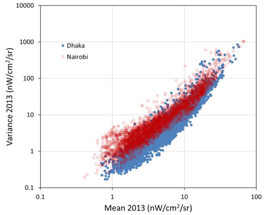
Index of dispersion: This index is calculated by dividing the variance by the mean. The theory is that if the brightness of the lighting is fluctuating due to instability in the power supply, the dispersion will be anomalously high. Figure 38 shows a histogram and scattergram of the dispersion. The overall pattern is that the dispersion is tracking the mean. That is to say, as the mean increases, the variance increases even more, and the dispersion level rises. The classification accuracy for dispersion is 58%. Adding in population (lighting per person), the classification accuracy climbs to a 75% accuracy (Table 2). Looking at the mean dispersion radiance from 2012 through to 2020 (Figure 39), it can be seen that the brightest cities have a higher dispersion. There is a dispersion spike for Sana’a, corresponding with the year where lighting was extinguished by aerial bombing; part of the year was bright and the other part of the year was near the 1 nW detection limit. We found that it is possible to identify lighting fluctuations that are likely related to variable voltage in power supplies by using a comparable city as a reference. Figure 40 shows the variance versus mean for grid cells in Nairobi and Dhaka for 2013. The two cities are nearly matched in terms of the range of mean radiances. However, Nairobi has a higher variance. We believe that this is caused by Nairobi having wider voltage fluctuations than Dhaka.
Percent outage: This annual index is calculated by dividing the number of cloud-free observations with radiances dropping to 1 nW or lower by the total number of cloud-free observations. Most of the study sites had either zero outages or small percentages, under 2–3% (Figure 41). The exceptions are the Rohingya Camps and Sana’a. In the Rohingya camps, the percent of outages has been declining, indicating the electric power supply is increasing and becoming steadier. In Sana’a, the city started out with relatively low percent outage levels and then the levels jumped to quite high numbers following the aerial bombing. Mari’b shows a minor uptick in outages the year of the aerial bombing, followed by a step down in the outage rates in the subsequent years. Santa Rosa shows an increase in outage rates in the first several years, followed by steady outage rates in the range of 1.5% to 1.8%.
Percent of population in the dark: This annual index is calculated by dividing the population count in areas lacking light detection by the total population covered by the data grid. The Rohingya Camps started out at 100% and dropped steadily in the past three years from 50% to 30% (Figure 42). Sana’a had moderately high population numbers with not lighting in the range of 15% for the first three years. In 2016, the level jumped to 75% due to the aerial bombing. The levels have declined in the past three years, ending at 38%. In contrast, Mari’b started out with high percentages of population without lighting, in the range of 55–65% prior to the aerial bombing. The spatial extent of lighting has been increasing in Mari’b, with the population numbers lacking lighting dropping from 39% to 15% in the past four years. Electrification is also evident in Charpakri, which started out with 100% of the population lacking lighting. This has declined to the 25–30% range. Cities with declining rates of population in the dark include Gaya, Wuhan, Beijing, and Houston, all indicating an expansion of the spatial extent of lighting. During the entire time period, Santa Rosa has had a steady 20% of the population living in areas that lack lighting detection.
5. Discussion
The VIIRS collects global DNB low-light imaging data every night, with a time series extending back to April 2012. The DNB’s primary mission is cloud imaging at night based on reflected moonlight. With a million-to-one light intensification, the cloud imaging is possible for more than half of each lunar cycle. In this study, we assembled and analyzed more than 130,000 temporal profiles spanning more than 3000 nights each. The first step in preparing a profile for analysis is to filter out the cloud-impacted pixels using the VIIRS cloud mask. A review of the cloud-free temporal profiles indicated that there is substantial variance in the observed radiances. We sought to reduce the variance by applying three types of radiance adjustments. The first is a minor adjustment associated with a change in the source for dark current adjustment. The second is a normalization for view angle effects. The third adjustment is the subtraction of the lunar reflectance component present in the observed radiances.
The view angle effects arise from the wide range of satellite zenith angles collected by the VIIRS, ranging from -70 to 70 (Figure 43). This is the angle from a ground location to the satellite and varies systematically from day to day due to the precession of the orbital track. An examination of the radiance distribution as a function of the satellite zenith angles found four types of distributions, including flat, convex, concave, and peak at nadir. These types are the results of the angular differences in the skyward emission of electric lighting due to factors such as the type of shielding present on outdoor lighting, the illumination of building exteriors from below, and the obstruction of lighting by multistory building. We developed a method to characterize these angular effects at the grid cell level and normalize the profile radiances to the nadir condition. The purpose of this nadir normalization is to reduce view angle effects on the analysis of electric power conditions.
A method has been developed to estimate and then subtract reflected moonlight, adjusting the radiance back to the dark night level. This has the favorable effect of increasing the sample size by about 40% as compared to filtering out the moonlit observations. The method uses modeled lunar illuminance (LI with units of lux) to define and then subtract the reflected moonlight component from the observed radiance. The lunar illuminance model accounts for the location of the grid cell on the earth’s surface, lunar elevation, azimuth angles, and lunar phase. The analysis is made with the cloud-free observations from the full record and does not include the use of an externally derived albedo product. It is likely that this approach will produce irregular results in areas where the surface albedo is not stable, such as areas with a variable snow cover.
We found that the radiometric adjustments reduce the variance present in the DNB temporal profiles. In the example shown in Figure 44, the satz normalization brought the variance from 95.7 to 37.4. The LI correction contributes much less to lowering the variance, dropping it to 33.5. The earth view–space view adjustment had no effect on the variance. However, even with these radiometric adjustments applied, the variance remains high. If the surface lighting is stable, why would there be such high levels of variance? This indicates that some other factor is introducing a vast amount of variance to the satellite observation of surface lighting. To investigate the cause for this variance, we calculated the dwell time for the individual DNB pixels. According to the NOAA Geolocation Algorithm Theoretical Basis Document [41] Table 3.3–6—DNB Aggregation for NPP (Nadir to End-of-Scan)—the DNB dwell time ranges from 2.53 × 10⁻⁴ at the nadir to 4.22 × 10⁻⁵ at the edge of the scan. How does this compare with the voltage cycle present in the widely used alternating current systems? The world is roughly evenly divided into 50 and 60 Hz electric power services. Since Hz is the cycles per second, the frame rate of the flicker present in AC lighting ranges from 0.017 to 0.02 frames per second. Since the dwell time for the DNB pixels is substantially shorter that the AC frame rate, we conclude that a large part of the residual variance present after the satz and lunar illuminance radiometric adjustments arises from the temporal under-sampling of the flickering of lights powered by alternating current electricity.
6. Conclusions
Most studies conducted with VIIRS nighttime lights make use of the EOG’s monthly and annual summary grids, reporting the mean radiance levels. These have an advantage over nightly products in that data gaps from clouds are filled in and the averaging process stabilizes the brightness level by including large numbers of samples from varying flicker states. The annual and monthly DNB products are convenient because they are readily available; compact; and relieve the researcher from having to ingest, filter, and compose vast quantities of raw data. However, some information related to electric power reliability is lost due to filtering and averaging. The monthly and annual products are filtered to remove sunlight, moonlight, and cloudy data and distilled down to a single average radiance per grid cell. This makes it impossible to distinguish between sporadic outages and brownouts versus general declines in brightness levels. There are other advantages to working with the full-resolution temporal profiles, including an ability to record precise dates for outages, the onset of lighting recovery or expansion in lighting, and normalization for satellite zenith angle effects. The other advantage of working with the full temporal resolution DNB profiles is the option to work with a broader range of indices, beyond just the mean. In this paper, we explored the value of 12 indices: mean, variance, skew, kurtosis, lift, CDF slope, % ALD, % outage, dispersion, annual cycling, long term trend, and % population in the dark. The annual index values for each grid cell from all the test sites are available at: https://eogdata.mines.edu/wwwdata/hidden/power_stability_study/.
The largest difference in the satellite-observed nighttime lights between developed and developing electric power services is the brightness. Cities with ample electric power supplies are substantially brighter than comparably populated cities with limited power supplies. This is expressed in the DNB profiles as higher values in several of the tested indices, including the mean, variance, and lift. Perhaps the best indicator of power supply adequacy is the lighting per person index, which is quite high in the USA and quite low in the developing cities tested.
Our results indicate that several cities are becoming slightly brighter year by year. This includes Nairobi (with the exception of 2020), Mari’b from 2015 onward, Gaya from 2017 onward, Wuhan, and Beijing. The largest dimming event found is the loss in lighting from 2014 to 2015 as the result of aerial bombing. Other sits exhibiting declines in brightness include Harare, Delhi (2105 forward), and Santa Rosa. The decline in the brightness of lights in Harare is likely due to the overall decline in electric power services during the current economic crisis. Cities with an overall static brightness include Pyongyang, Dhaka, and Houston.
The most clear-cut indicator of power supply instability is the percent of outage. Outages are indicated when the radiance drops to the detection limit, which we take to be 1 nW. In Sana’a, the % outage increased dramatically in 2015, hit 40% in 2016, and has gradually declined to 15% in 2020. The Rohingya Camps started out with high levels of outage and have declined substantially over the past four years, reaching 15% in 2020.
We looked for evidence that limited and highly variable power supplies affect one or more of the indices. We understand that the expression of limited power supplies is a dimly lit city, which shows up in the mean, variance, and lift indices. Voltage drops could show up as outages; however, few of the developing cities tested have frequent outages, such as Sana’a. Voltage spikes could result in brighter lights, contributing to the profile’s variance, skew, or kurtosis. We found two cities with an anomalously high variance: Nairobi and pre-2015 Sana’a. The variance anomalies are best seen in comparison to reference cities with comparable mean radiances. The high variance levels in Nairobi and Sana’a can be seen graphically in the mean versus variance scattergrams, where Dhaka is used as a reference. Pyongyang has an anomalously high skew and kurtosis, which can be seen graphically in scattergrams with Harare as a reference.
The final indicator we found for reliability problems in electric power supplies is annual cycling, which was anomalously high in Gaya and Delhi. The lights are brightest from October through to March every year and dip during the hot summer months. This matches the description given for load-shedding, a widespread practice in part of India, where power supplies are oversubscribed during the hot summer months.
One of the interesting findings of this study is that most cities are either largely stable over time or are gradually increasing in indices such as the mean, variance, and lift. There are exceptions, such as Harare, where a long-standing economic crisis has resulted in a gradual decline in brightness and other indices. This suggests that many cities have an established trajectory for the evolution of their lighting. The lighting in many developing cities, such as Nairobi, Mari’b, Dhaka, and Beijing, is following an upward trajectory, becoming more like the lighting of cities such as Houston, which has been largely stable in its mean radiance and other indices over the past nine years. These are signs of technologic progress and economic expansion. There are good energy conservation and environmental reasons to constrain and even reduce lighting at night [42]. In addition to the assessment of power supply growth and stability, it is possible to use the VIIRS data to detect and track declines in lighting that may be the result of efforts to preserve the night sky though improved shielding, narrowing the application of lighting to where human activities are concentrated, and motion detection control on outdoor lighting. An example of this may be Santa Rosa, California, where the brightness per person is high, but the overall brightness of lighting is in gradual decline.
Author Contributions
Conceptualization, J.T. M.B. and C.D.E.; database design and implementation methodology, F.-C.H.; index calculation algorithm software, M.Z.; validation, X.X., Y.Y. and Z.Z.; extraction and analysis of temporal profiles, F.-C.H.; preparation of figures by F.-C.H. and C.D.E.; writing—original draft preparation, C.D.E.; writing—review and editing, T.G., J.T., and M.B. All authors have read and agreed to the published version of the manuscript.
Funding
This research was funded by the Rockefeller Foundation, grant number 2018 POW 004.
Conflicts of Interest
The authors declare no conflict of interest.
References
- World Bank, Sustainable Energy for All. Available online: https://data.worldbank.org/indicator/eg.elc.accs.zs (accessed on 20 February 2019).
- John, A.; Morgan, B.; Jacob, K.; Todd, M. Measuring “Reasonably Reliable” access to electricity services. Electr. J. 2020, 33, 7. [Google Scholar]
- Andersen, T.B.; Dalgaard, C.J. Power outages and economic growth in Africa. Energy Econ. 2013, 38, 19–23. [Google Scholar] [CrossRef] [Green Version]
- Klinger, C.; Owen Landeg, V.M. Power outages, extreme events and health: A systematic review of the literature from 2011–2012. PLoS Curr. 2014, 6. [Google Scholar] [CrossRef] [PubMed]
- Farquharson, D.; Paulina, J.; Constantine, S. Sustainability implications of electricity outages in sub-Saharan Africa. Nat. Sustain. 2018, 1, 589–597. [Google Scholar] [CrossRef]
- IEA. Global Energy Review; IEA: Paris, France, 2020; Available online: https://www.iea.org/reports/global-energy-review-2020 (accessed on 15 August 2020).
- Croft, T.A. Nighttime images of the earth from space. Sci. Am. 1978, 239, 86–101. [Google Scholar] [CrossRef]
- IEA. Light’s Labour’s Lost: Policies for Energy-Efficient Lighting, Energy Efficiency Policy Profiles; OECD Publishing: Paris, France, 2006. [Google Scholar]
- Miller, S.D.; Straka, W., III; Mills, S.P.; Elvidge, C.D.; Lee, T.F.; Solbrig, J.E.; Walther, A.; Heidinger, A.K.; Weiss, S.C. Illuminating the capabilities of the Suomi National Polar-Orbiting Partnership (NPP) Visible Infrared Imaging Radiometer Suite (VIIRS) Day/Night Band. Remote Sens. 2013, 5, 6717–6766. [Google Scholar] [CrossRef] [Green Version]
- Elvidge, C.D.; Kimberly Baugh, M.; Zhizhin, F.; Chi, H.; Tilottama, G. VIIRS night-time lights. Int. J. Remote Sens. 2017, 38, 5860–5879. [Google Scholar] [CrossRef]
- Elvidge, C.D.; Baugh, K.; Zhizhin, M.; Hsu, F.-C.; Ghosh, T. Preliminary results on VIIRS detection of power outages in India. In Proceedings of the Asian Conference on Remote Sensing, New Delhi, India, 23–27 October 2017. [Google Scholar]
- Elvidge, C.D.; Baugh, K.E.; Hobson, V.R.; Kihn, E.A.; Kroehl, H.W. Detection of fires and power outages using DMSP-OLS data. Remote Sens. Chang. Detect. Environ. Monit. Methods Appl. 1998, 123–135. [Google Scholar]
- Amin, M. North America’s electricity infrastructure: Are we ready for more perfect storms? IEEE Secur. Priv. 2003, 99, 19–25. [Google Scholar] [CrossRef] [Green Version]
- Aubrecht, C.; Elvidge, C.D.; Ziskin, D.; Baugh, K.E.; Tuttle, B.; Erwin, E.; Kerle, N. Observing Power Blackouts from Space-A Disaster Related Study. EGU General Assembly: Geophysical Research Abstracts; European Geosciences Union: Vienna, Austria, 2009; pp. 1–2. [Google Scholar]
- Cao, C.; Shao, X.; Uprety, S. Detecting light outages after severe storms using the S-NPP/VIIRS day/night band radiances. IEEE Geosci. Remote Sens. Lett. 2013, 10, 1582–1586. [Google Scholar] [CrossRef]
- Kohiyama, M.; Hayashi, H.; Maki, N.; Higashida, M.; Kroehl, H.W.; Elvidge, C.D.; Hobson, V.R. Early damaged area estimation system using DMSP-OLS night-time imagery. Int. J. Remote Sens. 2004, 25, 2015–2036. [Google Scholar] [CrossRef]
- Witmer, F.D.; O’Loughlin, J. Detecting the effects of wars in the Caucasus regions of Russia and Georgia using radiometrically normalized DMSP-OLS nighttime lights imagery. GISci. Remote Sens. 2011, 48, 478–500. [Google Scholar] [CrossRef]
- Mann, M.; Eli, M.; Arun, M. Using VIIRS day/night band to measure electricity supply reliability: Preliminary results from Maharashtra, India. Remote Sens. 2016, 8, 711. [Google Scholar] [CrossRef] [Green Version]
- Min, B.; O’Keeffe, Z.; Zhang, F. Whose Power Gets Cut? Using High.-Frequency Satellite Images to Measure Power Supply Irregularity; Policy Research Working Paper; No. WPS 8131; World Bank Group: Washington, DC, USA, 2017; Available online: http://documents.worldbank.org/curated/en/125911498758273922/Whose-power-gets-cut-using-high-frequency-satellite-images-to-measure-power-supply-irregularity (accessed on 15 August 2020).
- Janiczek, P.M. Computer Program. for Sun and Moon Illuminance with Contingent Tables and Diagrams; No. 171; U.S. Naval Observatory Circular: Washington, DC, USA, 1987. [Google Scholar]
- Bright, E.A.; Rose, A.N.; Urban, M.L.; McKee, J. LandScan 2017 High-Resolution Global Population Data Set. In No. LandScan 2017 High-Resolution Global Population Da; 005854MLTPL00; Oak Ridge National Lab (ORNL): Oak Ridge, TN, USA, 2018. [Google Scholar]
- UNHCR. Rohingya Emergency. Available online: https://www.unhcr.org/en-us/rohingya-emergency.html (accessed on 25 August 2020).
- Talmadge, E. Options Limited, North Korea Lit by Flashlights, Creaky Grid; Associate Press: New York, NY, USA, 12 November 2018; Available online: https://apnews.com/f0a95a5b376b4152a25feb283bc0ce8e (accessed on 12 August 2020).
- Mutasa, H. Zimbabwe Experiences Worst Power Outages in Three Years; Aljazeera: Doha, Qatar, 5 July 2019; Available online: https://www.aljazeera.com/news/2019/07/zimbabwe-experiences-worst-power-outages-years-190705162434042.html (accessed on 12 August 2020).
- Hossain, E. Power Cuts Make Households, Industries Suffer in Bangladesh; New Age: Dhaka, Bangladesh, 11 March 2020; Available online: https://www.newagebd.net/article/101874/power-cuts-make-households-industries-suffer-in-bangladesh (accessed on 12 August 2020).
- UNHCR. Yemen Emergency. Available online: https://www.unhcr.org/en-us/yemen-emergency.html (accessed on 25 August 2020).
- Tongia, R. Embarrassment of Riches? The Rise of RE in India and Steps to Manage “Surplus” Electricity; Brookings Institution: Washington, DC, USA, 2018; Available online: https://www.brookings.edu/blog/planetpolicy/2018/06/15/embarrassment-of-riches-the-rise-of-re-in-india-and-steps-to-manage-surplus-electricity/ (accessed on 25 August 2020).
- Kopp, T.J.; William, T.; Andrew, K.; Heidinger, D.B.; Richard, A.; Frey, K.D.; Hutchison, B.D.; Iisager, K.B.; Bonnie, R. The VIIRS Cloud Mask: Progress in the first year of S-NPP toward a common cloud detection scheme. J. Geophys. Res. Atmos. 2014, 119, 2441–2456. [Google Scholar] [CrossRef]
- Cao, C.; Yan Bai, W.W.; Taeyoung, C. Radiometric Inter-Consistency of VIIRS DNB on Suomi NPP and NOAA-20 from Observations of Reflected Lunar Lights over Deep Convective Clouds. Remote Sens. 2019, 11, 934. [Google Scholar] [CrossRef] [Green Version]
- Uprety, S.; Changyong, C.; Yalong, G.; Xi, S. Improving the low light radiance calibration of S-NPP VIIRS Day/Night Band in the NOAA operations. In Proceedings of the 2017 IEEE International Geoscience and Remote Sensing Symposium (IGARSS), Fort Worth, TX, USA, 23–28 July 2017; IEEE: Piscataway, NJ, USA, 2017; pp. 4726–4729. [Google Scholar]
- Geis, J.; Florio, C.; Moyer, D.; Rausch, K.; De Luccia, F.J. VIIRS day-night band gain and offset determination and performance. In Earth Observing Systems XVII; International Society for Optics and Photonics: Washington, DC, USA, 2012; Volume 8510, p. 851012. [Google Scholar]
- Delignette, M.; Marie, L.; Christophe, D. Fitdistrplus: An R package for fitting distributions. J. Stat. Softw. 2015, 64, 1–34. [Google Scholar]
- Hu, F.; Alan, F. Smeaton, and Eamonn Newman. “Periodicity detection in lifelog data. In Proceedings of the 2014 IEEE International Conference on Bioinformatics and Biomedicine (BIBM), Belfast, UK, 2–5 November 2014; IEEE: Piscataway, NJ, USA, 2014; pp. 16–23. [Google Scholar]
- Lund, R.; Xiaolan, L.; Wang, Q.; Lu, Q.; Jaxk, R.; Colin, G.; Yang, F. Changepoint detection in periodic and autocorrelated time series. J. Clim. 2007, 20, 5178–5190. [Google Scholar] [CrossRef] [Green Version]
- Maini, R.; Himanshu, A. Study and comparison of various image edge detection techniques. Int. J. Image Process. 2009, 3, 1–11. [Google Scholar]
- Selby, B. The index of dispersion as a test statistic. Biometrika 1965, 52, 627–629. [Google Scholar] [CrossRef]
- Perry, J.N.; Mead, R. On the power of the index of dispersion test to detect spatial pattern. Biometrics 1979, 35, 613–622. [Google Scholar] [CrossRef]
- Stehman, S.V. Selecting and interpreting measures of thematic classification accuracy. Remote Sens. Environ. 1997, 62, 77–89. [Google Scholar] [CrossRef]
- Altman, N.S. An introduction to kernel and nearest-neighbor nonparametric regression. Am. Stat. 1992, 46, 175–185. [Google Scholar]
- Platt, J. Probabilistic outputs for support vector machines and comparisons to regularized likelihood methods. Adv. Large Margin Classif. 1999, 10, 61–74. [Google Scholar]
- Baker, N. Joint Polar Satellite System (JPPS) VIIRS Geolocation Algorithm Theoretical Basis Document (ATBD). NOAA NESDIS Center Satell. Appl. Res. 2011, 474-00053. Available online: https://lpdaac.usgs.gov/documents/135/VNP03_ATBD.pdf (accessed on 30 September 2020).
- Falchi, F.; Pierantonio, C.; Christopher, D.; Elvidge, D.; Keith, M.; Abraham, H. Limiting the impact of light pollution on human health, environment and stellar visibility. J. Environ. Manag. 2011, 92, 2714–2722. [Google Scholar] [CrossRef] [PubMed]
Figure 1.
Electric power generation for the nine countries with test sites in this study from 2010 to 2018. Data from the International Energy Agency (IEA) [6].
Figure 1.
Electric power generation for the nine countries with test sites in this study from 2010 to 2018. Data from the International Energy Agency (IEA) [6].

Figure 2.
Jeweled carpet. Color composite of the monthly Visible Infrared Imaging Radiometer Suite (VIIRS) day/night band (DNB) cloud-free average radiance images of a portion of the Gangetic Plain, India. The color hues arise from the differing level of radiances from the three months of data. January 2015 as blue, June 2015 as green, and November 2015 as red.

Figure 3.
Grid points for the DNB temporal profiles for Nairobi, Kenya. It is an east–west north–south grid with center points 15 arc seconds apart. The Nairobit grid has 100 points east–west and 70 points north–south.
Figure 3.
Grid points for the DNB temporal profiles for Nairobi, Kenya. It is an east–west north–south grid with center points 15 arc seconds apart. The Nairobit grid has 100 points east–west and 70 points north–south.

Figure 4.
The effects of filtering to remove cloudy and moonlit data from a VIIRS DNB profile from Shanghai, China.
Figure 4.
The effects of filtering to remove cloudy and moonlit data from a VIIRS DNB profile from Shanghai, China.

Figure 5.
The source used for the dark offset in the DNB radiance calculation changed from an earth view to a space view on 12 January 2017, resulting in a slight upward shift in the radiance. This can be seen visually in the DNB temporal profiles that lack surface lighting or have extremely dim surface lighting. We apply a radiance adjustment of +0.125 nW to the pixels acquired prior the 12 January 2017.

Figure 6.
This DNB temporal profile was divided into three segments based on the sharp radiance changes to either side of the prolonged outage in Segment 2.
Figure 6.
This DNB temporal profile was divided into three segments based on the sharp radiance changes to either side of the prolonged outage in Segment 2.

Figure 7.
DNB radiance versus the satellite zenith (satz) angle profiles fall into four primary types: flat, convex, concave, and peak at nadir. For any location on the ground, there are a limited set of possible satz positions due to orbit precession. The red lines mark the median positions for each satz column. The orange horizontal line marks the inter quartile range (IQR).

Figure 8.
Nadir normalized DNB radiance versus the satellite zenith (satz) angle for the temporal profiles shown in Figure 7. The medians (red lines) are now aligned within the satz column. The IQRs (green horizontal lines) declined, except in the case of peak at nadir.
Figure 8.
Nadir normalized DNB radiance versus the satellite zenith (satz) angle for the temporal profiles shown in Figure 7. The medians (red lines) are now aligned within the satz column. The IQRs (green horizontal lines) declined, except in the case of peak at nadir.

Figure 9.
Scattergram of DNB radiances versus lunar illuminance (LI) for a grid cell in Harare, Zimbabwe. DNB radiances are corrected to remove the reflected moonlight component to the signal. The presence of reflected moonlight is evident from the blank wedge zone on the low-radiance end of the distribution. The wedge widens as the LI increases. The wedge dissipates when the reflected LI component is subtracted.

Figure 10.
DNB temporal profiles from Houston and Harare, each with a Landscan population count of near 2000. The center of the Houston grid cell is at 29.7375 N, 95.4292 W. The center of the Harare grid cell is at 17.8625 S, 31.0333 E.
Figure 10.
DNB temporal profiles from Houston and Harare, each with a Landscan population count of near 2000. The center of the Houston grid cell is at 29.7375 N, 95.4292 W. The center of the Harare grid cell is at 17.8625 S, 31.0333 E.

Figure 11.
DNB histograms for the Houston and Harare points from Figure 10. The two distributions are nearly 100% disjointed.
Figure 11.
DNB histograms for the Houston and Harare points from Figure 10. The two distributions are nearly 100% disjointed.

Figure 12.
DNB temporal profile of a location in Yemen showing prominent annual cycles in the brightness of the lights. January is always the brightest month and July the dimmest. The lower panel shows the corresponding autocorrelation chart with a peak near the one-year mark.
Figure 12.
DNB temporal profile of a location in Yemen showing prominent annual cycles in the brightness of the lights. January is always the brightest month and July the dimmest. The lower panel shows the corresponding autocorrelation chart with a peak near the one-year mark.

Figure 13.
The % annual lighting deficit (orange horizonal lines) is the percent loss in monthly average radiances over a year relative to the brightest month. Open circles indicate anomalously bright radiances excluded from the analysis, associated with the annual Diwali holidays.
Figure 13.
The % annual lighting deficit (orange horizonal lines) is the percent loss in monthly average radiances over a year relative to the brightest month. Open circles indicate anomalously bright radiances excluded from the analysis, associated with the annual Diwali holidays.

Figure 14.
Monthly outage rates (orange horizontal lines) following the aerial bombing of Sana’a, Yemen, in late March, 2015. Following the bombing, the outage rates jumped to 100% for 10 of the first 12 months. Small radiance spikes are associated with Ramadan in 2016 and 2017, plus a slight rise in radiance above the detection limit resulted in fluctuating monthly outage rates starting from June 2016. The last recorded outage event was 28 October 2017.

Figure 15.
Upward trend in the DNB profile from Gaya, India.

Figure 16.
This grid cell started out with nearly zero lift. Lift began to rise midway through 2017.
Figure 16.
This grid cell started out with nearly zero lift. Lift began to rise midway through 2017.

Figure 17.
Histogram and scattergram of the 2018 mean values for the developing set (Harare, Nairobi, Dhaka, and Pyongyang) versus the developed set (Houston, Seoul, Shanghai, Beijing). The developed set is red and developing set is blue. The two sets are referred to as “lower” and “upper”, respectively. The sample set excludes grid cells deemed to be permanent background, where no lighting is detected. The scattergram is the mean versus population count from 2018.

Figure 18.
Picket-fence chart of the mean radiances for each of the test sites by year.

Figure 19.
Picket-fence chart of the radiance per person for each of the test sites by year.

Figure 20.
Histogram and scattergram of the 2018 variance values for the developing set (Harare, Nairobi, Dhaka, and Pyongyang) versus the developed set (Houston, Seoul, Shanghai, Beijing). The developed set is red and developing set is blue. The two sets are referred to as “lower” and “upper”, respectively. The sample set excludes grid cells deemed to be permanent background, where no lighting is detected. The scattergram is the variance versus population count from 2018.

Figure 21.
Picket-fence chart of the mean variance for each of the test sites by year.

Figure 22.
Histogram and scattergram of the 2018 skew values for the developing set (Harare, Nairobi, Dhaka, and Pyongyang) versus the developed set (Houston, Seoul, Shanghai, Beijing). The developed set is red and developing set is blue. The two sets are referred to as “lower” and “upper”, respectively. The sample set excludes grid cells deemed to be permanent background, where no lighting is detected. The scattergram is the skew versus population count from 2018.

Figure 23.
Picket-fence chart of the mean skew for each of the test sites by year.

Figure 24.
Skew versus mean for Pyongyang versus Harare from 2013. Pyongyang’s skew is anomalously high. This is caused by the high-end outliers present in the DNB profiles, where the data cloud is pressed against the sensor’s detection limit.
Figure 24.
Skew versus mean for Pyongyang versus Harare from 2013. Pyongyang’s skew is anomalously high. This is caused by the high-end outliers present in the DNB profiles, where the data cloud is pressed against the sensor’s detection limit.

Figure 25.
Histogram and scattergram of the 2018 kurtosis values for the developing set (Harare, Nairobi, Dhaka, and Pyongyang) versus the developed set (Houston, Seoul, Shanghai, Beijing). The developed set is red and developing set is blue. The two sets are referred to as “lower” and “upper”, respectively. The sample set excludes grid cells deemed to be permanent background, where no lighting is detected. The scattergram is the kurtosis versus population count from 2018.

Figure 26.
Picket-fence chart of the mean kurtosis for each of the test sites by year.

Figure 27.
Kurtosis versus the mean radiance for Pyongyang and Harare. Pyongyang has an anomalously high kurtosis.
Figure 27.
Kurtosis versus the mean radiance for Pyongyang and Harare. Pyongyang has an anomalously high kurtosis.

Figure 28.
Histogram and scattergram of the 2018 Cumulative Distribution Function (CDF) slope values for the developing set (Harare, Nairobi, Dhaka, and Pyongyang) versus the developed set (Houston, Seoul, Shanghai, Beijing). The developed set is red and developing set is blue. The two sets are referred to as “lower” and “upper”, respectively. The sample set excludes grid cells deemed to be permanent background, where no lighting is detected. The scattergram is the CDF slope versus population count from 2018.

Figure 29.
Picket-fence chart of the mean CDF slope for each of the test sites by year.

Figure 30.
Histogram and scattergram of the 2018 lift index values for the developing set (Harare, Nairobi, Dhaka, and Pyongyang) versus the developed set (Houston, Seoul, Shanghai, Beijing). The developed set is red and developing set is blue. The two sets are referred to as the “lower” and “upper”, respectively. The sample set excludes grid cells deemed to be permanent background, where no lighting is detected. The scattergram is the lift index versus population count from 2018.

Figure 31.
Picket-fence chart of the mean lift for each of the test sites by year.

Figure 32.
Histogram and scattergram of the 2018 ALD values for the developing set (Harare, Nairobi, Dhaka, and Pyongyang) versus the developed set (Houston, Seoul, Shanghai, Beijing). The developed set is red and developing set is blue. The two sets are referred to as “lower” and “upper”, respectively. The sample set excludes grid cells deemed to be permanent background, where no lighting is detected. The scattergram is the ALD versus population count from 2018.

Figure 33.
Picket-fence chart of the mean ALD % for each of the test sites by year.

Figure 34.
Histogram and scattergram of the 2018 primay cycle lag from the autocorrelation analysis. Values for the developing set (Harare, Nairobi, Dhaka, and Pyongyang) are blue and for the developed set are red (Houston, Seoul, Shanghai, Beijing). The two sets are referred to as “lower” and “upper”, respectively. The sample set excludes grid cells deemed to be permanent background, where no lighting is detected. The scattergram is the lag versus population count from 2018.

Figure 35.
Picket-fence chart of the percent of grid cells with annual cycling for each of the test sites.
Figure 35.
Picket-fence chart of the percent of grid cells with annual cycling for each of the test sites.

Figure 36.
Histogram and scattergram of the 2018 slope of the Longterm trend (LTT) values for the developing set (Harare, Nairobi, Dhaka, and Pyongyang) versus the developed set (Houston, Seoul, Shanghai, Beijing). The developed set is red and developing set is blue. The two sets are referred to as “lower” and “upper”, respectively. The sample set excludes grid cells deemed to be permanent background, where no lighting is detected. The scattergram is the LTT versus the population count from 2018.

Figure 37.
Picket-fence chart of the mean slope of the long-term trend for each of the test sites.

Figure 38.
Histogram and scattergram of the 2018 dispersion values for the developing set (Harare, Nairobi, Dhaka, and Pyongyang) versus the developed set (Houston, Seoul, Shanghai, Beijing). The developed set is red and developing set is blue. The two sets are referred to as “lower” and “upper”, respectively. The sample set excludes grid cells deemed to be permanent background, where no lighting is detected. The scattergram is the dispersion versus population count from 2018.

Figure 39.
Picket-fence chart of the mean dispersion for each of the test sites.

Figure 40.
Variance versus mean for grid cells in Nairobi and Dhaka. While the range of means is quite similar between the two cities, Nairobi has a higher variance. This is an indication that the voltage varies over time in Nairobi as compared to Dhaka.
Figure 40.
Variance versus mean for grid cells in Nairobi and Dhaka. While the range of means is quite similar between the two cities, Nairobi has a higher variance. This is an indication that the voltage varies over time in Nairobi as compared to Dhaka.

Figure 41.
Percent outage rates for the study sites by year.

Figure 42.
Percent of population in the dark by year.

Figure 43.
Observed and satz-normalized radiances from a grid cell in Nairobi, Kenya.

Figure 44.
Temporal profiles from a grid cell in Nairobi showing the variance reducing in a stepwise fashion following the satellite zenith, normalization, and lunar illuminance correction. In total, the variance drops 65%.
Figure 44.
Temporal profiles from a grid cell in Nairobi showing the variance reducing in a stepwise fashion following the satellite zenith, normalization, and lunar illuminance correction. In total, the variance drops 65%.


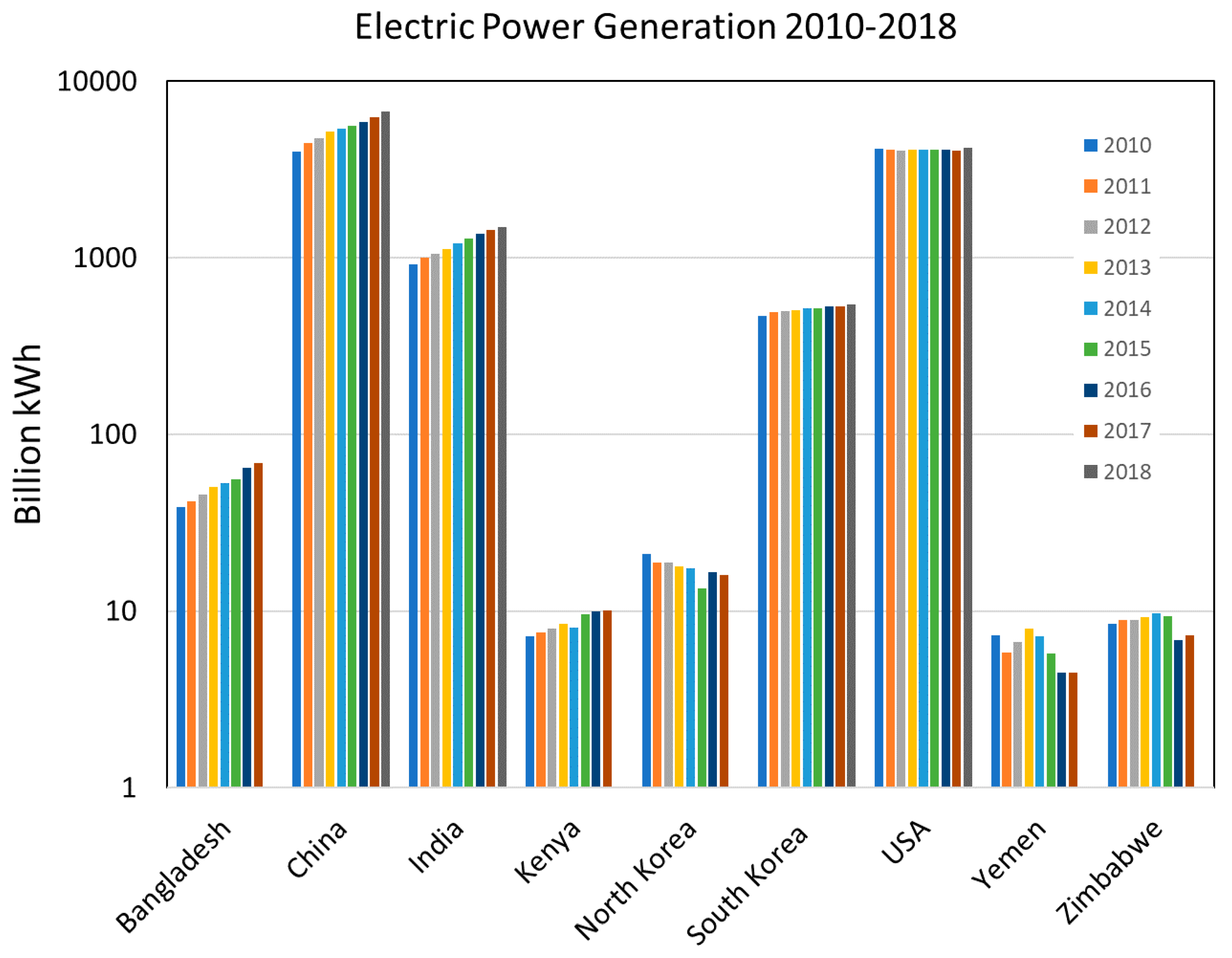
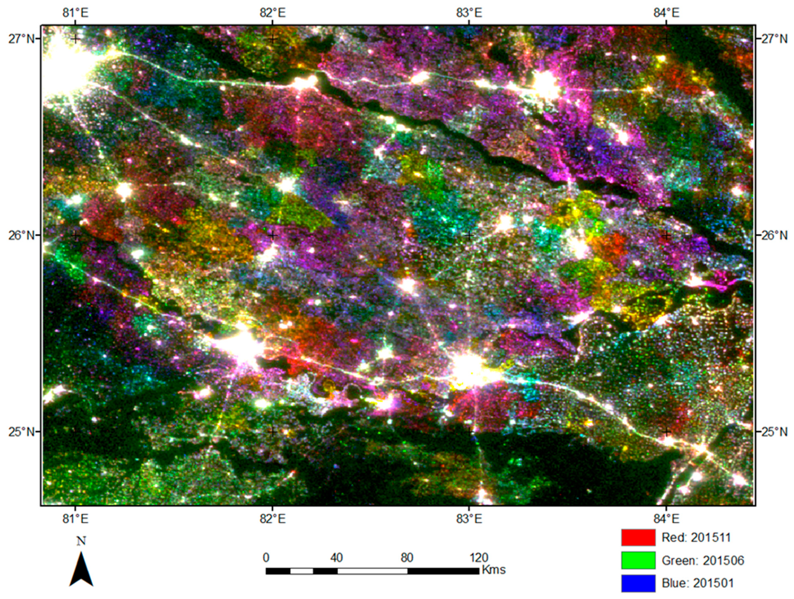
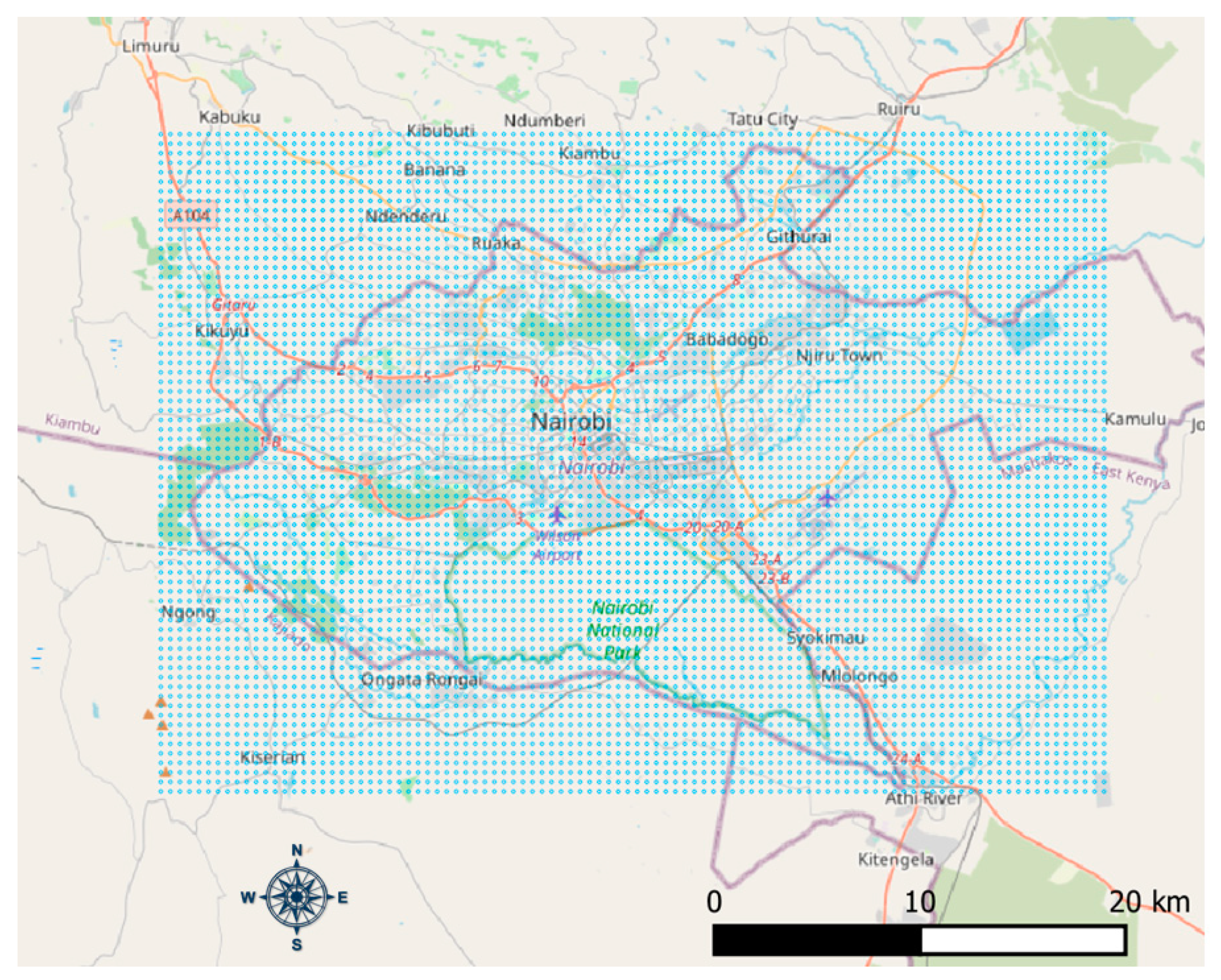
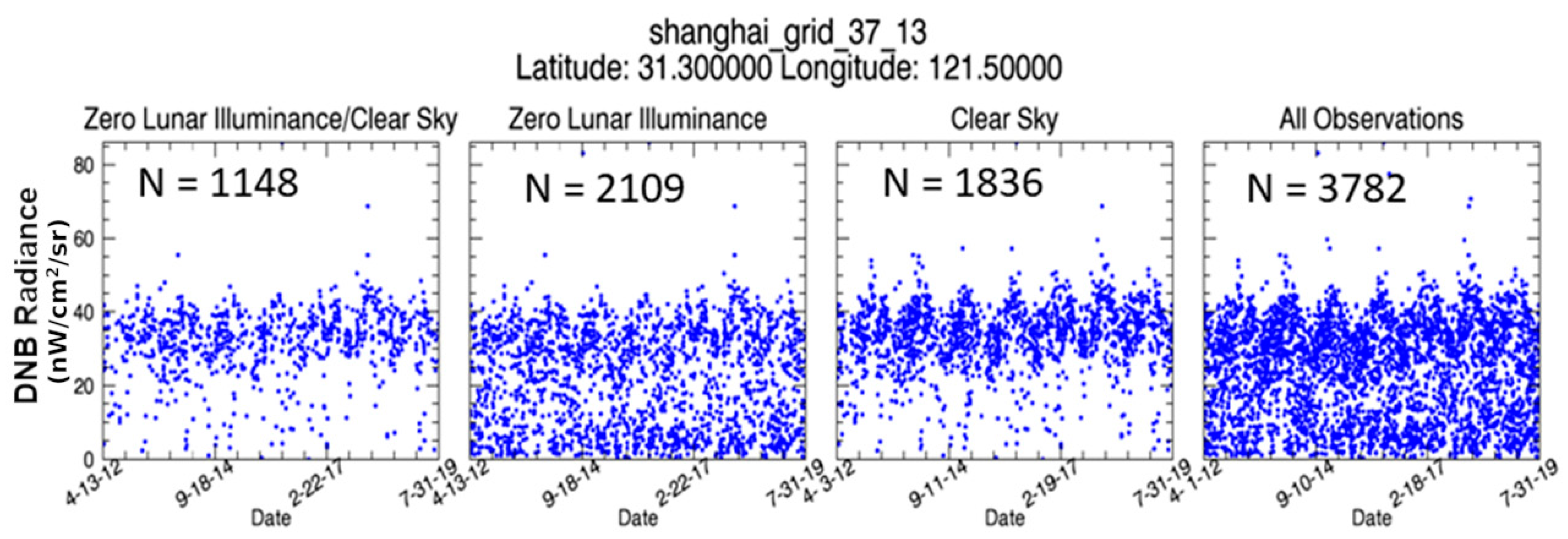
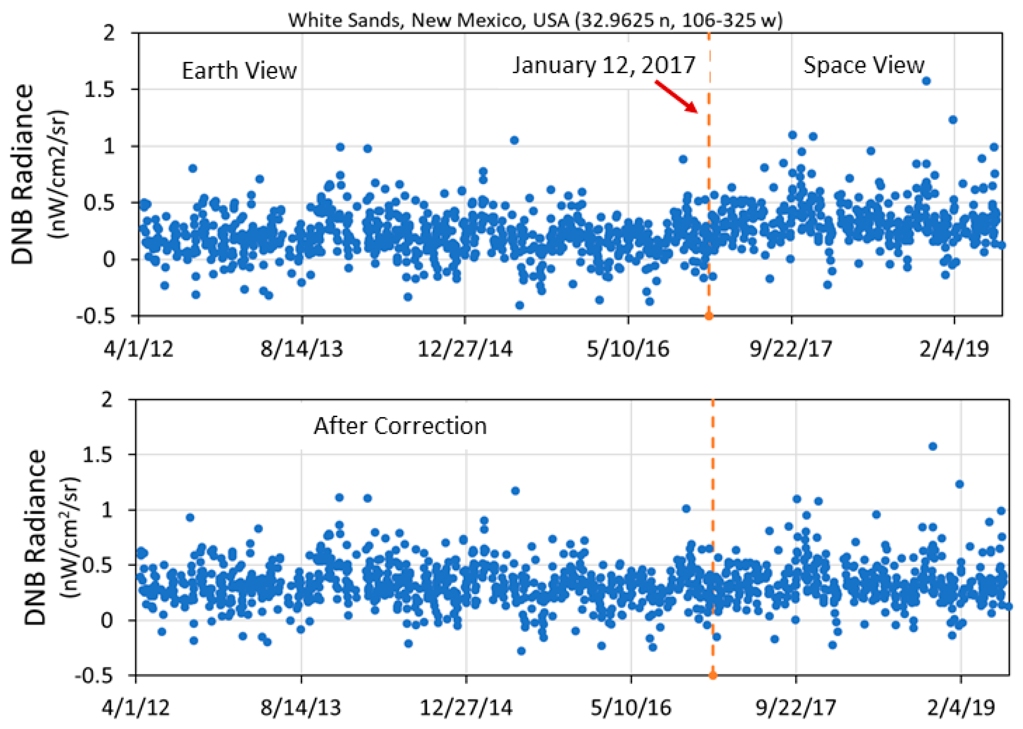
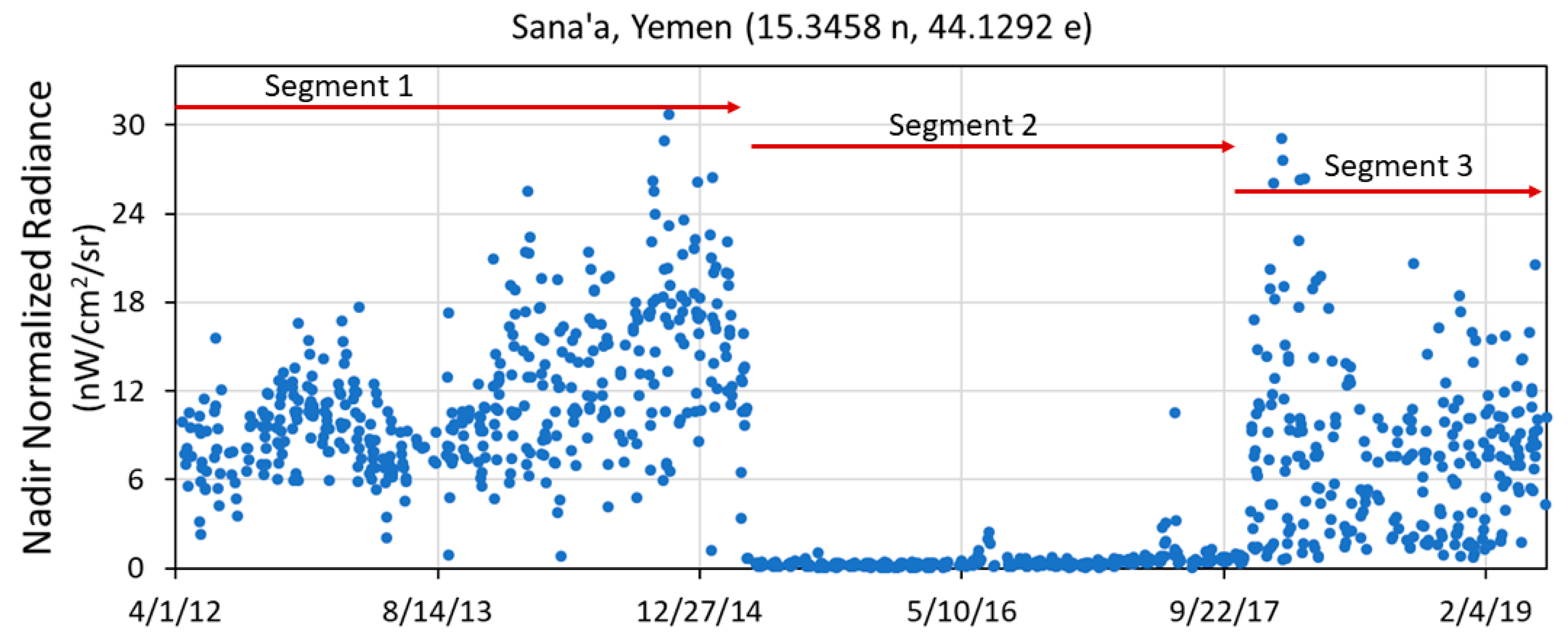
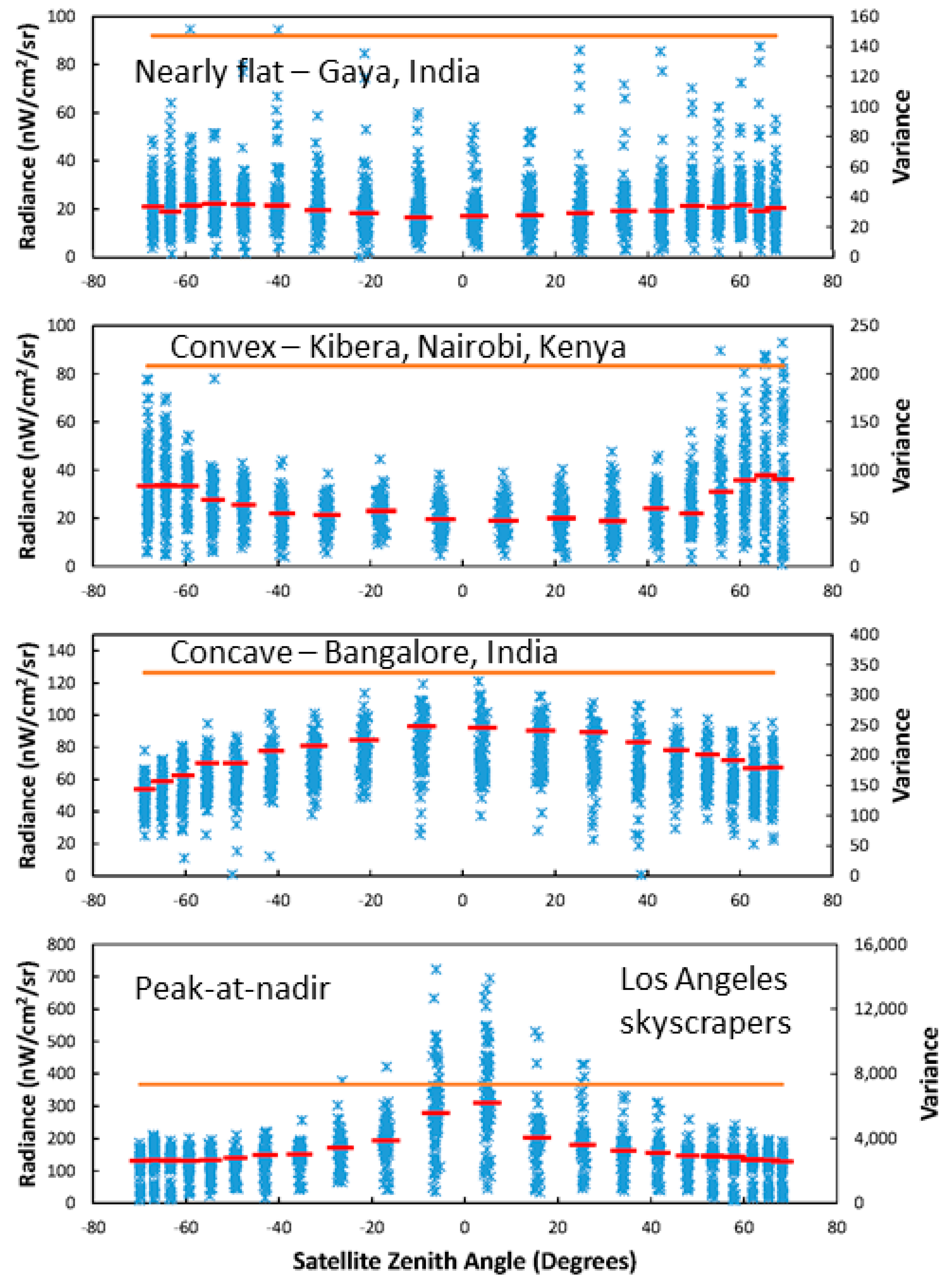
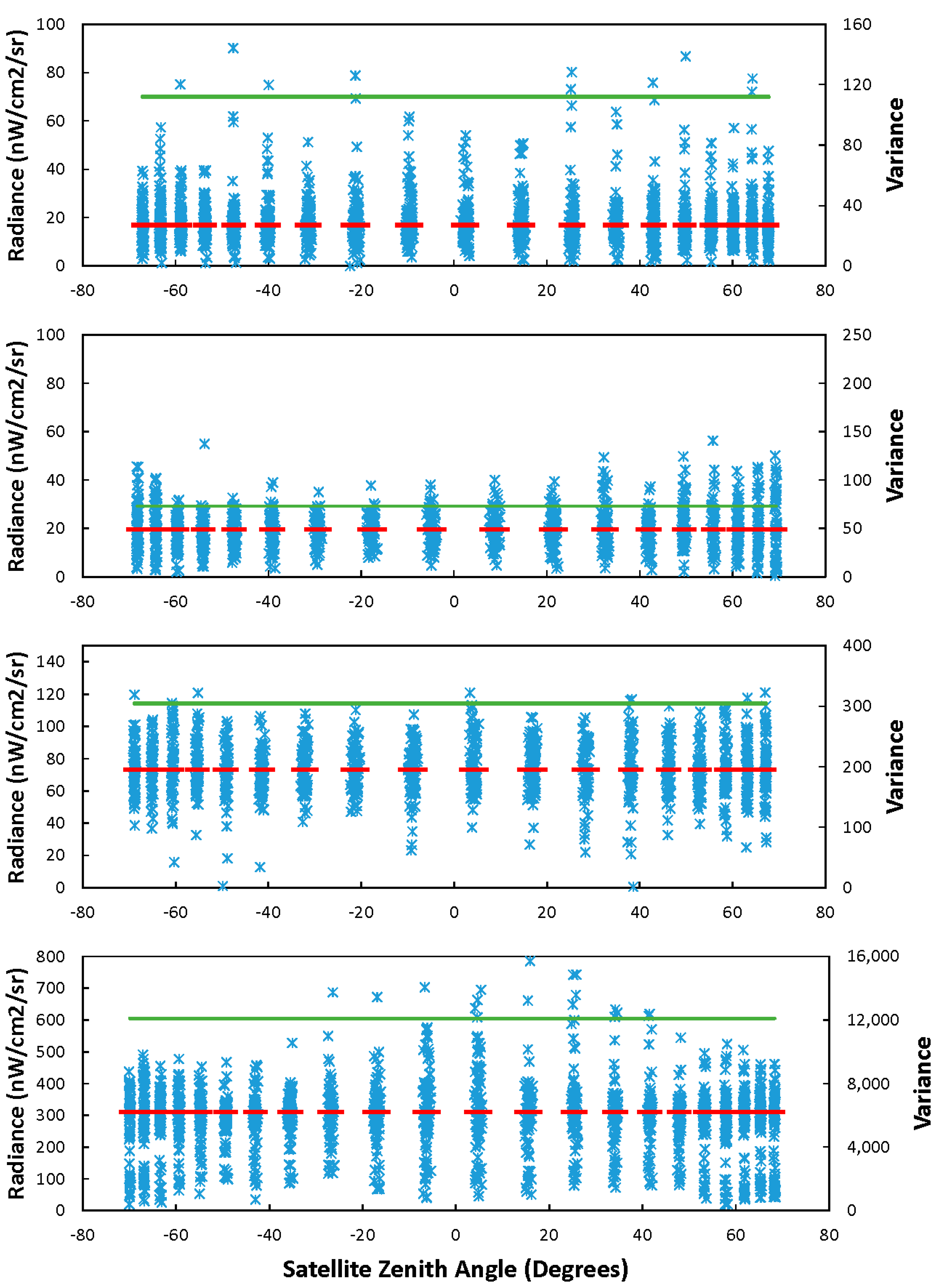
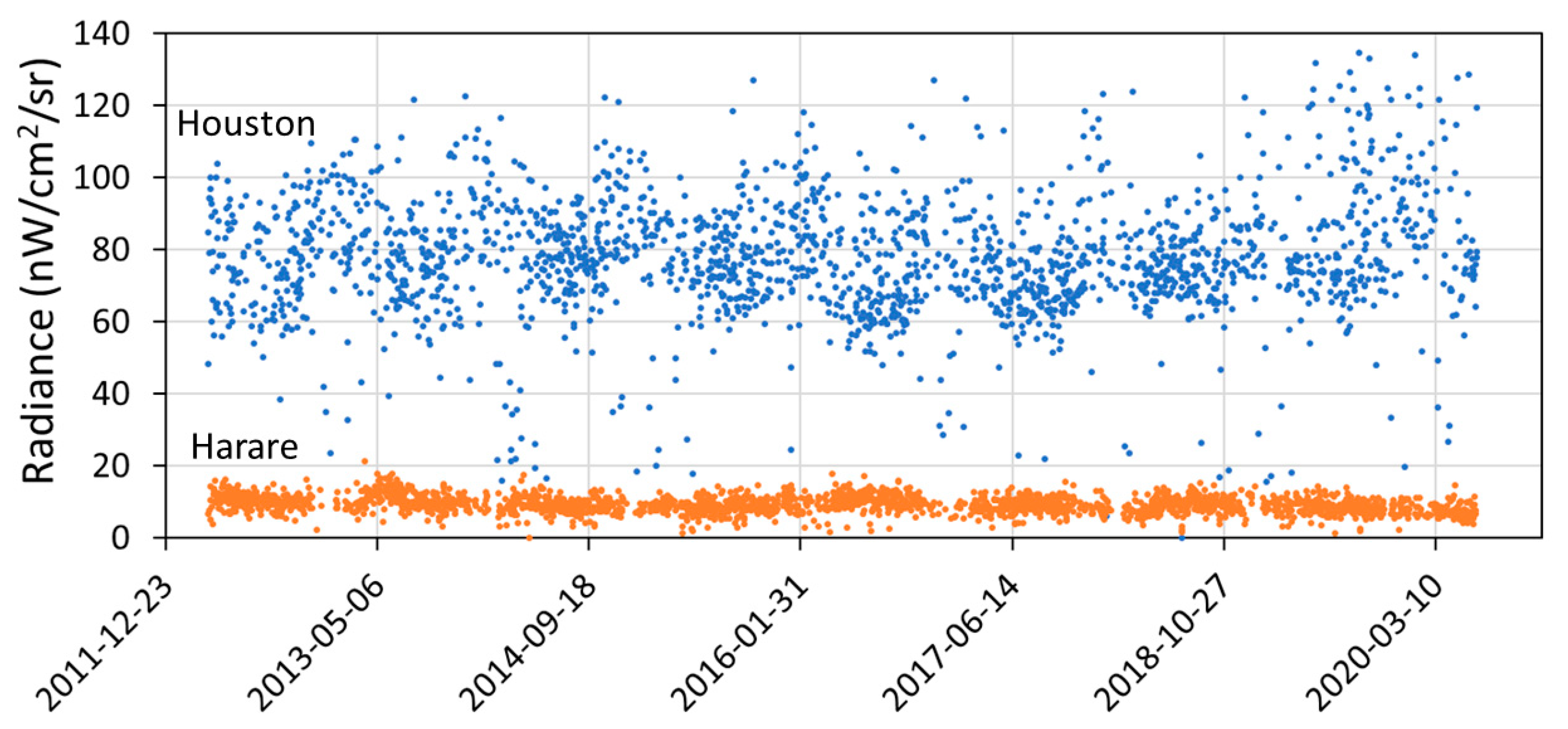
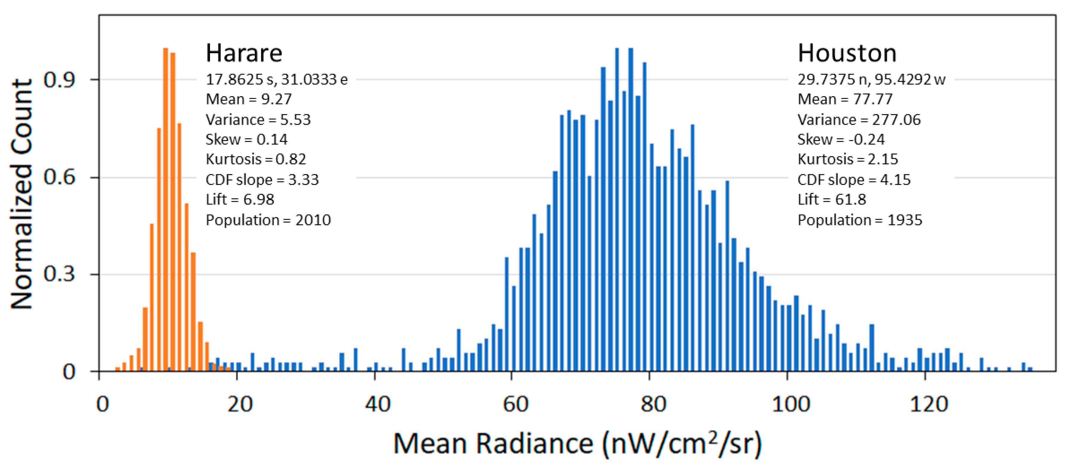
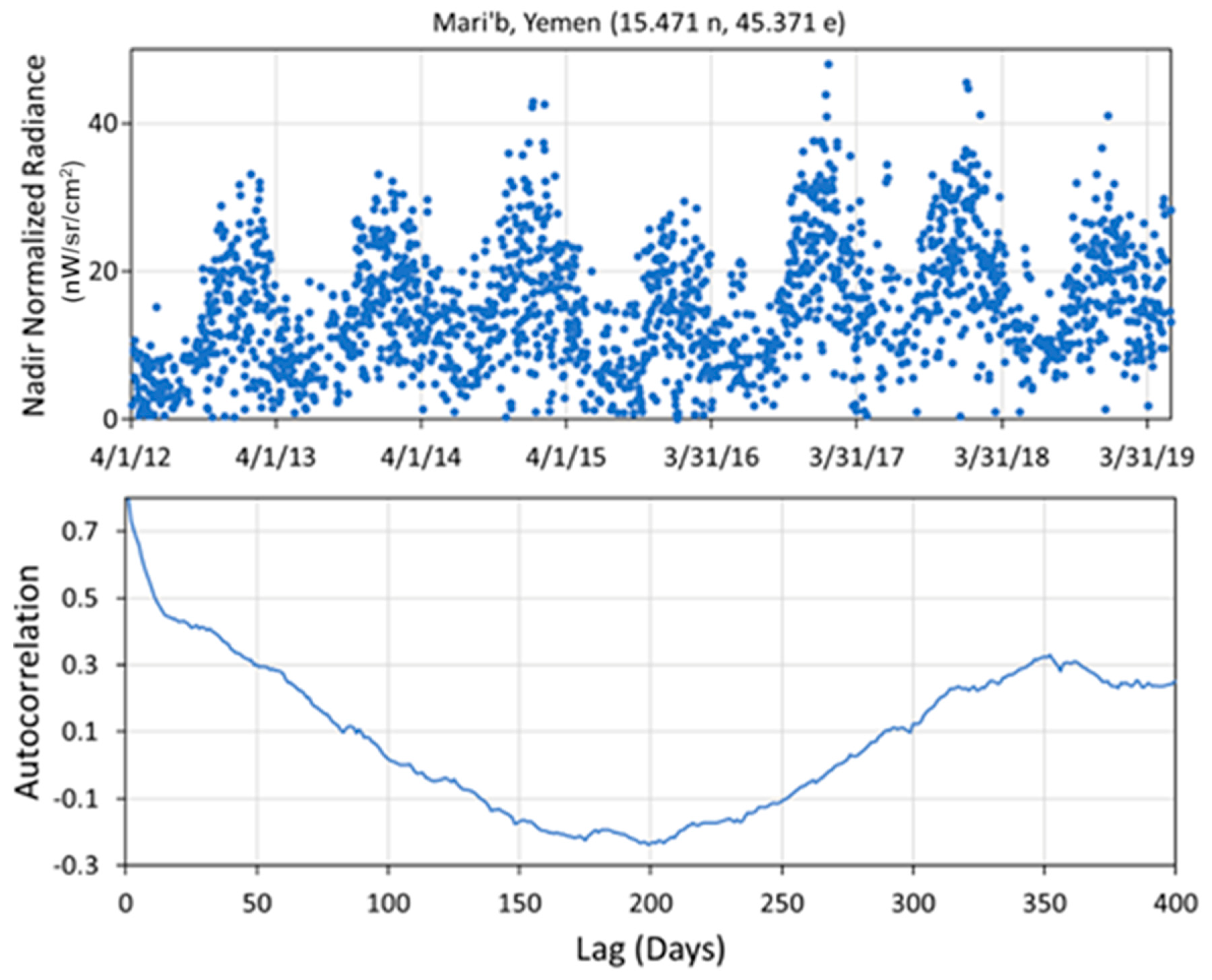
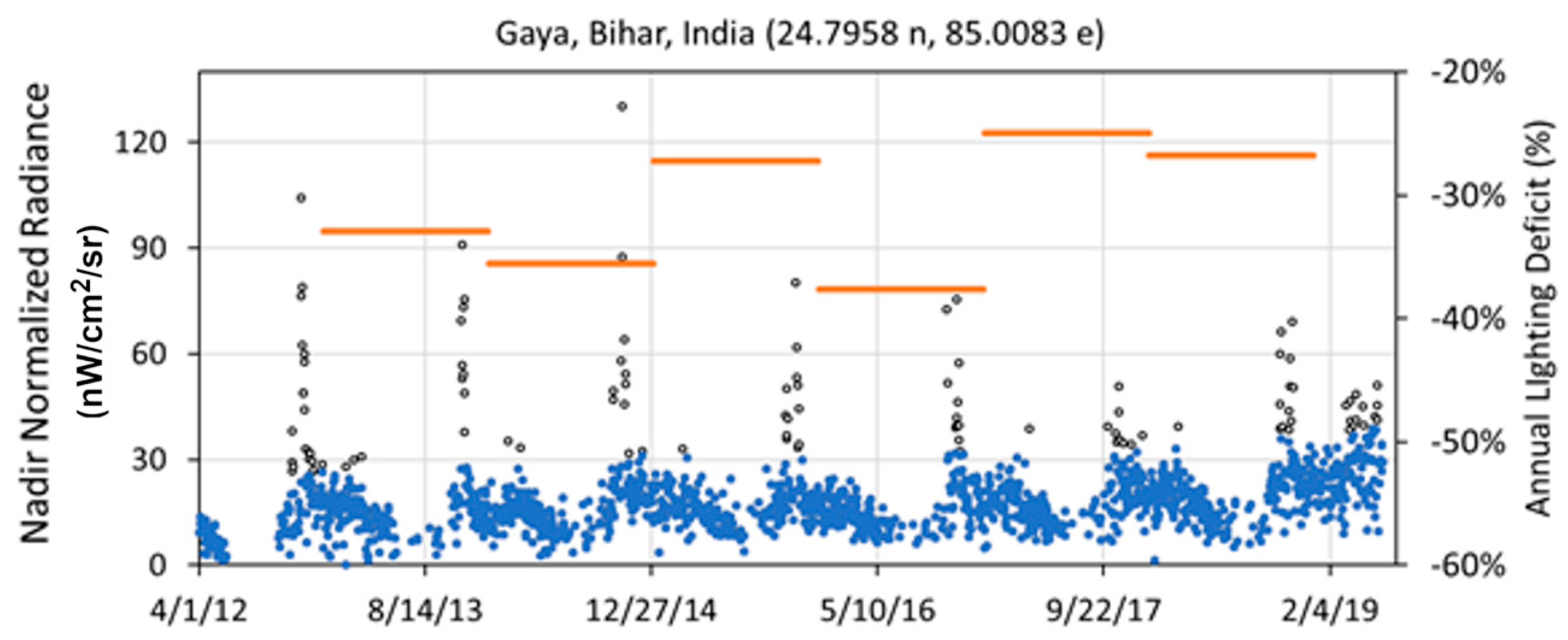
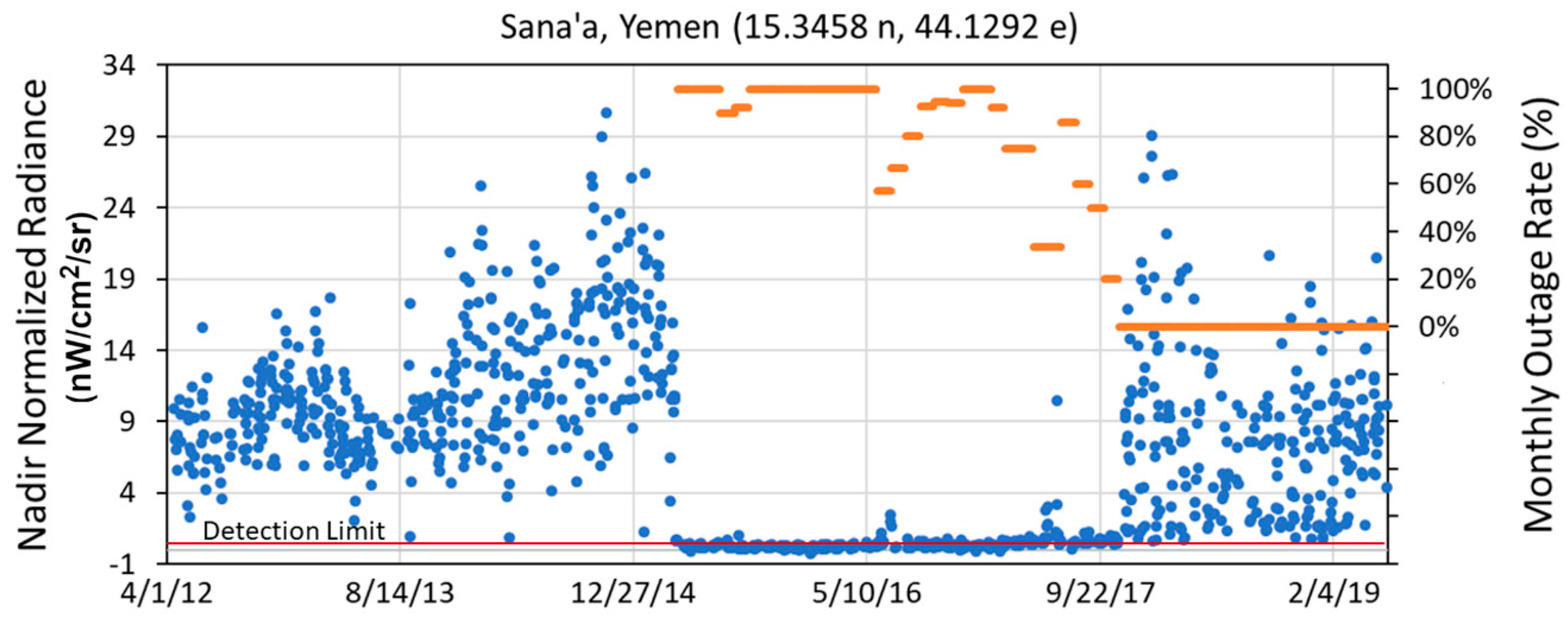
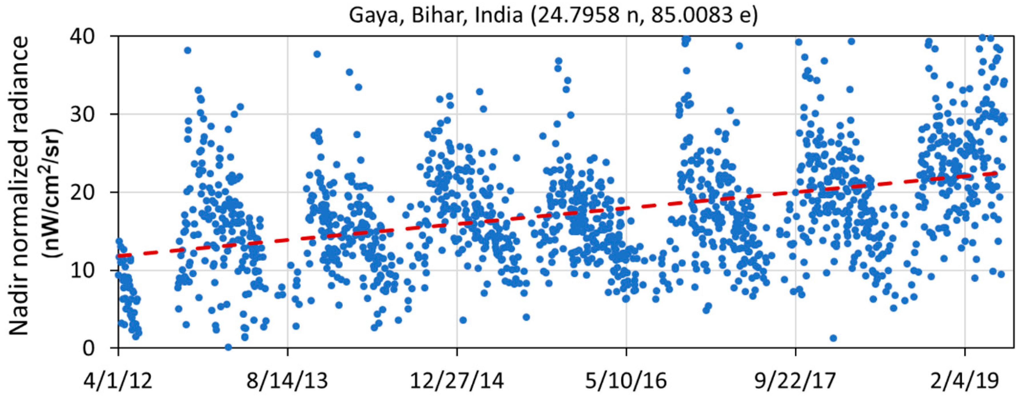
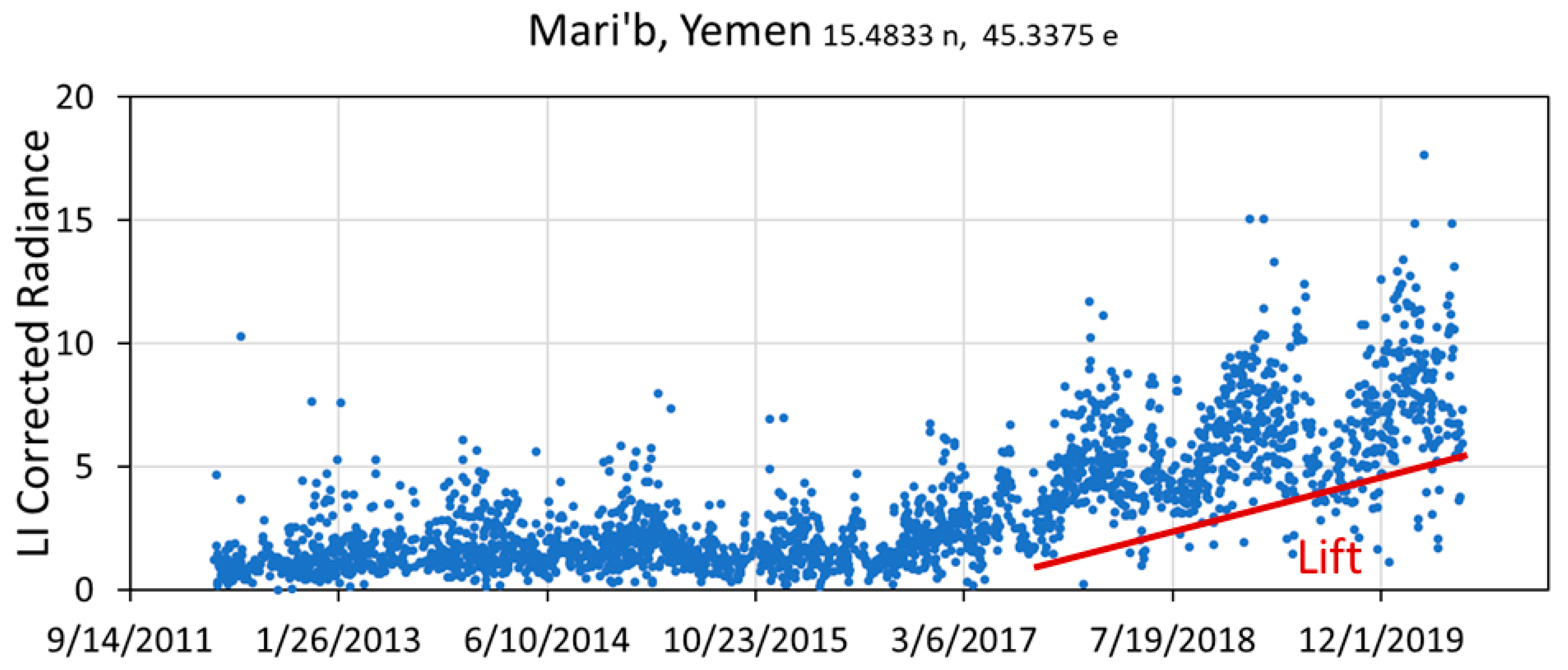
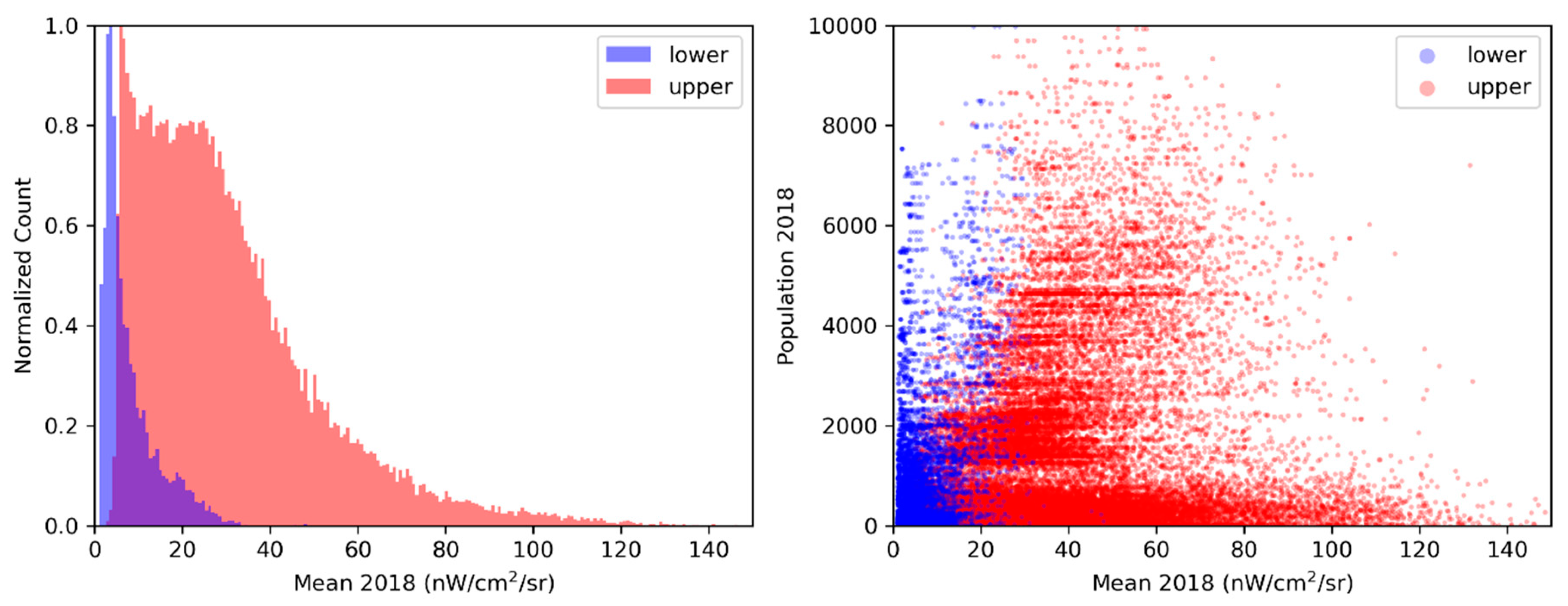
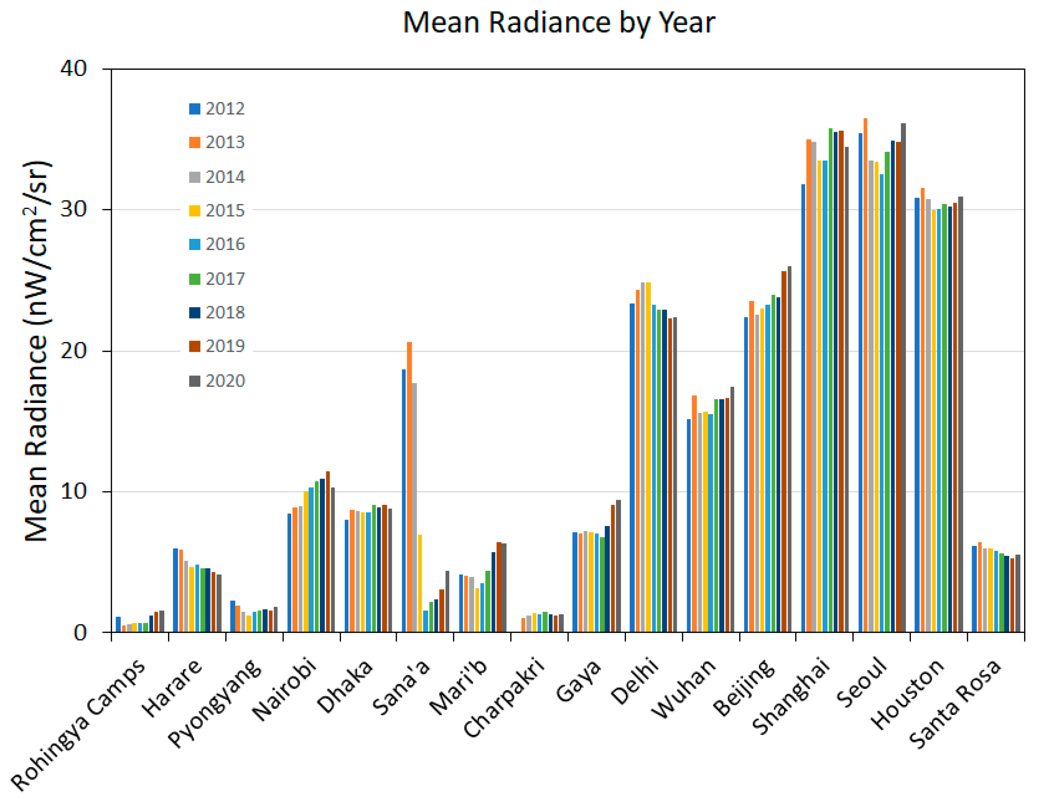
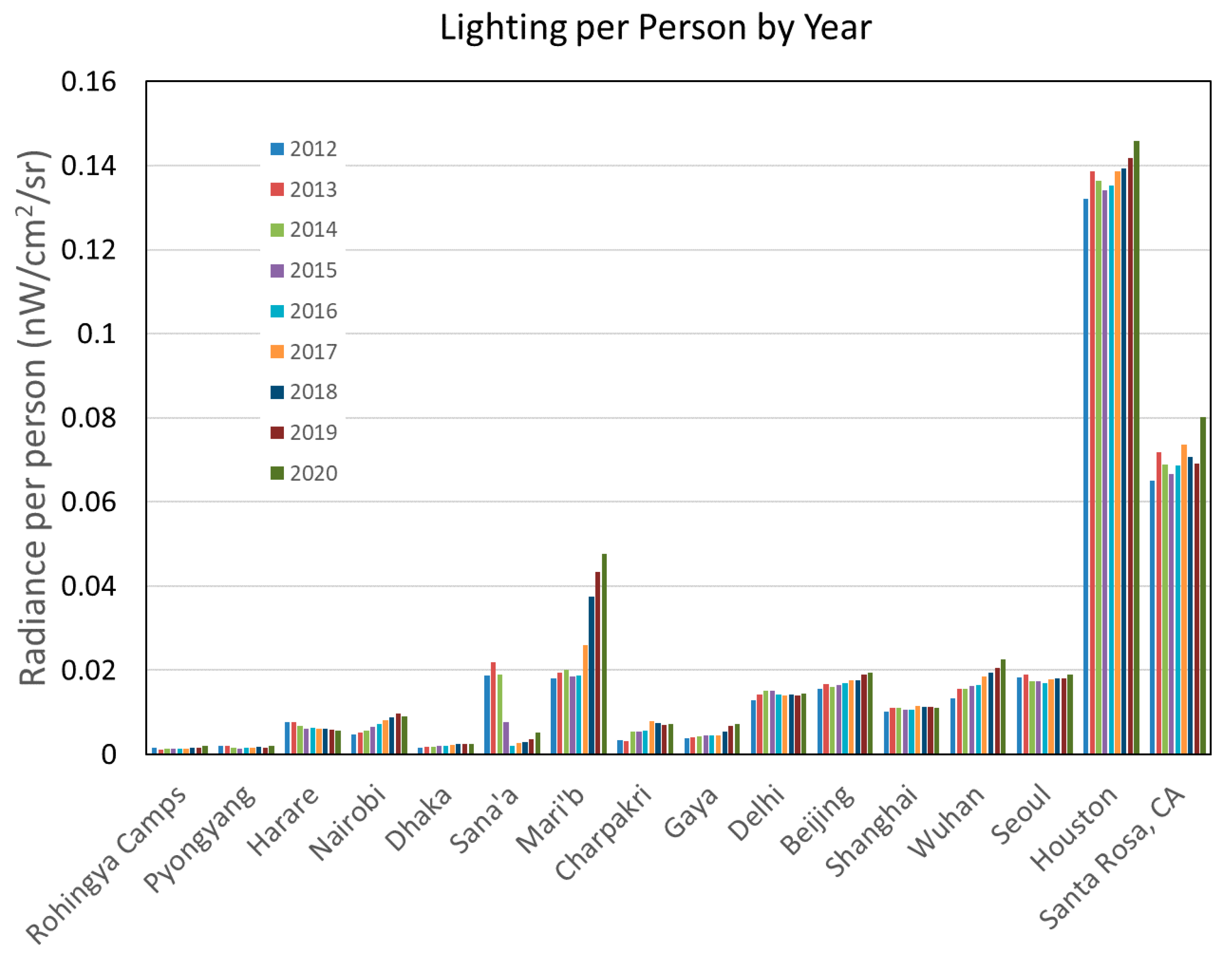
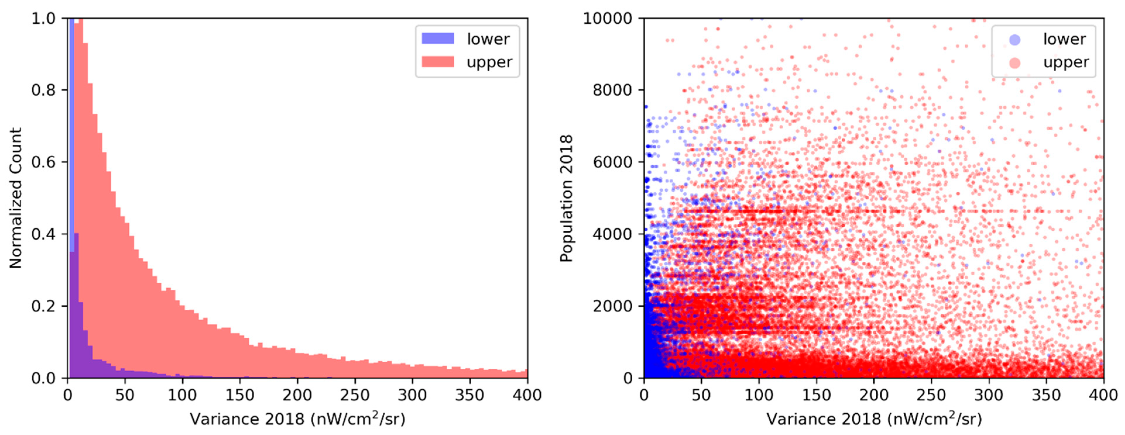
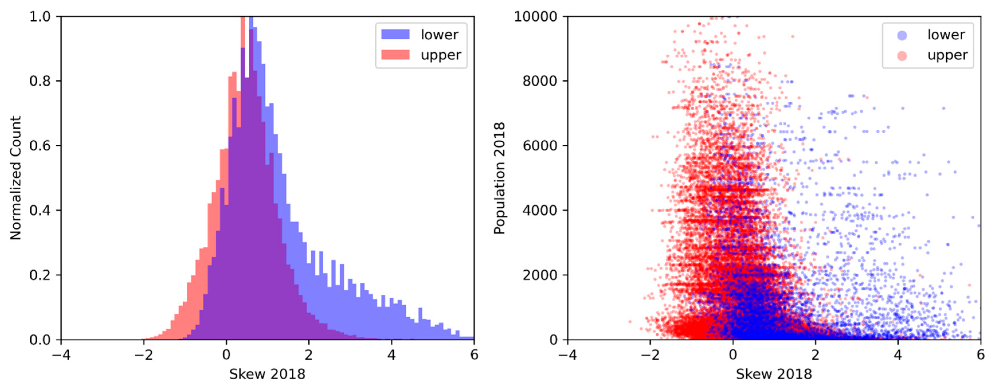
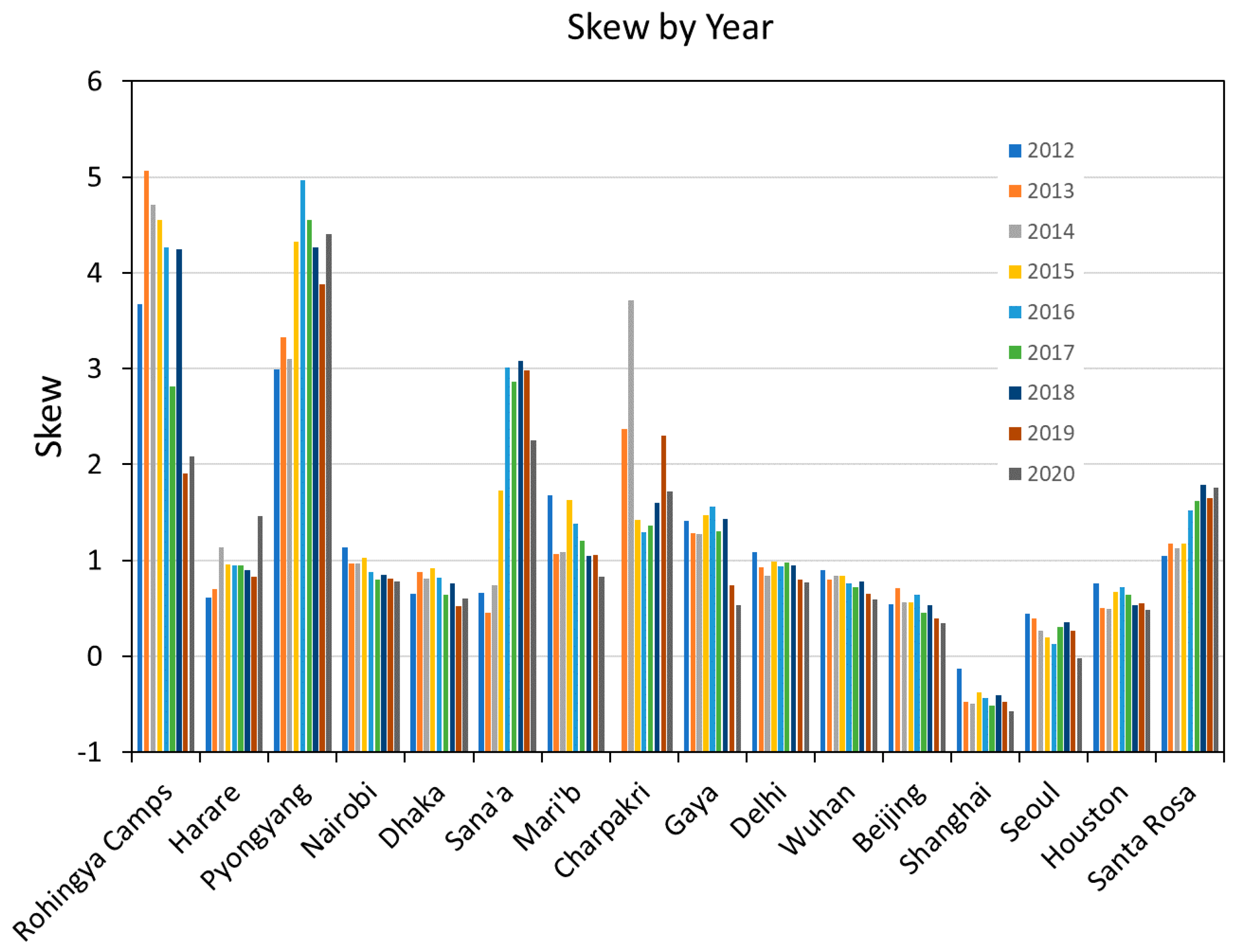
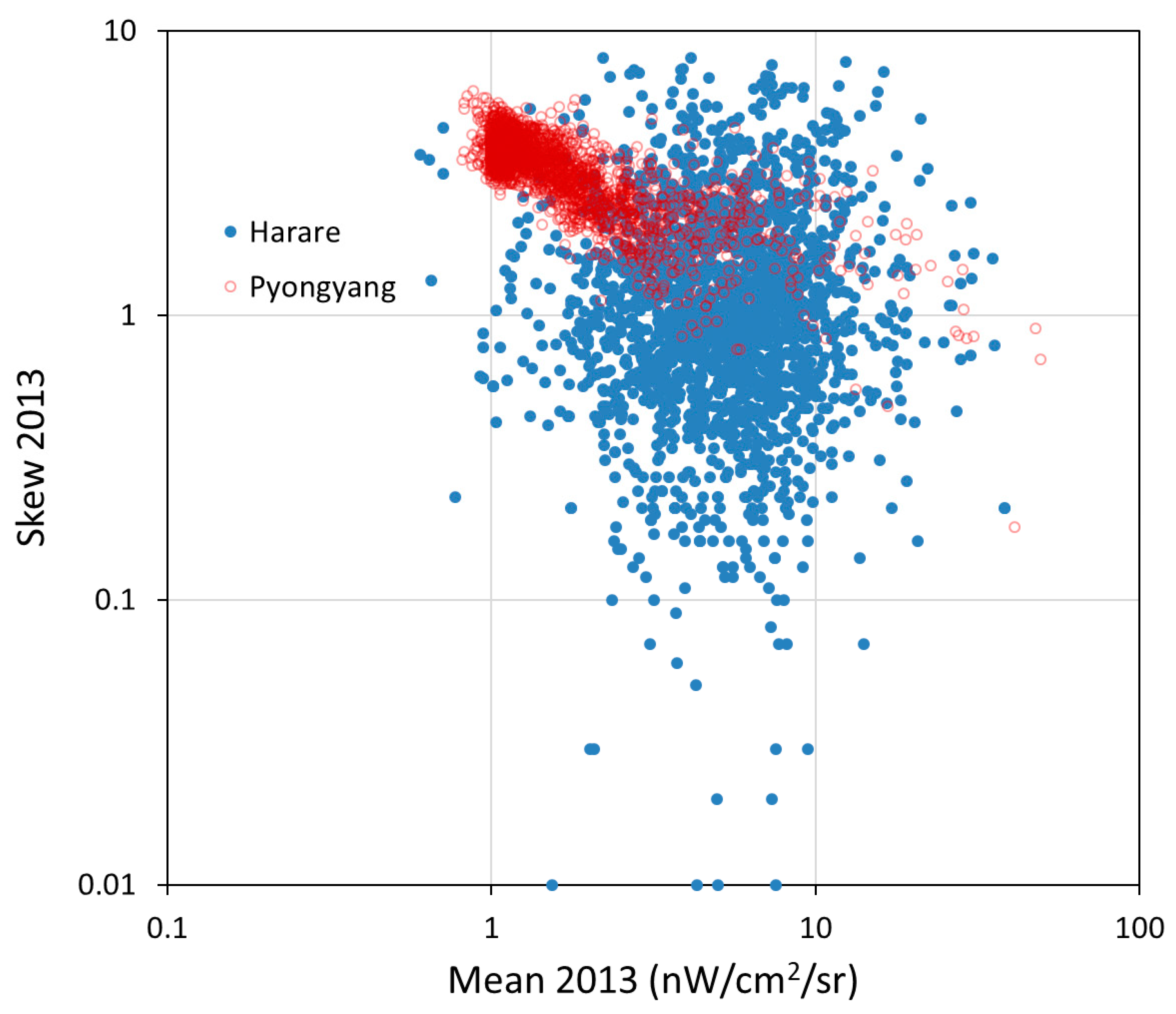
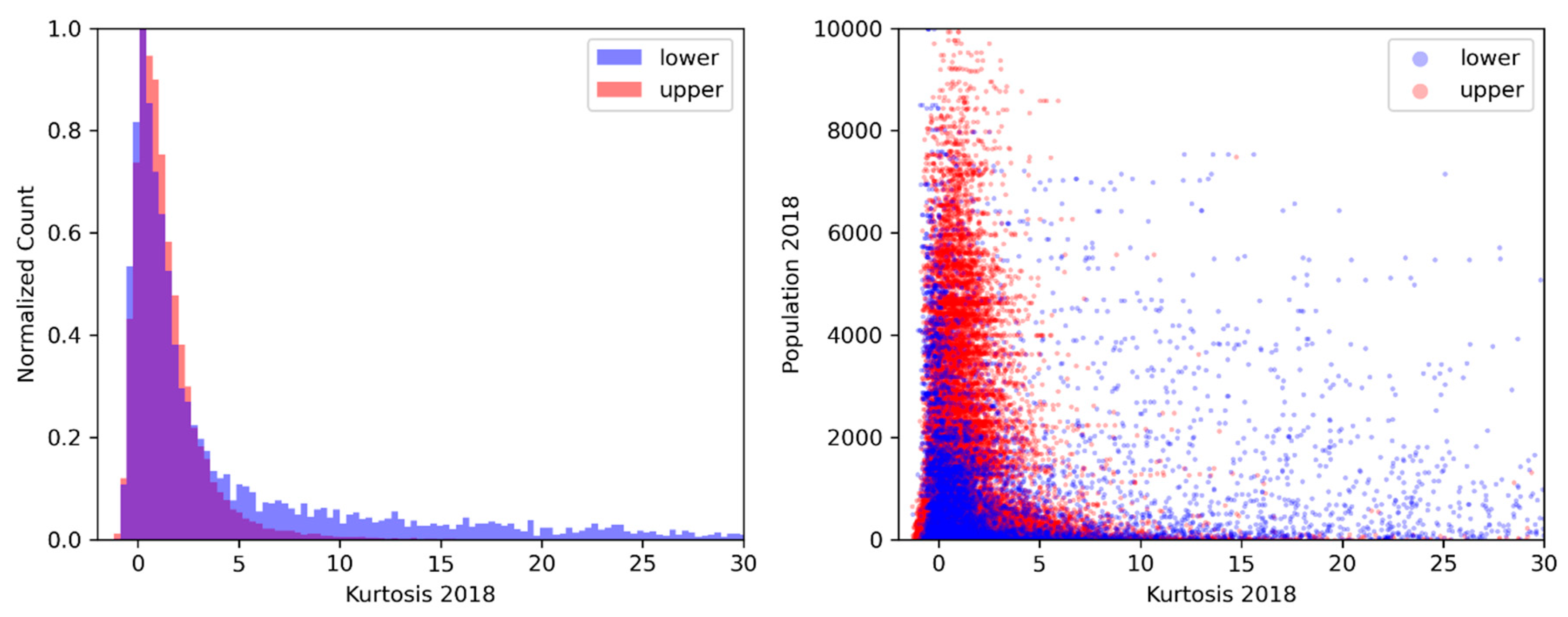
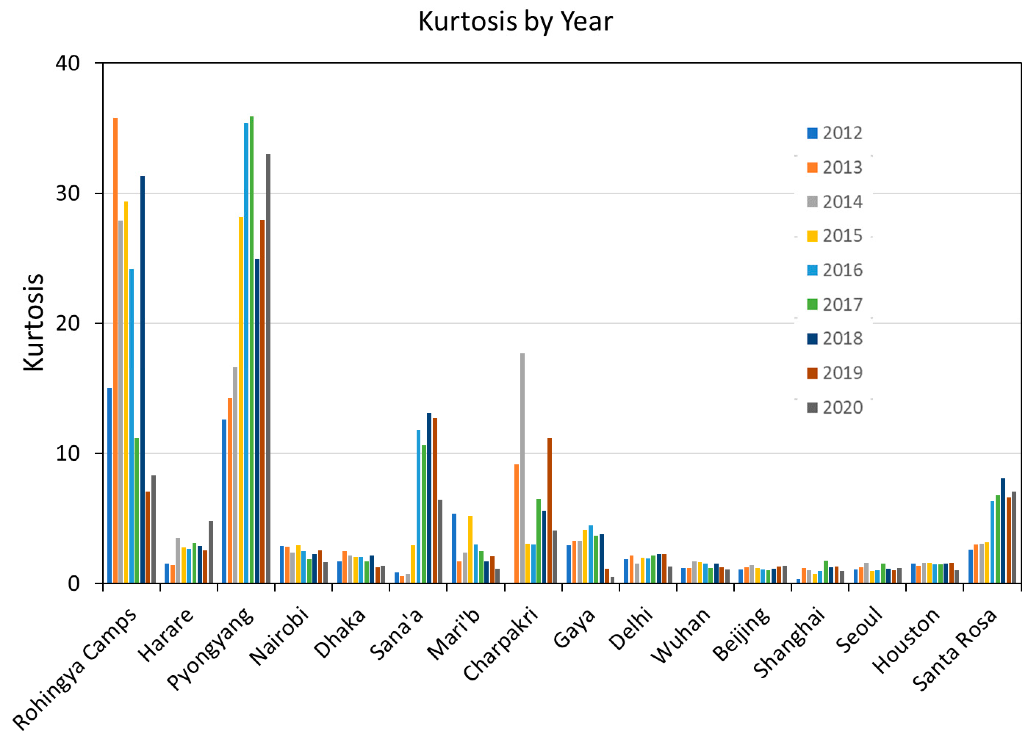
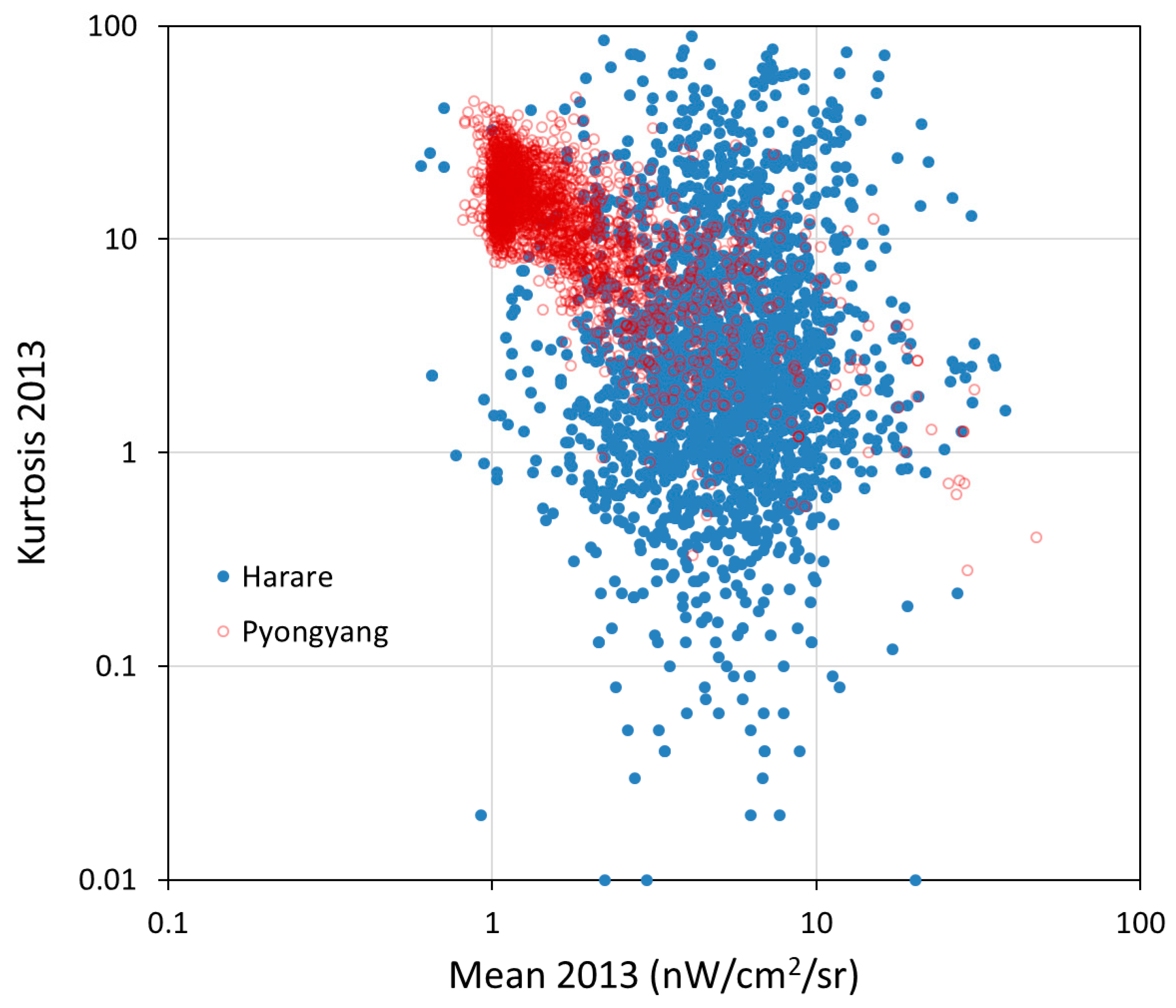
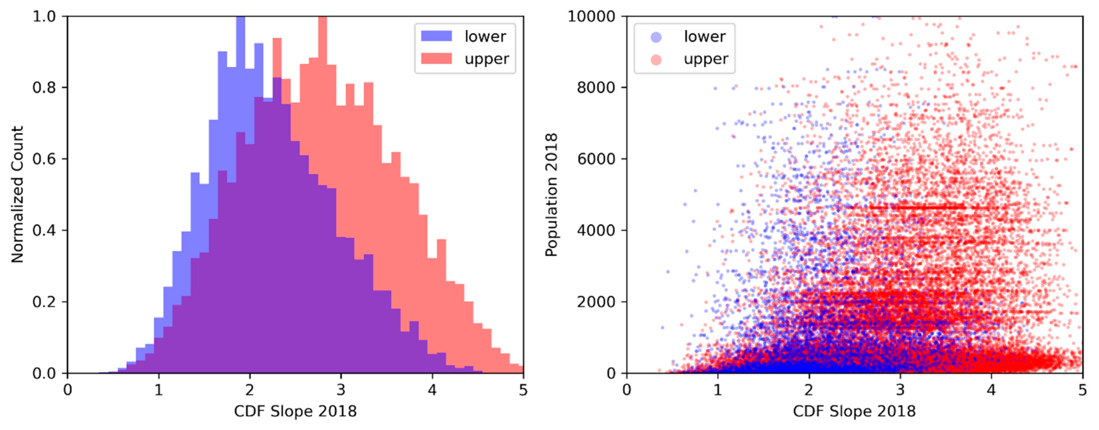
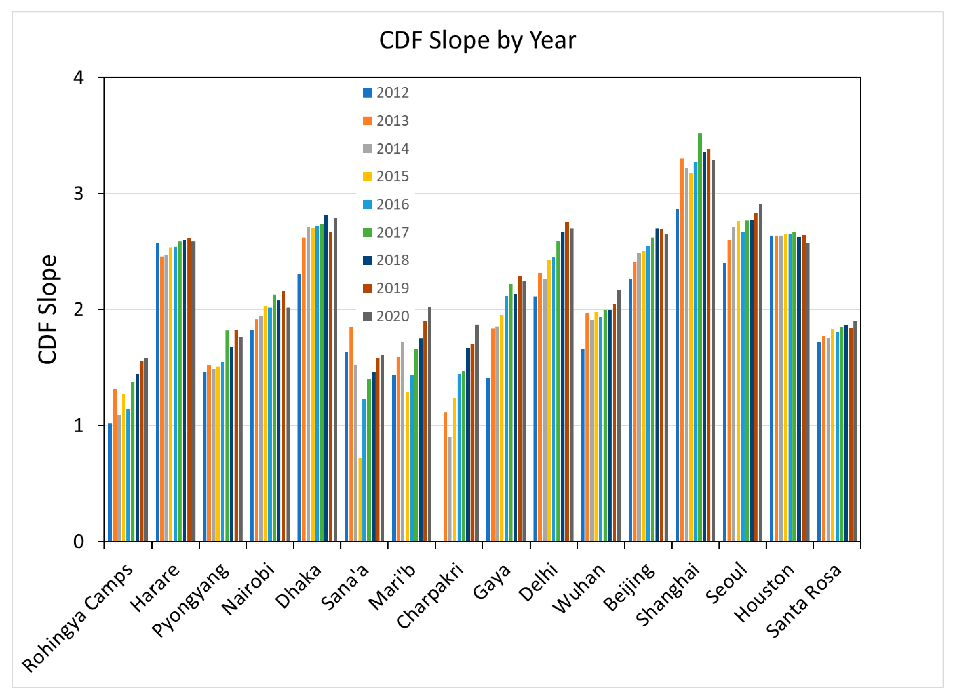
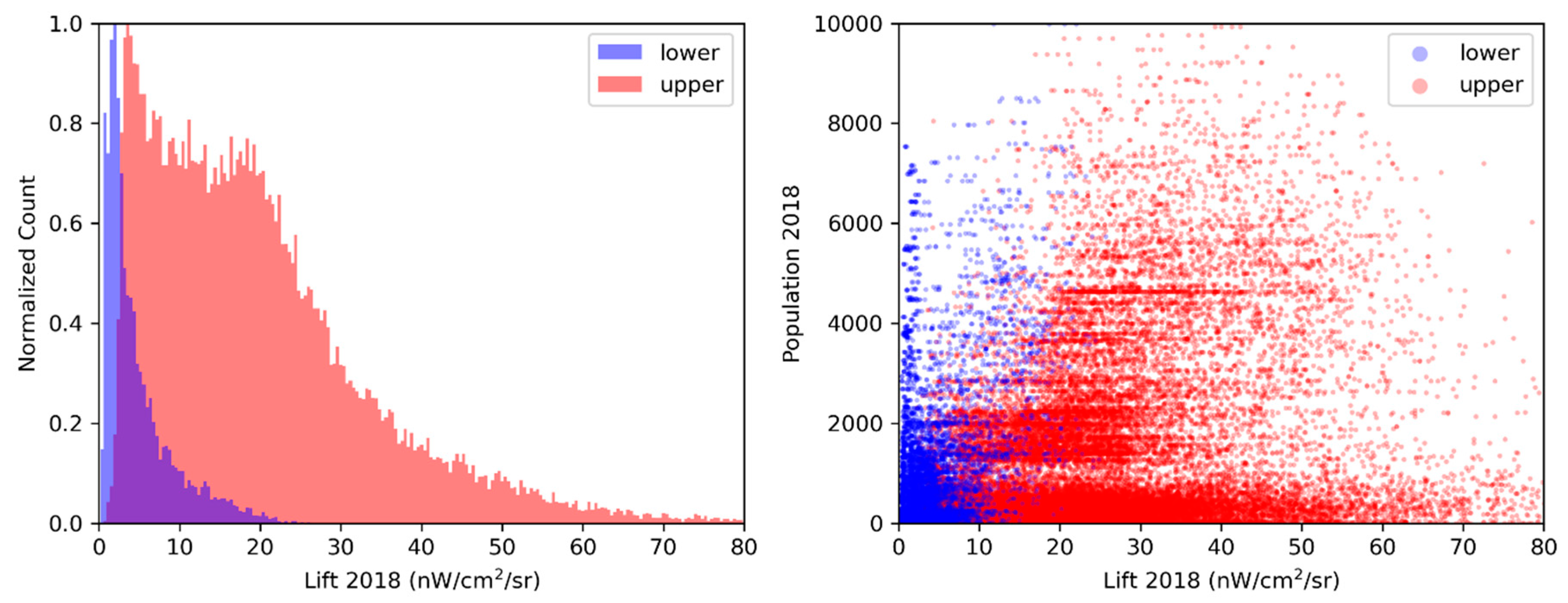
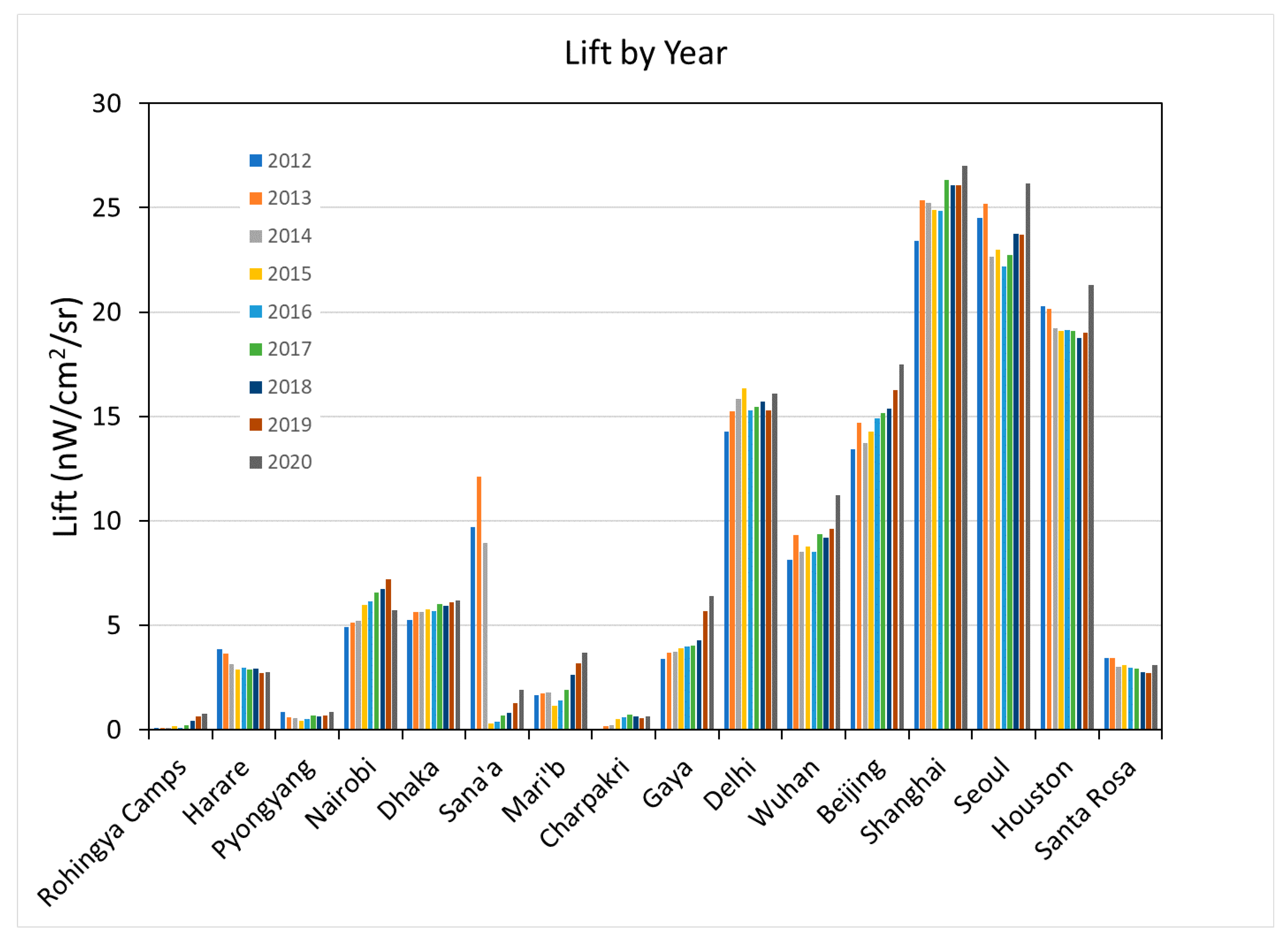
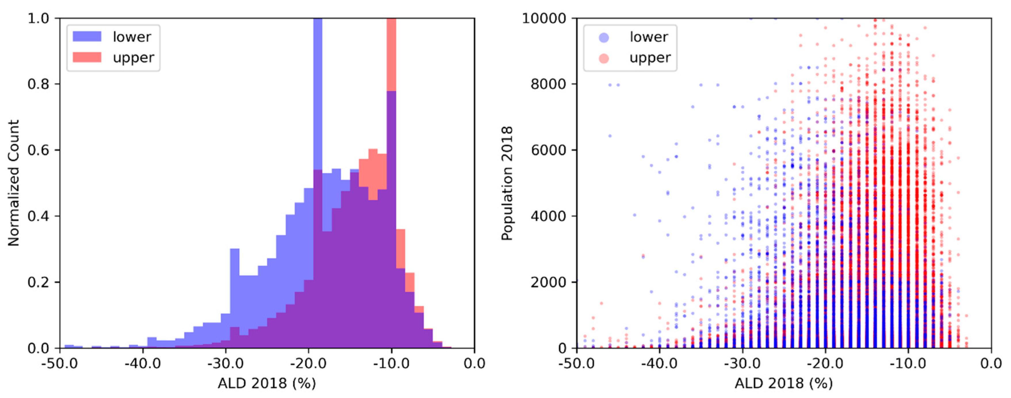
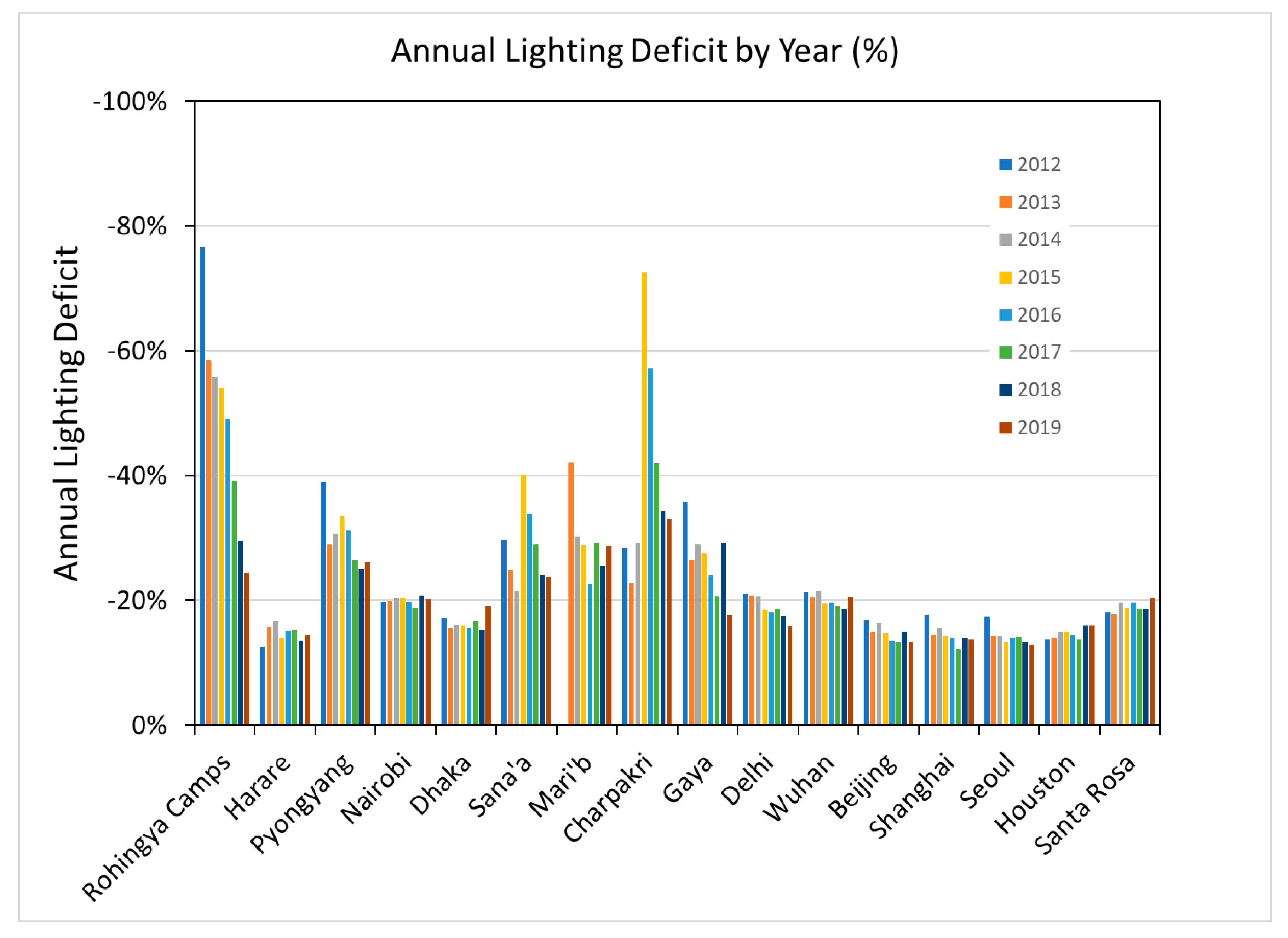
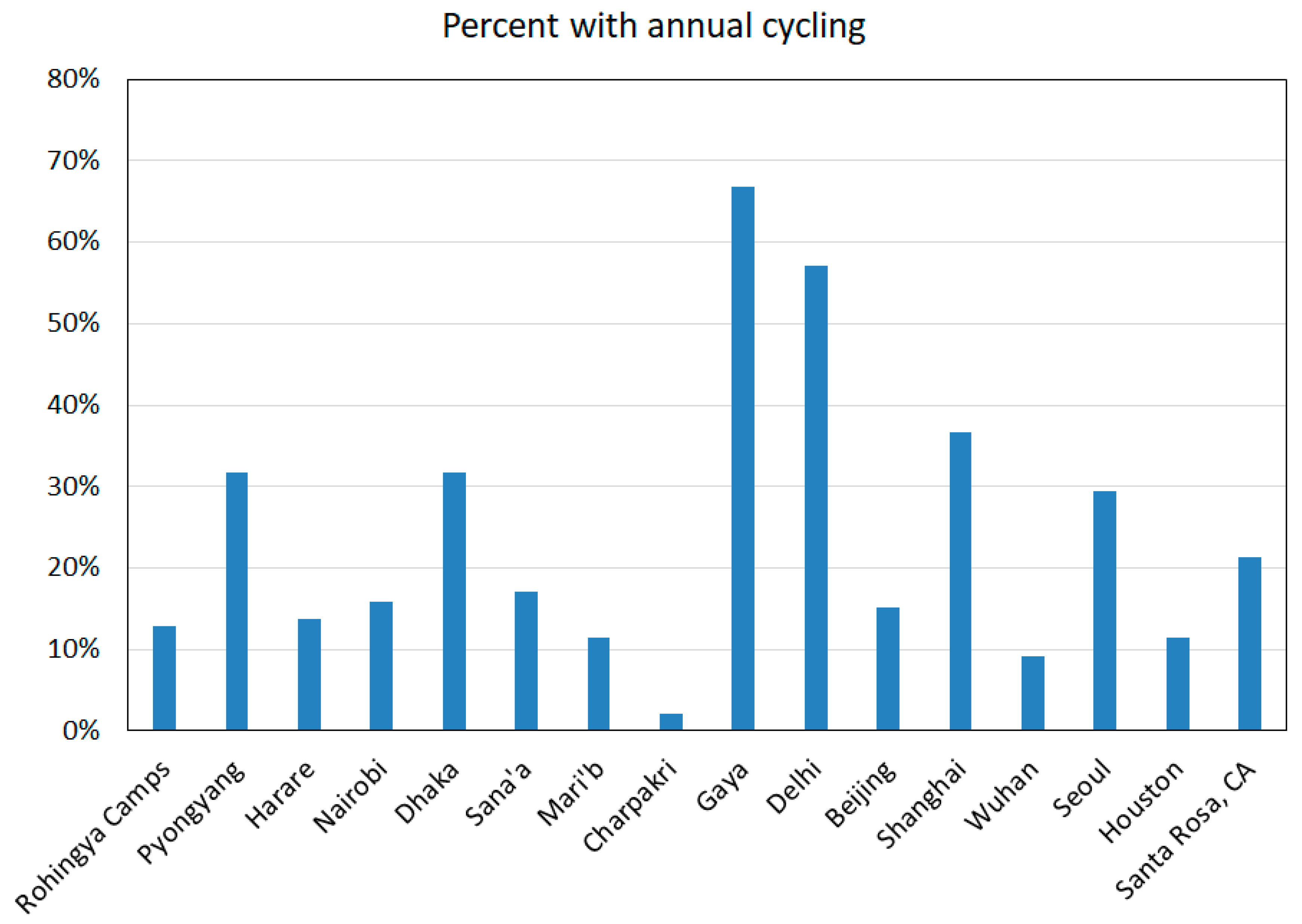
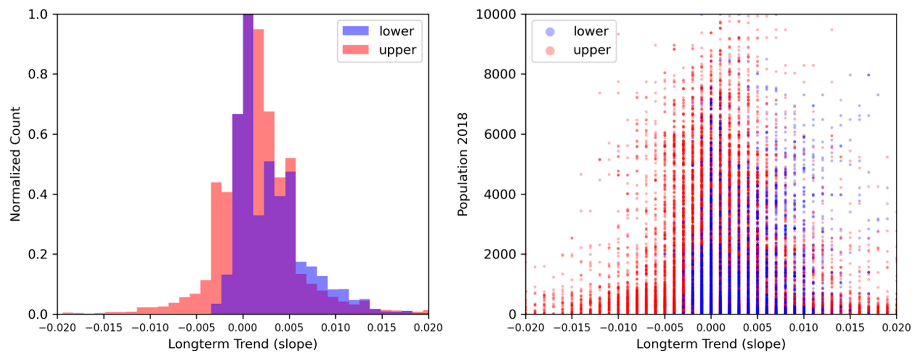
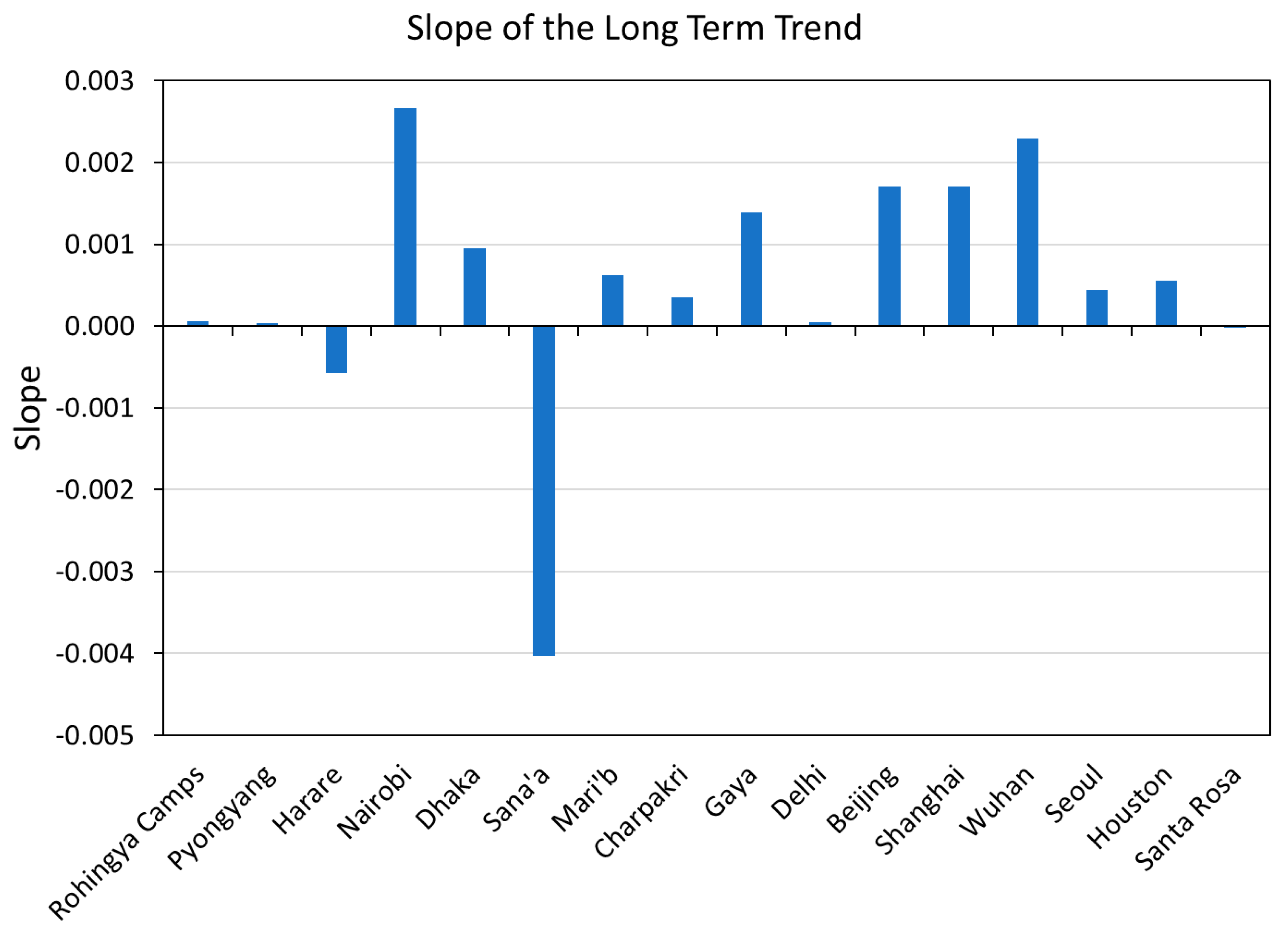
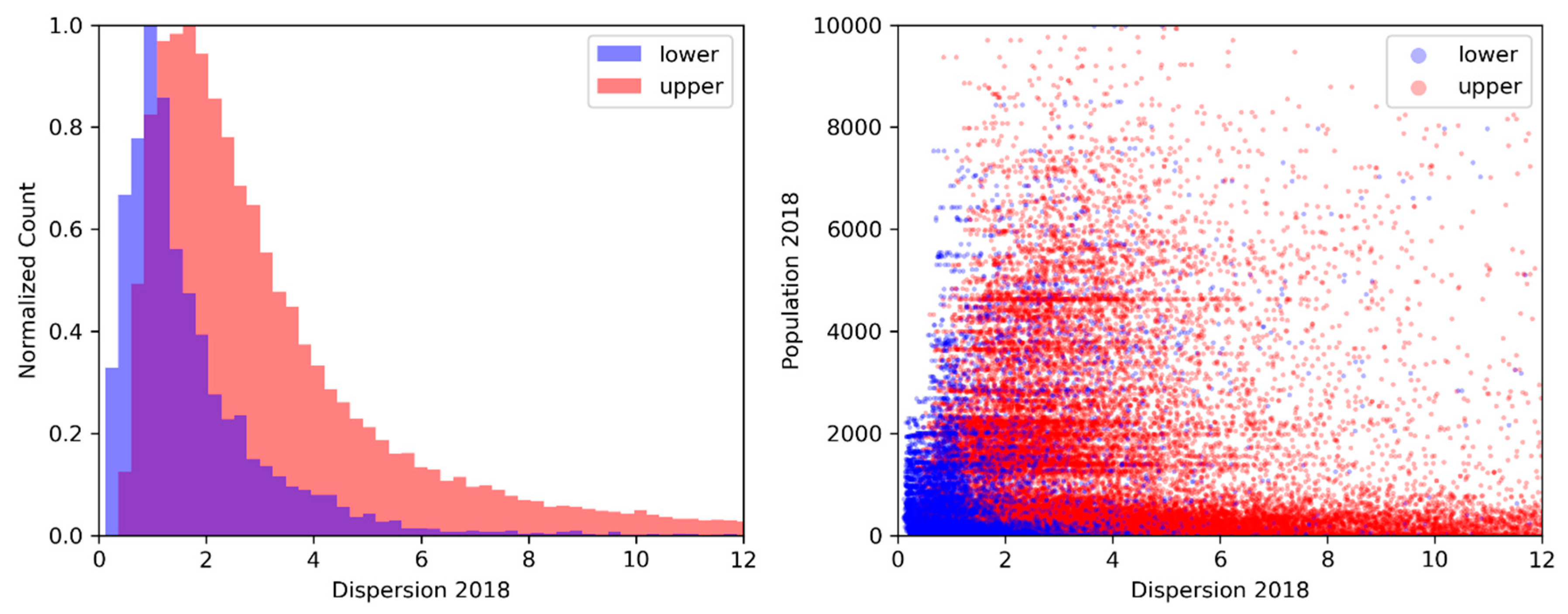
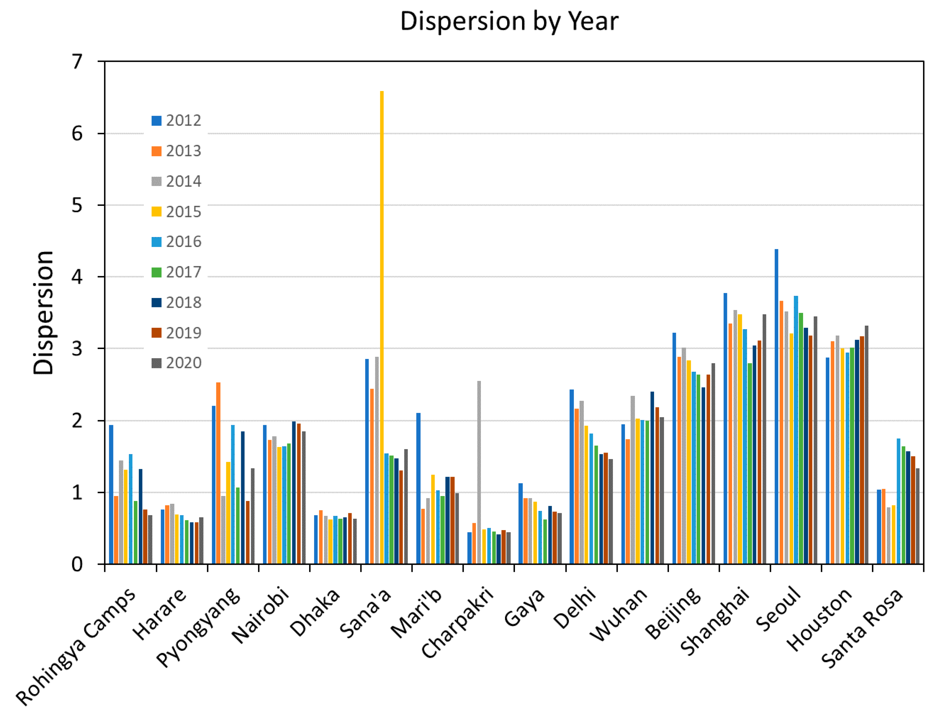
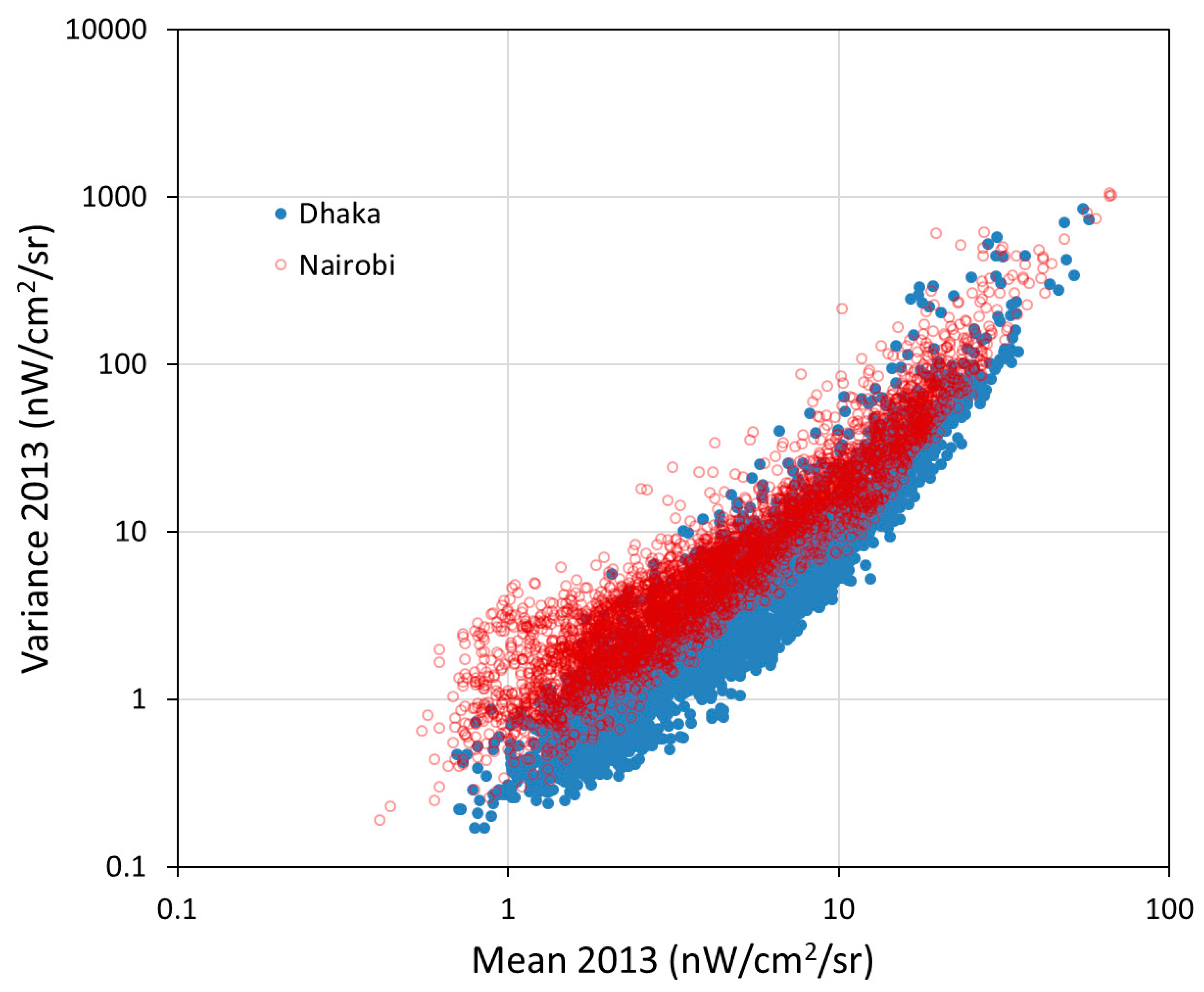
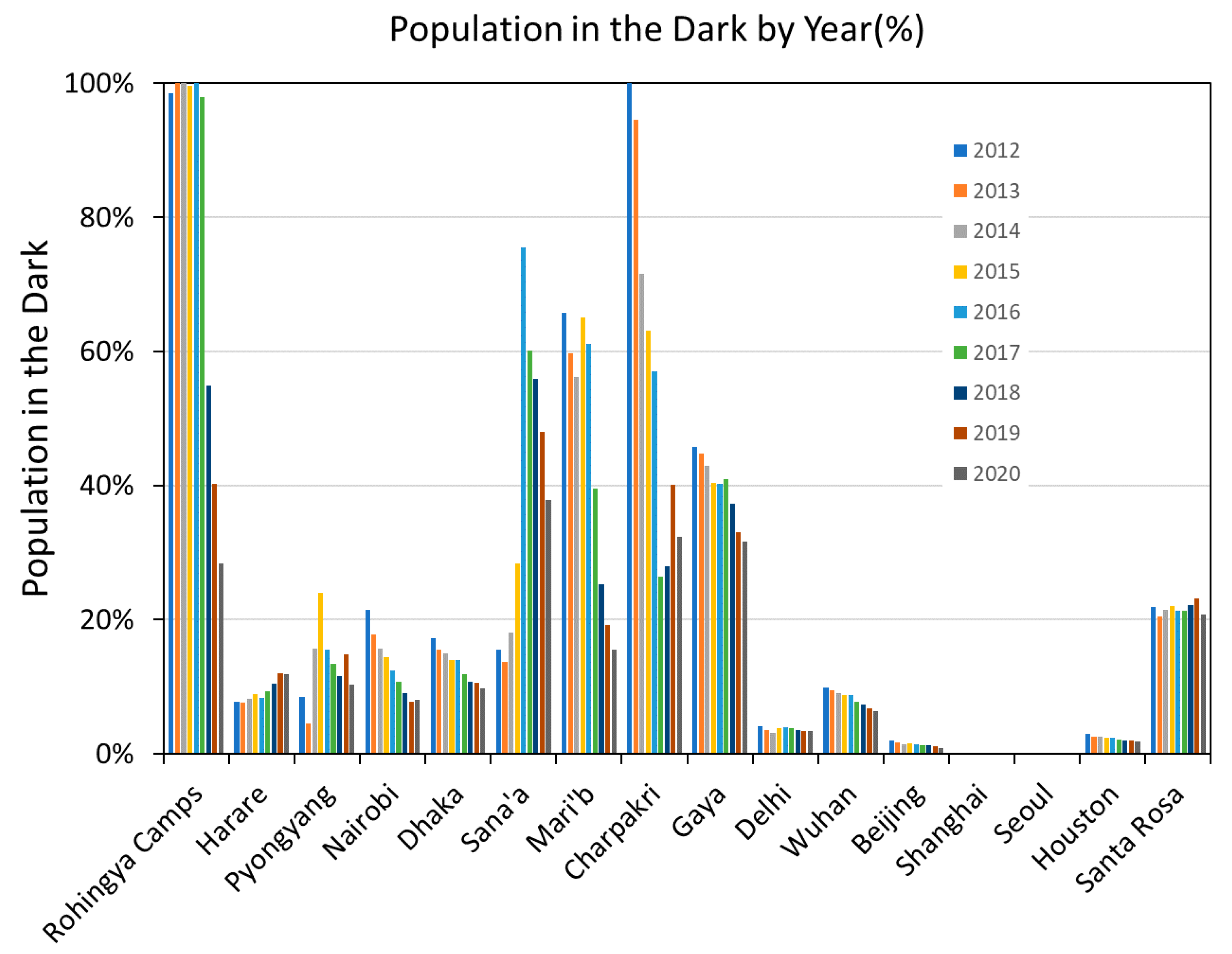
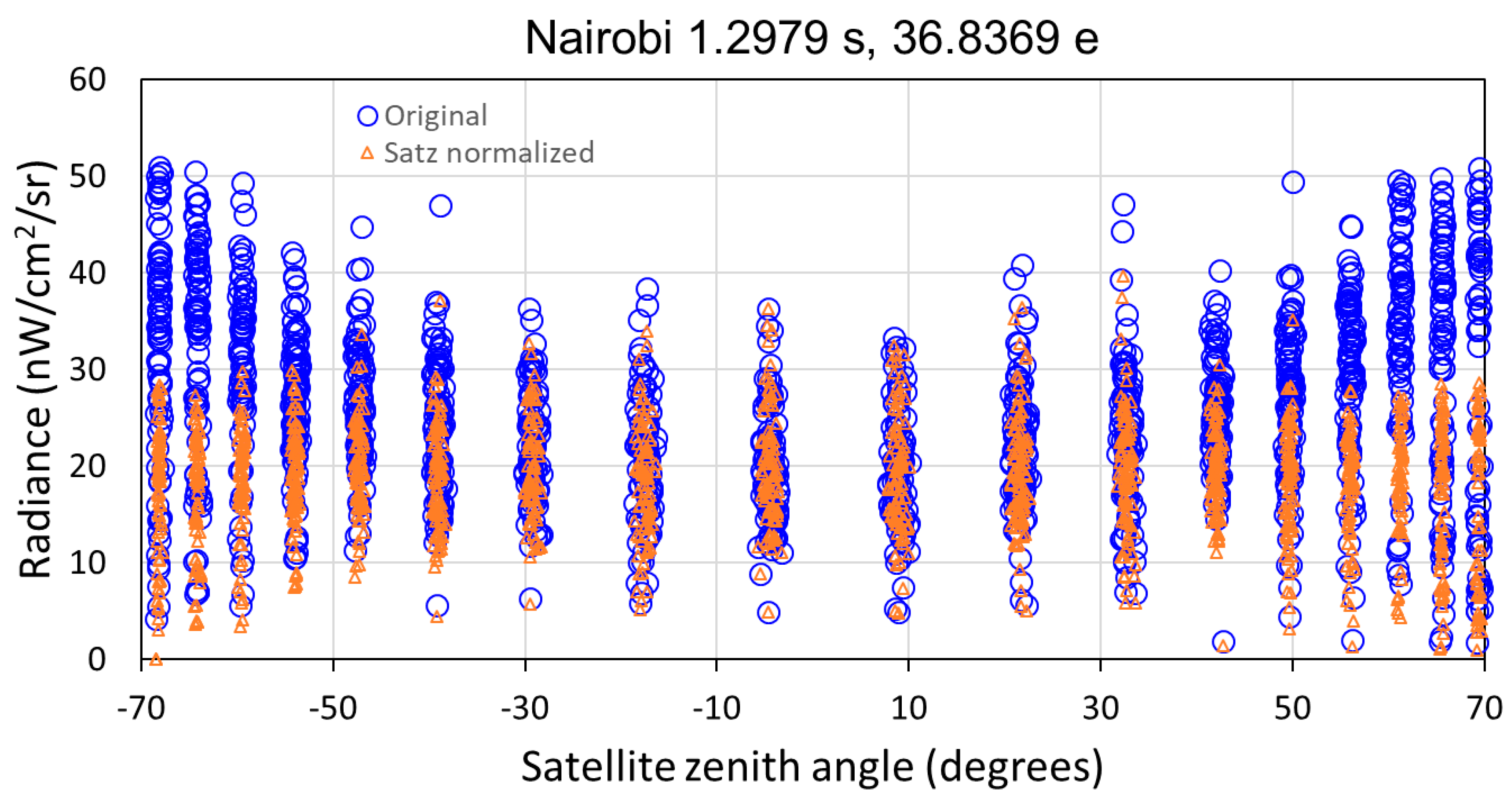
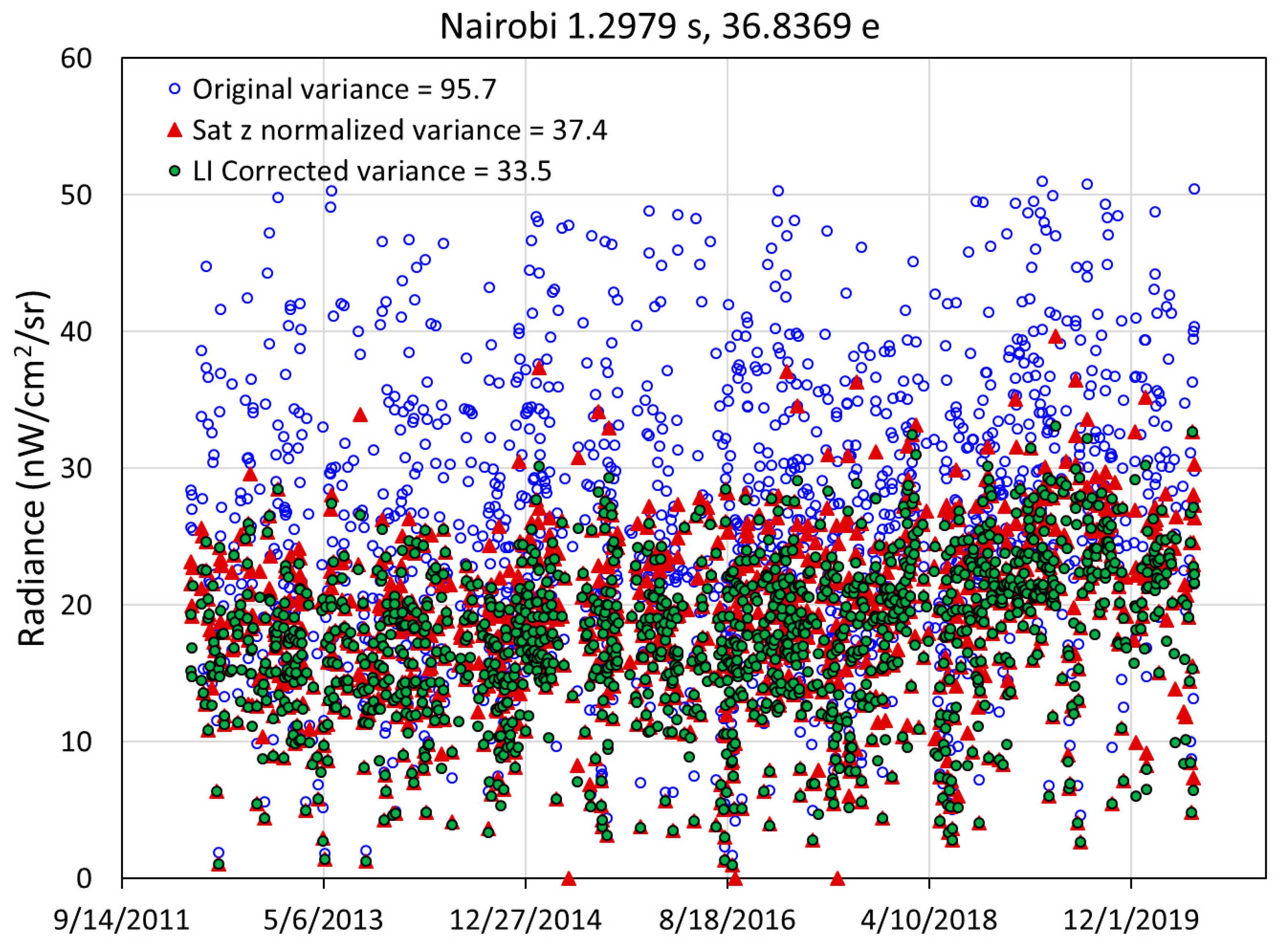
Table 1.
DNB temporal profiles extracted for this study.
| Location | Country | Population Covered | Grid Size | Status |
|---|---|---|---|---|
| Rohingya Camps | Bangladesh | 1,070,436 | 36 × 75 | Developing |
| Pyongyang | North Korea | 2,353,190 | 75 × 40 | Developing |
| Harare | Zimbabwe | 1,631,405 | 50 × 50 | Developing |
| Nairobi | Kenya | 5,129,731 | 100 × 70 | Developing |
| Dhaka | Bangladesh | 15,015,586 | 73 × 97 | Developing |
| Sana’a | Yemen | 1,615,498 | 45 × 73 | Developing |
| Mari’b | Yemen | 91,155 | 41 × 41 | Developing |
| Charpakri | India | 16,862 | 10 × 10 | Developing |
| Gaya | India | 727,277 | 31 × 31 | Developing |
| Delhi | India | 7,022,476 | 25 × 250 | Developing |
| Beijing | China | 12,451,668 | 100 × 100 | Developed |
| Shanghai | China | 11,264,168 | 60 × 60 | Developed |
| Wuhan | China | 7,048,797 | 120 × 120 | Developed |
| Seoul | South Korea | 13,011,839 | 105 × 69 | Developed |
| Houston | USA | 5,783,193 | 200 × 200 | Developed |
| Santa Rosa, CA | USA | 15,175 | 145 × 145 | Developed |
Table 2.
Index classification accuracies for a developed (Houston, Seoul, Shanghai, Beijing) and developing set (Harare, Nairobi, Dhaka, Pyongyang).
Table 2.
Index classification accuracies for a developed (Houston, Seoul, Shanghai, Beijing) and developing set (Harare, Nairobi, Dhaka, Pyongyang).
| Variable | Year | Accuracy Solo | Accuracy with Population |
|---|---|---|---|
| Mean | 2018 | 74% | 85% |
| Variance | 2018 | 68% | 84% |
| Skew | 2018 | 62% | 77% |
| Kurtosis | 2018 | 62% | 75% |
| Lift | 2018 | 70% | 86% |
| CDF slope | 2018 | 53% | 71% |
| ALD % | 2018 | 56% | 71% |
| Outage % | 2018 | 57% | 66% |
| Dispersion | 2108 | 58% | 75% |
| Primary ACF cycle | All | 69% | 73% |
| Long term trend | All | 59% | 72% |
© 2020 by the authors. Licensee MDPI, Basel, Switzerland. This article is an open access article distributed under the terms and conditions of the Creative Commons Attribution (CC BY) license (http://creativecommons.org/licenses/by/4.0/).
Share and Cite
MDPI and ACS Style
Elvidge, C.D.; Hsu, F.-C.; Zhizhin, M.; Ghosh, T.; Taneja, J.; Bazilian, M. Indicators of Electric Power Instability from Satellite Observed Nighttime Lights. Remote Sens. 2020, 12, 3194. https://doi.org/10.3390/rs12193194
AMA Style
Elvidge CD, Hsu F-C, Zhizhin M, Ghosh T, Taneja J, Bazilian M. Indicators of Electric Power Instability from Satellite Observed Nighttime Lights. Remote Sensing. 2020; 12(19):3194. https://doi.org/10.3390/rs12193194
Chicago/Turabian StyleElvidge, Christopher D., Feng-Chi Hsu, Mikhail Zhizhin, Tilottama Ghosh, Jay Taneja, and Morgan Bazilian. 2020. "Indicators of Electric Power Instability from Satellite Observed Nighttime Lights" Remote Sensing 12, no. 19: 3194. https://doi.org/10.3390/rs12193194
Note that from the first issue of 2016, this journal uses article numbers instead of page numbers. See further details here.